## Pie Charts: Self-Judgement and Self-Difficulty Evaluation for Qwen2.5-14B-Instruct
### Overview
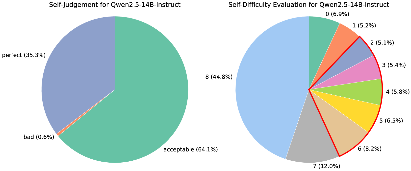
The image displays two pie charts side-by-side, both related to evaluations of "Qwen2.5-14B-Instruct". The left chart, titled "Self-Judgement for Qwen2.5-14B-Instruct", categorizes responses into "perfect", "acceptable", and "bad". The right chart, titled "Self-Difficulty Evaluation for Qwen2.5-14B-Instruct", presents a more granular breakdown of difficulty levels, labeled numerically from 0 to 8.
### Components/Axes
**Left Pie Chart: Self-Judgement for Qwen2.5-14B-Instruct**
* **Title:** Self-Judgement for Qwen2.5-14B-Instruct
* **Categories and Percentages:**
* perfect: 35.3% (represented by a light purple/blue slice)
* acceptable: 64.1% (represented by a teal/green slice)
* bad: 0.6% (represented by a thin orange slice)
**Right Pie Chart: Self-Difficulty Evaluation for Qwen2.5-14B-Instruct**
* **Title:** Self-Difficulty Evaluation for Qwen2.5-14B-Instruct
* **Categories and Percentages:**
* 0: 6.9% (represented by a light green slice)
* 1: 5.2% (represented by an orange slice)
* 2: 5.1% (represented by a coral slice)
* 3: 5.4% (represented by a pink slice)
* 4: 5.8% (represented by a light green slice)
* 5: 6.5% (represented by a yellow slice)
* 6: 8.2% (represented by a tan/beige slice)
* 7: 12.0% (represented by a grey slice)
* 8: 44.8% (represented by a light blue slice)
* **Visual Element:** A red outline is present, encompassing slices 2 through 7, suggesting a potential grouping or focus on this range of difficulty levels.
### Detailed Analysis
**Left Pie Chart:**
The "Self-Judgement" pie chart indicates a strong positive self-assessment. The "acceptable" category dominates with 64.1% of the responses. "Perfect" responses account for a significant 35.3%. The "bad" category is extremely small, representing only 0.6% of the responses.
**Right Pie Chart:**
The "Self-Difficulty Evaluation" pie chart shows a bimodal distribution, with the highest proportion of responses at the highest difficulty level (8: 44.8%) and a secondary peak at a moderate difficulty level (7: 12.0%). The difficulty levels from 2 to 6 show a relatively consistent distribution, ranging from 5.1% to 8.2%. The lowest difficulty level (0) accounts for 6.9%.
### Key Observations
* **Self-Judgement:** The overwhelming majority of self-judgements are positive ("acceptable" or "perfect"), with a negligible amount of negative feedback ("bad").
* **Difficulty Distribution:** The most frequently reported difficulty level is 8 (44.8%), followed by 7 (12.0%). This suggests that the model is perceived as most challenging at its highest difficulty settings.
* **Red Outline:** The red outline on the right chart highlights difficulty levels 2 through 7. This range represents a substantial portion of the responses, but it is overshadowed by the highest difficulty level (8).
### Interpretation
The two pie charts provide insights into the perceived performance and difficulty of the "Qwen2.5-14B-Instruct" model.
The "Self-Judgement" chart suggests that users or evaluators have a generally positive view of the model's output, with a combined 99.4% of responses falling into the "perfect" or "acceptable" categories. This indicates a high level of satisfaction or perceived quality.
The "Self-Difficulty Evaluation" chart, however, reveals a more nuanced picture. While the self-judgement is positive, the difficulty ratings indicate that the model is perceived as most challenging at its highest settings (level 8). The significant proportion of responses at level 8 (44.8%) suggests that users are frequently encountering situations where the model's task is difficult. The secondary peak at level 7 (12.0%) further supports the idea that higher difficulty levels are more commonly encountered. The relatively uniform distribution across difficulty levels 2-6, and the lower proportion at level 0, suggest that the model is not perceived as trivially easy across the board, but rather that the most significant challenges lie at the upper end of the difficulty scale.
The red outline on the right chart might be intended to draw attention to the middle range of difficulty levels, perhaps as a point of focus for further analysis or improvement. However, the data clearly shows that the highest difficulty level (8) is the most prominent.
In conclusion, the data suggests that "Qwen2.5-14B-Instruct" is generally well-received in terms of its output quality, but it is also perceived as being quite challenging to utilize effectively, particularly at its most advanced difficulty settings. This could imply that while the model is capable, users may struggle to fully leverage its potential or that the tasks presented at higher difficulty levels are inherently complex.