## Grouped Bar Chart: Model Accuracy Comparison
### Overview
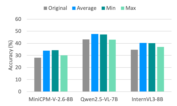
This image displays a grouped bar chart comparing the accuracy percentages of three specific AI models: **MiniCPM-V-2.6-8B**, **Qwen2.5-VL-7B**, and **InternVL3-8B**. The chart evaluates each model across four distinct metrics: "Original," "Average," "Min," and "Max."
### Components/Axes
* **Y-Axis (Vertical):** Labeled "Accuracy (%)". The scale ranges from 0 to 60, with grid lines at 10-unit intervals (0, 10, 20, 30, 40, 50, 60).
* **X-Axis (Horizontal):** Categorical axis listing the three models:
* MiniCPM-V-2.6-8B
* Qwen2.5-VL-7B
* InternVL3-8B
* **Legend:** Positioned at the top center of the chart.
* **Grey:** Original
* **Blue:** Average
* **Dark Teal:** Min
* **Light Teal:** Max
### Detailed Analysis
The chart groups four bars for each model, corresponding to the legend. Below are the approximate values for each model based on visual estimation against the Y-axis grid lines:
**1. MiniCPM-V-2.6-8B (Left Group)**
* **Original (Grey):** ~28%
* **Average (Blue):** ~34%
* **Min (Dark Teal):** ~34.5%
* **Max (Light Teal):** ~30%
**2. Qwen2.5-VL-7B (Center Group)**
* **Original (Grey):** ~43%
* **Average (Blue):** ~48%
* **Min (Dark Teal):** ~47.5%
* **Max (Light Teal):** ~43%
**3. InternVL3-8B (Right Group)**
* **Original (Grey):** ~35%
* **Average (Blue):** ~40%
* **Min (Dark Teal):** ~40%
* **Max (Light Teal):** ~37%
### Key Observations
* **Performance Leader:** The **Qwen2.5-VL-7B** model consistently demonstrates the highest accuracy across all four metrics compared to the other two models.
* **Counter-Intuitive Labeling:** In all three model groups, the bar labeled **"Min" (Dark Teal)** is visually higher than the bar labeled **"Max" (Light Teal)**. This contradicts standard statistical definitions where a maximum value should be greater than or equal to a minimum value.
* **Metric Hierarchy:** For all models, the "Original" metric is consistently the lowest value. The "Average" metric is consistently the highest or tied for the highest value.
### Interpretation
* **Data Anomaly:** The inversion of the "Min" and "Max" labels suggests either a labeling error in the chart's legend or that the terms "Min" and "Max" refer to specific, non-standard subsets of data (e.g., perhaps "Min" refers to a specific prompt category that performed unexpectedly well, or the labels were swapped during chart generation).
* **Model Efficacy:** The data demonstrates that the "Average" metric provides the most optimistic view of model performance, while the "Original" metric represents the baseline performance, which is consistently lower.
* **Comparative Standing:** Qwen2.5-VL-7B is the clear superior model in this dataset, maintaining a significant lead (approximately 5-15 percentage points) over MiniCPM-V-2.6-8B and InternVL3-8B across all metrics.