## Diagram Comparison: Optimal Path vs. Model Path
### Overview
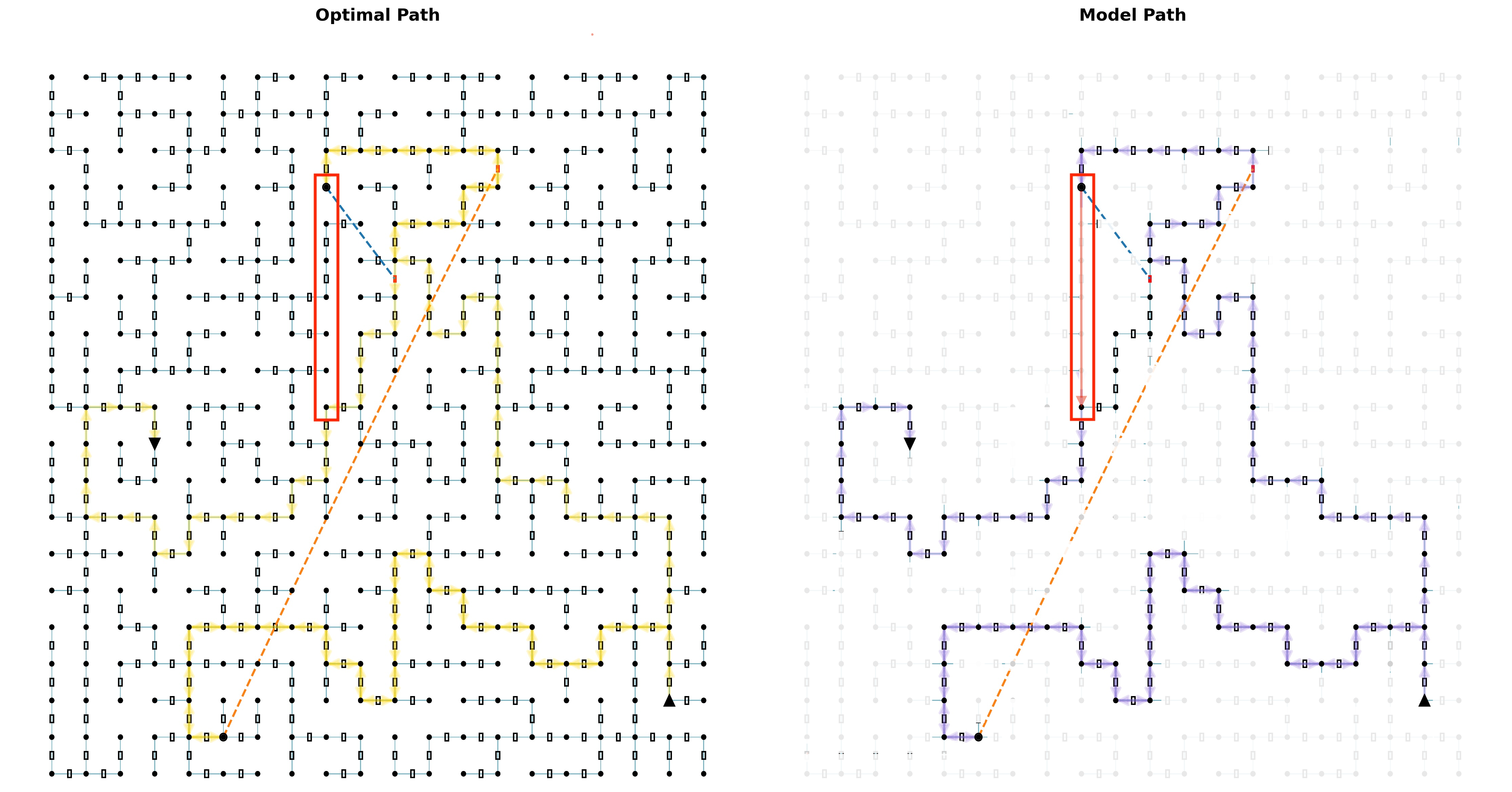
The image displays a side-by-side comparison of two pathfinding results on an identical grid-based environment. The left panel is titled "Optimal Path," and the right panel is titled "Model Path." Both diagrams visualize a path from a starting point to an endpoint, navigating through a network of nodes and edges. The comparison highlights the differences between a theoretically optimal route and the route generated by a computational model.
### Components/Axes
* **Grid Structure:** Both diagrams are built on a uniform grid of black circular nodes connected by thin, light-blue lines representing possible edges or pathways.
* **Start Point:** A black, downward-pointing triangle (▼) located in the lower-left quadrant of the grid.
* **End Point:** A black, upward-pointing triangle (▲) located in the lower-right quadrant of the grid.
* **Waypoints/Targets:** Two black circular nodes are highlighted with red rectangular outlines in both diagrams. One is in the upper-left quadrant, and the other is in the lower-left quadrant, near the start point.
* **Path Lines:**
* **Optimal Path (Left Panel):** A thick, solid yellow line traces the optimal route.
* **Model Path (Right Panel):** A thick, solid purple line traces the model-generated route.
* **Direct Line (Both Panels):** A dashed orange line connects the two red-boxed waypoints directly, serving as a reference for the shortest possible distance between them.
* **Legend/Labels:** The titles "Optimal Path" and "Model Path" are the primary labels. No explicit color legend is present, but the path colors (yellow vs. purple) are consistent with the panel titles.
### Detailed Analysis
**Optimal Path (Left Panel):**
* **Trajectory:** The yellow path starts at the lower waypoint (▼), moves directly upward to the upper waypoint (red box), then proceeds in a generally southeast direction with efficient, right-angle turns to reach the endpoint (▲).
* **Key Segment:** The path from the lower waypoint to the upper waypoint is a straight vertical line, matching the most direct route.
* **Efficiency:** The path appears to minimize distance, taking direct routes between nodes with minimal backtracking or unnecessary turns.
**Model Path (Right Panel):**
* **Trajectory:** The purple path starts at the lower waypoint (▼). Instead of going directly up, it first moves right, then up, then left, creating a detour before reaching the upper waypoint (red box). From there, it proceeds to the endpoint (▲) with a route that is similar but not identical to the optimal path.
* **Key Deviation:** The most significant difference is in the segment between the two red-boxed waypoints. The model's path (purple) takes a circuitous, three-segment route (right, up, left) to cover the vertical distance that the optimal path (yellow) covers in one straight segment. This is highlighted by the red rectangle.
* **Inefficiency:** The model's path contains clear inefficiencies, particularly the initial detour and some less direct routing in the latter half compared to the optimal path.
### Key Observations
1. **Path Divergence:** The primary divergence occurs at the very beginning of the route between the two highlighted waypoints. The model fails to identify the direct vertical connection.
2. **Structural Similarity:** After the initial deviation, the model's path follows a broadly similar topological structure to the optimal path, suggesting it understands the general goal but not the most efficient sequence of moves.
3. **Grid Utilization:** Both paths exclusively use the grid's nodes and edges, moving only horizontally or vertically between adjacent nodes.
4. **Visual Emphasis:** The red rectangles and the orange dashed "direct line" are deliberate visual cues drawing the viewer's attention to the specific segment where the model's performance is most suboptimal.
### Interpretation
This diagram is a diagnostic visualization, likely from a machine learning or robotics context, evaluating a pathfinding model's performance against a ground-truth optimal solution.
* **What it Demonstrates:** The model has learned the general task of navigating from a start to an end point via specified waypoints but has not learned the optimal policy. Its failure to take the direct vertical path suggests a potential flaw in its training, reward function, or state evaluation—it may be overvaluing certain movements or lack a precise understanding of the grid's connectivity.
* **Relationship Between Elements:** The side-by-side comparison is the core analytical tool. The identical grid and waypoints create a controlled experiment. The orange dashed line acts as a visual benchmark for the ideal connection between key points, making the model's deviation immediately apparent.
* **Anomalies and Implications:** The model's detour is a clear anomaly. In a real-world application (e.g., robot navigation, game AI, logistics), this inefficiency would translate to wasted time, energy, or resources. The diagram argues that while the model is functional, it is not yet optimal and requires refinement to match the efficiency of the known best solution. The investigation would focus on why the model "chose" the longer path—was it due to a local minimum in its planning algorithm, a bias in its training data, or an incomplete map of available edges?