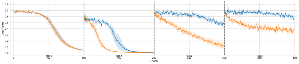
## Line Chart: Loss Value vs. Epoch for Multiple Tasks
### Overview
The image is a line chart displaying the loss value over epochs for two different models (represented by blue and orange lines) across four tasks. The chart is divided into four sections by vertical dashed lines, each representing a different task. The x-axis represents the epoch number, and the y-axis represents the loss value. Shaded regions around each line indicate the uncertainty or variance in the loss value.
### Components/Axes
* **X-axis:** Epoch, labeled from 0 to 400 in increments of 50.
* **Y-axis:** Loss Value, labeled from 0.0 to 0.8 in increments of 0.1.
* **Vertical dashed lines:** Separate the tasks. These lines are located at approximately Epoch 100, 200, and 300.
* **Task Labels:** Task 0, Task 1, Task 2, Task 3 are labeled at approximately Epoch 50, 150, 250, and 350 respectively.
* **Data Series:**
* **Blue Line:** Represents one model's performance.
* **Orange Line:** Represents another model's performance.
* **Shaded Regions:** Light blue and light orange regions around the lines represent the standard deviation or confidence interval of the loss value.
### Detailed Analysis
**Task 0 (Epoch 0-100):**
* **Orange Line:** Starts at approximately 0.7 and decreases steadily to approximately 0.05 by Epoch 100.
* **Blue Line:** Starts at approximately 0.7 and decreases slightly to approximately 0.65 before decreasing rapidly to approximately 0.55 by Epoch 100.
**Task 1 (Epoch 100-200):**
* **Orange Line:** Starts at approximately 0.55 and decreases steadily to approximately 0.01 by Epoch 200.
* **Blue Line:** Starts at approximately 0.55 and decreases rapidly to approximately 0.01 by Epoch 200.
**Task 2 (Epoch 200-300):**
* **Orange Line:** Starts at approximately 0.6 and decreases steadily to approximately 0.4 by Epoch 300.
* **Blue Line:** Starts at approximately 0.7 and decreases slightly to approximately 0.6 by Epoch 300.
**Task 3 (Epoch 300-400):**
* **Orange Line:** Starts at approximately 0.45 and fluctuates around 0.4 by Epoch 400.
* **Blue Line:** Starts at approximately 0.7 and fluctuates around 0.6 by Epoch 400.
### Key Observations
* Both models show a decrease in loss value over time, indicating learning.
* The orange model appears to learn faster in Task 0 and Task 1, achieving lower loss values more quickly.
* In Task 2 and Task 3, the blue model consistently maintains a lower loss value than the orange model.
* The shaded regions indicate the variability in the loss value, with wider regions suggesting greater instability or uncertainty.
### Interpretation
The chart compares the performance of two models across four different tasks. The initial tasks (0 and 1) show a clear learning curve for both models, with the orange model initially performing better. However, in later tasks (2 and 3), the blue model demonstrates superior performance, maintaining a lower loss value. This suggests that the blue model may have better generalization capabilities or is better suited for the later tasks. The shaded regions highlight the stability of the models, with narrower regions indicating more consistent performance. The vertical lines indicate the transition between tasks, and the change in loss value at these points may indicate the models' ability to adapt to new tasks.