\n
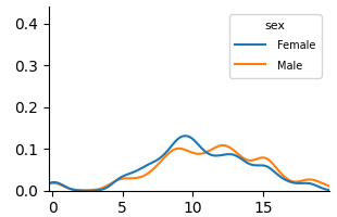
## Line Chart: Distribution Comparison by Sex
### Overview
The image displays a line chart comparing two probability distributions or density estimates, categorized by sex (Female and Male). The chart plots numerical values on the x-axis against a probability or density measure on the y-axis. There is no main chart title or axis titles provided.
### Components/Axes
* **Legend:** Located in the top-right corner of the chart area. It contains the title "sex" and defines two data series:
* **Female:** Represented by a blue line.
* **Male:** Represented by an orange line.
* **X-Axis:** A horizontal numerical axis with major tick marks labeled at 0, 5, 10, and 15. The axis extends slightly beyond 15, suggesting a range from approximately 0 to 18.
* **Y-Axis:** A vertical numerical axis with major tick marks labeled at 0.0, 0.1, 0.2, 0.3, and 0.4. The axis starts at 0.0.
### Detailed Analysis
The chart shows two smooth, unimodal (single-peaked) distribution curves.
**1. Female Distribution (Blue Line):**
* **Trend:** The line starts near 0.0 at x=0, rises steadily to a peak, and then declines back towards 0.0.
* **Key Points (Approximate):**
* Starts at (0, ~0.01).
* Begins a noticeable ascent around x=3.
* Reaches its peak density of approximately **0.13** at an x-value of about **9.5**.
* After the peak, it declines, crossing below the Male line around x=11.
* Ends near (18, ~0.01).
**2. Male Distribution (Orange Line):**
* **Trend:** The line also starts near 0.0, rises to a peak later than the Female line, and then declines.
* **Key Points (Approximate):**
* Starts at (0, ~0.01).
* Begins a noticeable ascent around x=4, slightly later than the Female line.
* Reaches its peak density of approximately **0.11** at an x-value of about **12.5**.
* After the peak, it declines, crossing above the Female line around x=11 and remaining above it until the end of the range.
* Ends near (18, ~0.01).
**Relationship Between Lines:**
* The Female distribution is shifted to the left (lower x-values) compared to the Male distribution.
* The two lines intersect at two points: once near x=2 (both near 0.0) and again around x=11 (at a density of ~0.09).
* Between x=2 and x=11, the Female line is generally above the Male line.
* Between x=11 and x=18, the Male line is generally above the Female line.
### Key Observations
1. **Peak Disparity:** The most notable feature is the difference in peak location. The Female distribution peaks at a lower x-value (~9.5) than the Male distribution (~12.5).
2. **Peak Height:** The peak density for Females (~0.13) is slightly higher than the peak density for Males (~0.11).
3. **Distribution Shape:** Both distributions have a similar overall shape—a rise, a single peak, and a fall—but are offset from each other along the x-axis.
4. **Overlap:** There is significant overlap between the two distributions, particularly in the range of x=5 to x=15, indicating commonality in the measured variable between the groups despite the shift.
### Interpretation
This chart visually demonstrates a difference in the central tendency of a measured variable between two groups, Female and Male. The variable, represented on the x-axis, could be age, a test score, a physiological measurement, or any continuous metric.
* **What the data suggests:** The data suggests that, for the population sampled, the typical or most common value (the mode) of the measured variable is lower for Females than for Males. The Female group's values are more concentrated around a lower point (x≈9.5), while the Male group's values are more concentrated around a higher point (x≈12.5).
* **How elements relate:** The legend directly maps color to category, enabling the comparison. The x-axis provides the scale for the variable, and the y-axis shows the relative likelihood or frequency of each value within its group. The intersecting lines highlight the points where the relative likelihoods are equal.
* **Notable patterns/anomalies:** The clean, smooth nature of the lines suggests these are likely kernel density estimates (KDEs) or fitted distribution curves rather than raw histogram data. The lack of axis titles is a significant omission, as it prevents definitive interpretation of what is being measured. The uncertainty in extracting exact peak values is high due to the absence of gridlines; the values provided are best visual estimates.