\n
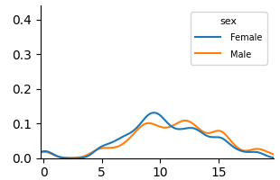
## Line Chart: Distribution by Sex
### Overview
The image presents a line chart depicting the distribution of a variable (likely age or a similar continuous variable) across two sexes: Female and Male. The y-axis represents the density or frequency, while the x-axis ranges from 0 to approximately 20.
### Components/Axes
* **X-axis:** Ranges from 0 to 20, with no explicit label. It represents the independent variable.
* **Y-axis:** Ranges from 0.0 to 0.4, labeled as "Density" (inferred). It represents the dependent variable.
* **Legend:** Located in the top-right corner, labeled "sex". It contains two entries:
* "Female" - represented by a blue line.
* "Male" - represented by an orange line.
### Detailed Analysis
The chart displays two overlapping lines.
* **Female (Blue Line):** The line starts at approximately 0.0 at x=0, gradually increases, reaching a peak density of approximately 0.12 at x=9. It then declines, crossing back to approximately 0.0 at x=18.
* **Male (Orange Line):** The line starts at approximately 0.0 at x=0, gradually increases, reaching a peak density of approximately 0.11 at x=11. It then declines, crossing back to approximately 0.0 at x=18.
The lines are very similar in shape, with the Female line peaking slightly earlier than the Male line. Both lines exhibit a unimodal distribution, meaning they have a single peak.
### Key Observations
* Both sexes exhibit a similar distribution pattern.
* The Female distribution peaks slightly earlier (around x=9) than the Male distribution (around x=11).
* The maximum density for the Female distribution is slightly higher than for the Male distribution.
* The distributions are roughly symmetrical around their peaks.
### Interpretation
The chart suggests that the variable being measured (likely age) is distributed similarly across both sexes, with a concentration of individuals around the ages of 9-11. The slight difference in peak location suggests that females may tend to be slightly younger in this sample. The overall shape of the distribution indicates a natural grouping or clustering of individuals within this age range. Without knowing the context of the data, it's difficult to draw more specific conclusions. The data suggests a possible cohort effect or a natural life-cycle pattern. The distributions could represent age distributions within a specific population or sample. The fact that the distributions are similar suggests that the variable being measured is not strongly influenced by sex.