\n
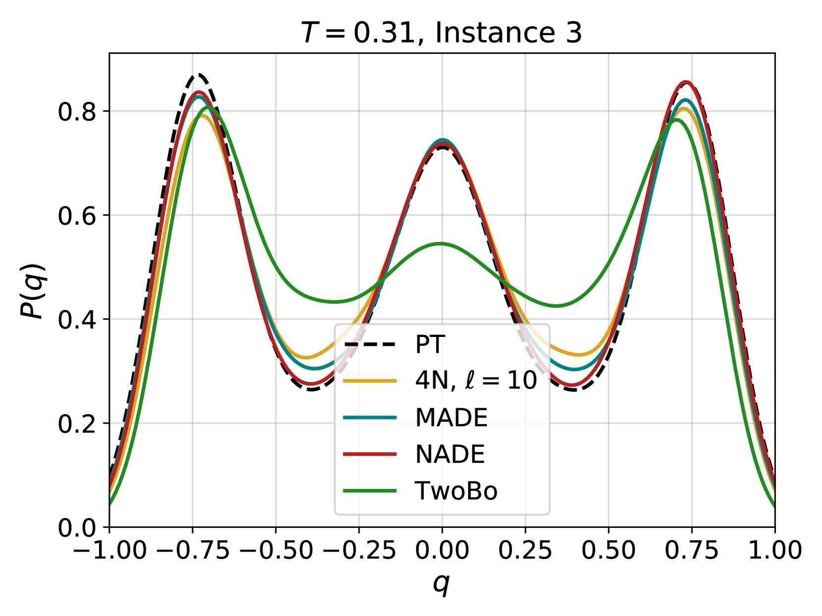
## Chart: Probability Distribution Comparison
### Overview
The image presents a line chart comparing probability distributions for different models (PT, 4N, MADE, NADE, and TwoBo) at a specific time (T = 0.31) and instance (Instance 3). The x-axis represents the variable 'q', and the y-axis represents the probability P(q). The chart visually compares the shapes of these distributions.
### Components/Axes
* **Title:** *T = 0.31, Instance 3* (positioned at the top-center)
* **X-axis Label:** *q* (positioned at the bottom-center)
* **Y-axis Label:** *P(q)* (positioned at the left-center)
* **X-axis Scale:** Ranges from -1.00 to 1.00, with markers at -1.00, -0.75, -0.50, -0.25, 0.00, 0.25, 0.50, 0.75, and 1.00.
* **Y-axis Scale:** Ranges from 0.0 to 0.8, with markers at 0.0, 0.2, 0.4, 0.6, and 0.8.
* **Legend:** Located in the top-right corner. Contains the following entries:
* PT (dashed black line)
* 4N, ℓ = 10 (yellow line)
* MADE (black line)
* NADE (red line)
* TwoBo (green line)
### Detailed Analysis
The chart displays five distinct lines, each representing a different model's probability distribution.
* **PT (dashed black line):** This line exhibits a roughly sinusoidal shape, peaking around -0.75 and 0.75 with a value of approximately 0.85. It dips to a minimum of approximately 0.25 around 0.0.
* **4N, ℓ = 10 (yellow line):** This line shows a similar sinusoidal pattern to PT, but with slightly lower peaks, reaching approximately 0.75 at -0.75 and 0.75. The minimum value is around 0.30 near 0.0.
* **MADE (black line):** This line closely follows the PT line, with peaks around -0.75 and 0.75 at approximately 0.83. The minimum value is around 0.27 near 0.0.
* **NADE (red line):** This line also exhibits a sinusoidal shape, peaking around -0.75 and 0.75 at approximately 0.85. The minimum value is around 0.25 near 0.0.
* **TwoBo (green line):** This line has a broader, more flattened sinusoidal shape compared to the others. It peaks around -0.75 and 0.75 at approximately 0.75. The minimum value is around 0.40 near 0.0.
All lines show a roughly symmetrical distribution around q = 0.
### Key Observations
* The PT, MADE, and NADE lines are very similar in shape and value, suggesting these models produce comparable probability distributions.
* The 4N line is also similar, but slightly lower in magnitude.
* The TwoBo line is noticeably different, with a broader and flatter distribution.
* All models exhibit peaks at approximately q = -0.75 and q = 0.75, and a minimum around q = 0.0.
### Interpretation
The chart demonstrates a comparison of probability distributions generated by different models. The close similarity between the PT, MADE, and NADE distributions suggests that these models are effectively capturing the underlying probability structure of the data at the given time and instance. The TwoBo model, with its broader distribution, may be representing greater uncertainty or a different underlying assumption about the data. The 4N model is also similar, but slightly less pronounced. The consistent peaks at -0.75 and 0.75 indicate a strong tendency for the variable 'q' to take on those values, while the minimum around 0.0 suggests a lower probability for values near zero. This data suggests that the models are converging on similar representations of the probability landscape, with the TwoBo model exhibiting a more conservative or uncertain estimate.