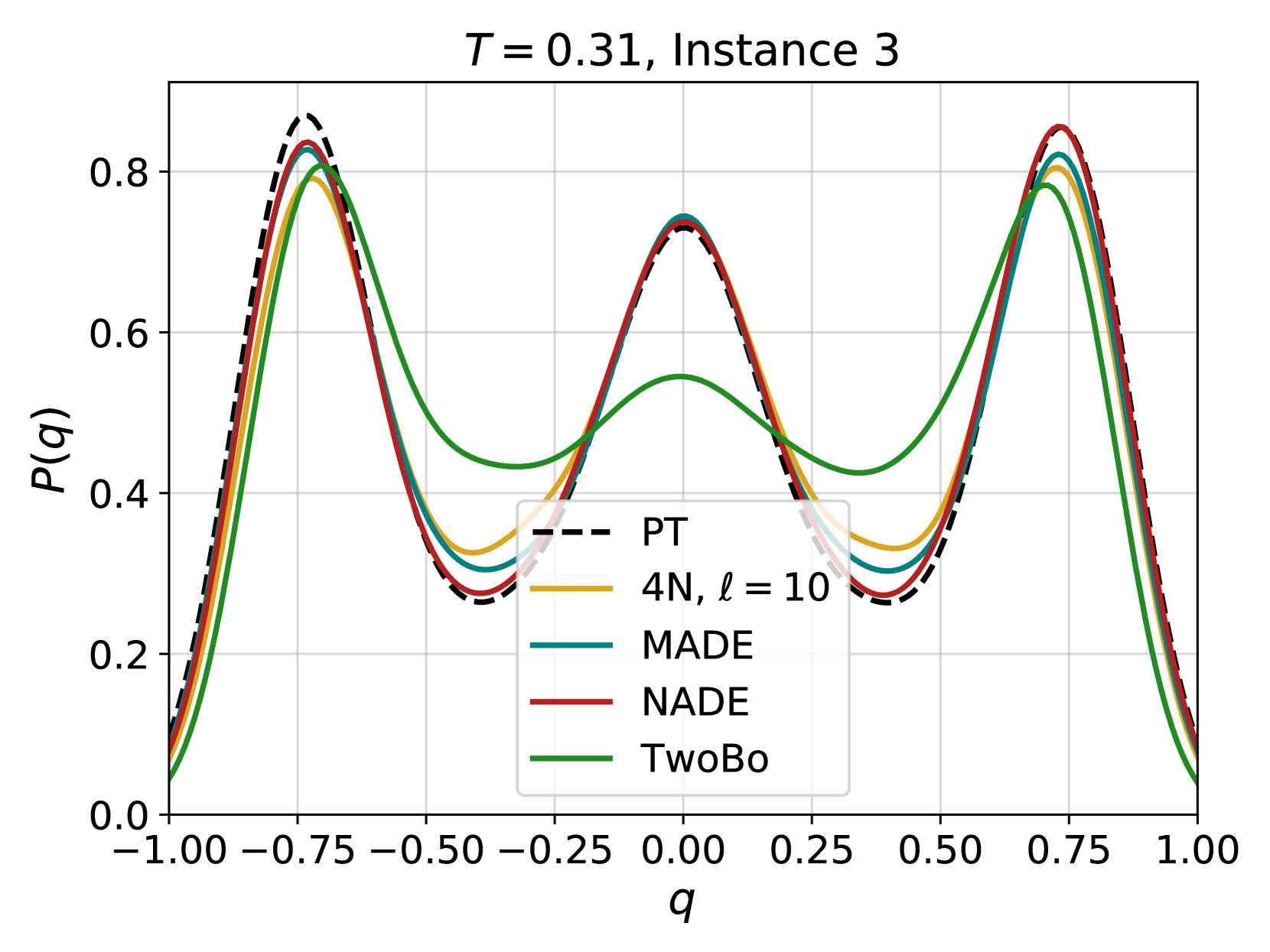
## Probability Distribution Plot: T = 0.31, Instance 3
### Overview
This image is a scientific line graph comparing the probability distribution functions, P(q), of five different models or methods for a specific experimental instance (Instance 3) at a parameter value T = 0.31. The plot shows how the probability density varies with the variable q across the range [-1.00, 1.00].
### Components/Axes
* **Title:** "T = 0.31, Instance 3" (centered at the top).
* **X-axis:** Labeled "q". The scale runs from -1.00 to 1.00 with major tick marks at intervals of 0.25 (-1.00, -0.75, -0.50, -0.25, 0.00, 0.25, 0.50, 0.75, 1.00).
* **Y-axis:** Labeled "P(q)". The scale runs from 0.0 to approximately 0.85, with major tick marks at intervals of 0.2 (0.0, 0.2, 0.4, 0.6, 0.8).
* **Legend:** Positioned in the center-bottom region of the plot area. It contains five entries:
1. **PT:** Black dashed line (`---`).
2. **4N, ℓ = 10:** Solid yellow/gold line.
3. **MADE:** Solid teal/dark cyan line.
4. **NADE:** Solid red line.
5. **TwoBo:** Solid green line.
* **Grid:** A light gray grid is present, aiding in value estimation.
### Detailed Analysis
The plot displays five curves, each representing a different method's estimated probability distribution P(q). All distributions are symmetric around q = 0 and exhibit a distinct three-peak (trimodal) structure.
**Trend Verification & Data Points (Approximate):**
1. **PT (Black Dashed Line):** This appears to be the reference or ground truth distribution.
* **Trend:** Sharp, well-defined peaks.
* **Key Points:**
* Left Peak: Maximum at q ≈ -0.75, P(q) ≈ 0.85.
* Central Peak: Maximum at q ≈ 0.00, P(q) ≈ 0.73.
* Right Peak: Maximum at q ≈ 0.75, P(q) ≈ 0.85.
* Minima: Deep troughs at q ≈ -0.40 and q ≈ 0.40, with P(q) ≈ 0.25.
2. **4N, ℓ = 10 (Yellow Line):**
* **Trend:** Follows the PT curve very closely, with slightly lower peak amplitudes.
* **Key Points:**
* Left Peak: q ≈ -0.75, P(q) ≈ 0.80.
* Central Peak: q ≈ 0.00, P(q) ≈ 0.72.
* Right Peak: q ≈ 0.75, P(q) ≈ 0.80.
* Minima: q ≈ -0.40 & 0.40, P(q) ≈ 0.30.
3. **MADE (Teal Line):**
* **Trend:** Very similar to PT and 4N, nearly overlapping with the NADE curve.
* **Key Points:**
* Left Peak: q ≈ -0.75, P(q) ≈ 0.82.
* Central Peak: q ≈ 0.00, P(q) ≈ 0.73.
* Right Peak: q ≈ 0.75, P(q) ≈ 0.82.
* Minima: q ≈ -0.40 & 0.40, P(q) ≈ 0.28.
4. **NADE (Red Line):**
* **Trend:** Almost indistinguishable from the PT reference line, especially at the peaks.
* **Key Points:**
* Left Peak: q ≈ -0.75, P(q) ≈ 0.84.
* Central Peak: q ≈ 0.00, P(q) ≈ 0.73.
* Right Peak: q ≈ 0.75, P(q) ≈ 0.84.
* Minima: q ≈ -0.40 & 0.40, P(q) ≈ 0.26.
5. **TwoBo (Green Line):**
* **Trend:** Shows the most significant deviation. It captures the three-peak structure but with substantially lower peak heights and shallower minima.
* **Key Points:**
* Left Peak: q ≈ -0.75, P(q) ≈ 0.78.
* Central Peak: q ≈ 0.00, P(q) ≈ 0.55.
* Right Peak: q ≈ 0.75, P(q) ≈ 0.78.
* Minima: Broader and shallower, centered around q ≈ -0.35 & 0.35, with P(q) ≈ 0.43.
### Key Observations
1. **Trimodal Symmetry:** All five methods agree on the fundamental trimodal and symmetric nature of the distribution P(q) for this instance.
2. **Performance Hierarchy:** There is a clear hierarchy in how closely the methods approximate the PT reference:
* **Excellent Fit:** NADE (red) and MADE (teal) are nearly perfect matches.
* **Very Good Fit:** 4N, ℓ=10 (yellow) is slightly below the top performers.
* **Poor Fit:** TwoBo (green) significantly underestimates the probability density at the peaks and overestimates it in the troughs.
3. **Peak Consistency:** The location of the three peaks (q ≈ -0.75, 0.00, 0.75) is consistent across all methods, indicating robustness in identifying the modes of the distribution.
### Interpretation
This plot is likely from a study in machine learning or computational physics, comparing different generative models or sampling techniques (PT, MADE, NADE, TwoBo, 4N) on their ability to model a complex, multimodal probability distribution. The variable `q` could represent an order parameter, a latent variable, or a physical quantity.
* **What the data suggests:** The NADE and MADE architectures are highly effective at capturing the intricate details of this specific distribution (T=0.31, Instance 3). The 4N model with length parameter ℓ=10 is also very accurate. The TwoBo model, however, struggles, producing a "smeared out" approximation that fails to capture the sharpness of the probability peaks. This could indicate that TwoBo has lower capacity, uses a less suitable inductive bias, or was not properly tuned for this task.
* **Why it matters:** Accurately modeling such multimodal distributions is crucial for tasks like Bayesian inference, energy-based modeling, and sampling from complex systems. The failure of a model like TwoBo to capture sharp peaks could lead to poor performance in downstream tasks that rely on precise probability estimates, such as generating realistic samples or calculating expectations.
* **Anomalies:** The most notable anomaly is the systematic underperformance of the TwoBo method compared to the others. Its central peak is particularly suppressed (P(q)≈0.55 vs. ~0.73 for others), suggesting a specific difficulty in modeling the mode at q=0.