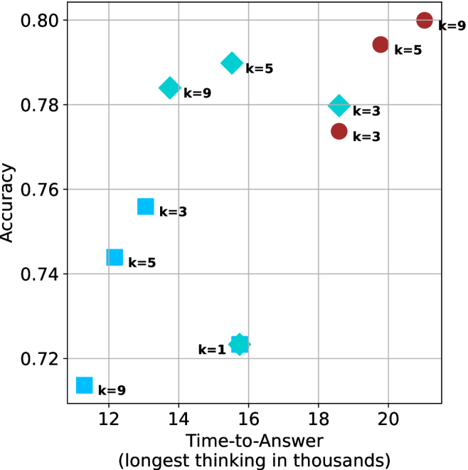
## Scatter Plot: Accuracy vs. Time-to-Answer
### Overview
The image is a scatter plot showing the relationship between "Accuracy" and "Time-to-Answer" (longest thinking in thousands). The plot contains data points for different values of 'k' (k=1, k=3, k=5, k=9), represented by cyan and brown markers. The cyan markers are squares, diamonds, and stars, while the brown markers are circles.
### Components/Axes
* **X-axis:** "Time-to-Answer (longest thinking in thousands)". The axis ranges from approximately 11 to 21, with gridlines at integer values.
* **Y-axis:** "Accuracy". The axis ranges from 0.72 to 0.80, with gridlines at intervals of 0.02.
* **Data Points:**
* Cyan markers (squares, diamonds, and stars)
* Brown markers (circles)
* **Labels:** Each data point is labeled with its corresponding 'k' value (k=1, k=3, k=5, k=9).
### Detailed Analysis
**Cyan Data Points:**
* **k=9 (square):** Located at approximately (11.7, 0.715).
* **k=5 (square):** Located at approximately (12.5, 0.743).
* **k=3 (square):** Located at approximately (13.5, 0.757).
* **k=1 (star):** Located at approximately (15.8, 0.723).
* **k=9 (diamond):** Located at approximately (14, 0.783).
* **k=5 (diamond):** Located at approximately (15.5, 0.79).
* **k=3 (diamond):** Located at approximately (18, 0.78).
**Brown Data Points:**
* **k=3 (circle):** Located at approximately (18.2, 0.773).
* **k=5 (circle):** Located at approximately (19.5, 0.793).
* **k=9 (circle):** Located at approximately (20.5, 0.80).
### Key Observations
* The cyan data points (squares, diamonds, and stars) generally show an increase in accuracy as the time-to-answer increases, up to a point, then accuracy decreases.
* The brown data points (circles) show an increase in accuracy as the time-to-answer increases.
* For the brown data points, as k increases, both the time-to-answer and accuracy increase.
* The cyan data points are more scattered than the brown data points.
### Interpretation
The scatter plot visualizes the relationship between the accuracy of a model and the time it takes to generate an answer, for different values of 'k'. The plot suggests that increasing the time-to-answer generally improves accuracy, but this effect may vary depending on the value of 'k' and the type of marker. The brown data points show a clear positive correlation between time-to-answer and accuracy, while the cyan data points show a more complex relationship. The cyan data points may represent a different model or configuration than the brown data points. The 'k' value seems to influence both the time-to-answer and the accuracy, with higher 'k' values generally leading to longer time-to-answer and higher accuracy for the brown data points.