## Scatter Plot: Accuracy vs. Time-to-Answer
### Overview
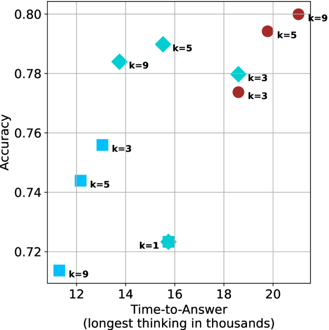
This image is a scatter plot visualizing the relationship between "Time-to-Answer" (x-axis) and "Accuracy" (y-axis). The data points are categorized by color and shape, with each point labeled with a "k" value (likely representing a parameter such as sample size, beam width, or number of candidates). The plot suggests a positive correlation between time and accuracy, though the relationship varies significantly across different data clusters.
### Components/Axes
* **Y-Axis:** Labeled "Accuracy". The scale ranges from 0.72 to 0.80, with major grid lines at 0.02 intervals.
* **X-Axis:** Labeled "Time-to-Answer (longest thinking in thousands)". The scale ranges from 12 to 20, with major grid lines at 2-unit intervals.
* **Data Series (Categorized by Shape/Color):**
* **Light Blue Squares:** Three points, generally located in the bottom-left quadrant.
* **Light Blue Diamonds:** Three points, generally located in the upper-middle region.
* **Light Blue Star/Complex Shape:** One point, located in the bottom-middle region.
* **Dark Red/Brown Circles:** Three points, generally located in the upper-right quadrant.
### Detailed Analysis
The following data points are extracted based on visual estimation from the grid:
**1. Light Blue Squares (Bottom-Left Cluster)**
* *Trend:* These points show a positive correlation where increasing time correlates with increasing accuracy.
* **k=9:** Positioned at (x ≈ 12.0, y ≈ 0.715)
* **k=5:** Positioned at (x ≈ 12.5, y ≈ 0.744)
* **k=3:** Positioned at (x ≈ 13.0, y ≈ 0.756)
**2. Light Blue Diamonds (Upper-Middle Cluster)**
* *Trend:* These points show a slight negative correlation or plateau, where increasing time does not yield higher accuracy.
* **k=9:** Positioned at (x ≈ 13.8, y ≈ 0.784)
* **k=5:** Positioned at (x ≈ 15.5, y ≈ 0.790)
* **k=3:** Positioned at (x ≈ 18.5, y ≈ 0.780)
**3. Light Blue Star (Outlier)**
* **k=1:** Positioned at (x ≈ 15.8, y ≈ 0.723)
**4. Dark Red/Brown Circles (Upper-Right Cluster)**
* *Trend:* These points show a strong positive correlation, where increasing time significantly increases accuracy.
* **k=3:** Positioned at (x ≈ 18.5, y ≈ 0.774)
* **k=5:** Positioned at (x ≈ 19.8, y ≈ 0.795)
* **k=9:** Positioned at (x ≈ 21.0, y ≈ 0.800)
### Key Observations
* **Efficiency Clusters:** The data is clearly segmented into three distinct groups. The Light Blue Squares are the fastest but least accurate. The Dark Red Circles are the slowest but achieve the highest accuracy.
* **The "k" Parameter:** The effect of the "k" parameter is inconsistent across groups. In the Blue Square group, lower "k" values (3) correlate with higher accuracy/time. In the Red Circle group, higher "k" values (9) correlate with higher accuracy/time.
* **Outlier:** The "k=1" star is a significant outlier, demonstrating low accuracy despite a relatively high "Time-to-Answer" (approx. 15.8k), making it the least efficient configuration on the chart.
### Interpretation
This chart likely represents a performance evaluation of different algorithmic configurations (e.g., different model architectures or inference methods) where "k" represents a hyperparameter.
* **Diminishing Returns:** The Dark Red Circles show that while increasing time (from 18.5k to 21k) improves accuracy, the gains are marginal (0.774 to 0.800).
* **Optimal Strategy:** Depending on the constraints, the "k=5" diamond (x≈15.5, y≈0.790) appears to be a "sweet spot" or Pareto-optimal point, offering high accuracy with significantly less time than the Red Circle configurations.
* **Inconsistency:** The fact that the relationship between "k" and performance flips between the Blue Square group and the Red Circle group suggests that the underlying mechanism or model being tested changes fundamentally between these groups.