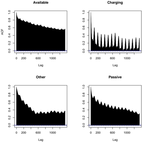
## Chart: Autocorrelation Function Plots for Different Device States
### Overview
The image presents four autocorrelation function (ACF) plots, each representing a different device state: "Available", "Charging", "Other", and "Passive". Each plot displays the autocorrelation coefficient (ACF) on the y-axis against the lag on the x-axis. The plots are arranged in a 2x2 grid.
### Components/Axes
* **X-axis:** "Lag" ranging from 0 to approximately 1000.
* **Y-axis:** "ACF" (Autocorrelation Function) ranging from 0 to 1.0.
* **Titles:** Each subplot has a title indicating the device state: "Available", "Charging", "Other", "Passive".
* **Horizontal Blue Lines:** A horizontal blue line is present at y = 0 in each plot, representing the zero autocorrelation level.
* **Data Series:** Each plot contains a black line representing the ACF values for the corresponding device state.
### Detailed Analysis
Each plot will be analyzed individually.
**1. Available:**
* **Trend:** The ACF line starts at approximately 1.0 at lag 0 and decays rapidly to near 0 as the lag increases. The decay appears relatively smooth and monotonic.
* **Data Points (approximate):**
* Lag 0: ACF ≈ 1.0
* Lag 100: ACF ≈ 0.7
* Lag 200: ACF ≈ 0.4
* Lag 500: ACF ≈ 0.15
* Lag 1000: ACF ≈ 0.05
**2. Charging:**
* **Trend:** The ACF line exhibits a highly oscillatory pattern with significant peaks and troughs. The peaks are concentrated at lower lags (below 200) and decay rapidly. After the initial oscillations, the ACF settles around 0.
* **Data Points (approximate):**
* Lag 0: ACF ≈ 1.0
* Lag 50: ACF ≈ 0.7
* Lag 100: ACF ≈ 0.2
* Lag 150: ACF ≈ -0.3
* Lag 200: ACF ≈ 0.1
* Lag 500: ACF ≈ -0.05
* Lag 1000: ACF ≈ 0.0
**3. Other:**
* **Trend:** Similar to "Available", the ACF line decays from approximately 1.0 at lag 0 to near 0 as the lag increases. The decay is relatively smooth, but exhibits some minor fluctuations.
* **Data Points (approximate):**
* Lag 0: ACF ≈ 1.0
* Lag 100: ACF ≈ 0.6
* Lag 200: ACF ≈ 0.3
* Lag 500: ACF ≈ 0.1
* Lag 1000: ACF ≈ 0.0
**4. Passive:**
* **Trend:** The ACF line starts at approximately 1.0 at lag 0 and decays to near 0 as the lag increases. The decay is initially rapid, then slows down, exhibiting some oscillations.
* **Data Points (approximate):**
* Lag 0: ACF ≈ 1.0
* Lag 100: ACF ≈ 0.6
* Lag 200: ACF ≈ 0.4
* Lag 500: ACF ≈ 0.2
* Lag 1000: ACF ≈ 0.1
### Key Observations
* The "Charging" state exhibits a distinctly different ACF pattern compared to the other three states, characterized by strong oscillations at low lags. This suggests a periodic or cyclical component in the data associated with the "Charging" state.
* The "Available", "Other", and "Passive" states show similar decaying ACF patterns, indicating a weaker temporal dependence.
* The rate of decay in the ACF differs slightly between the "Available", "Other", and "Passive" states, suggesting varying degrees of autocorrelation.
### Interpretation
These ACF plots are used to analyze the temporal dependence in time series data related to device states. The ACF measures the correlation between a time series and its lagged values.
* **Charging:** The strong oscillations in the ACF plot for the "Charging" state suggest that the data is highly correlated with its recent past, potentially indicating a regular charging cycle or a periodic process. The rapid decay of the oscillations suggests that this periodicity is relatively short-lived.
* **Available, Other, Passive:** The decaying ACF plots for these states indicate that the data is correlated with its past, but the correlation weakens as the lag increases. This suggests that the device state at a given time is influenced by its previous states, but the influence diminishes over time.
The differences in ACF patterns between the states can be used to distinguish between them and to model the temporal dynamics of the device behavior. The plots provide insights into the underlying processes governing the device states and can be used for forecasting or anomaly detection.