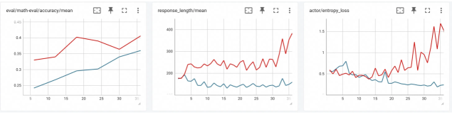
## Line Charts: Model Performance Metrics
### Overview
The image presents three line charts displaying the performance of a model across different metrics during training or evaluation. Each chart shows two data series, likely representing different model configurations or training strategies, plotted against a common x-axis representing training steps or epochs. The charts depict 'eval/math-eval/accuracy/mean', 'response_length/mean', and 'actor/entropy_loss'.
### Components/Axes
**Chart 1: eval/math-eval/accuracy/mean**
* **Title:** eval/math-eval/accuracy/mean
* **X-axis:** (Implied) Training steps or epochs, with markers at approximately 5, 10, 15, 20, 25, and 30.
* **Y-axis:** Accuracy, ranging from 0.25 to 0.45, with markers at 0.25, 0.3, 0.35, 0.4, and 0.45.
* **Data Series:**
* Red Line: Represents one model's accuracy.
* Blue Line: Represents another model's accuracy.
**Chart 2: response_length/mean**
* **Title:** response_length/mean
* **X-axis:** (Implied) Training steps or epochs, with markers at approximately 5, 10, 15, 20, 25, and 30.
* **Y-axis:** Response Length, ranging from 200 to 400, with markers at 200, 300, and 400.
* **Data Series:**
* Red Line: Represents one model's average response length.
* Blue Line: Represents another model's average response length.
**Chart 3: actor/entropy_loss**
* **Title:** actor/entropy_loss
* **X-axis:** (Implied) Training steps or epochs, with markers at approximately 5, 10, 15, 20, 25, and 30.
* **Y-axis:** Entropy Loss, ranging from 0.5 to 1.5, with markers at 0.5, 1.0, and 1.5.
* **Data Series:**
* Red Line: Represents one model's entropy loss.
* Blue Line: Represents another model's entropy loss.
### Detailed Analysis
**Chart 1: eval/math-eval/accuracy/mean**
* **Red Line (Accuracy):** Starts at approximately 0.33 at step 5, increases to about 0.34 at step 10, rises to approximately 0.40 at step 20, and then decreases to approximately 0.37 at step 30.
* **Blue Line (Accuracy):** Starts at approximately 0.24 at step 5, increases steadily to approximately 0.35 at step 30.
**Chart 2: response_length/mean**
* **Red Line (Response Length):** Starts at approximately 180 at step 5, fluctuates between 220 and 260 until step 25, and then increases sharply to approximately 380 at step 30.
* **Blue Line (Response Length):** Starts at approximately 180 at step 5, decreases to approximately 140 at step 10, and then remains relatively stable between 140 and 160 until step 30.
**Chart 3: actor/entropy_loss**
* **Red Line (Entropy Loss):** Starts at approximately 0.5 at step 5, fluctuates between 0.5 and 1.0 until step 25, and then increases sharply to approximately 1.6 at step 30.
* **Blue Line (Entropy Loss):** Starts at approximately 0.5 at step 5, decreases to approximately 0.2 at step 25, and then remains relatively stable until step 30.
### Key Observations
* In the accuracy chart, the red line initially performs better but plateaus and slightly decreases, while the blue line shows consistent improvement.
* In the response length chart, the red line shows significantly higher and more volatile response lengths compared to the blue line.
* In the entropy loss chart, the red line shows higher and increasing entropy loss, while the blue line shows decreasing entropy loss.
### Interpretation
The charts compare the performance of two models (or configurations) across three key metrics: accuracy, response length, and entropy loss. The blue line consistently shows a more stable and potentially better-performing model. While the red line initially shows higher accuracy, it plateaus and is accompanied by higher response lengths and increasing entropy loss, suggesting potential issues with model stability or overfitting. The blue line's consistent improvement in accuracy, coupled with lower response lengths and decreasing entropy loss, indicates a more robust and efficient model. The sharp increase in response length and entropy loss for the red line towards the end of the training period (step 30) is a notable anomaly that warrants further investigation.