## Line Charts: Model Training Metrics
### Overview
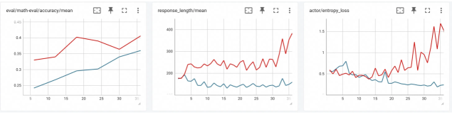
The image displays three horizontally arranged line charts, each tracking a different metric over what appears to be training steps or epochs (x-axis, labeled 0 to 30). Each chart contains two data series, represented by a red line and a blue line, suggesting a comparison between two models, conditions, or runs. The charts are presented in a dashboard or monitoring interface, with small icons (a chart, an expand/fullscreen icon, and a three-dot menu) in the top-right corner of each panel.
### Components/Axes
**Common Elements:**
* **X-Axis (All Charts):** Labeled with numerical markers at intervals of 5, ranging from 0 to 30. The axis title is not explicitly visible, but context suggests it represents training steps, epochs, or iterations.
* **Data Series:** Two lines per chart: one red, one blue. No legend is present within the chart areas to identify what each color represents.
* **Grid:** Light gray horizontal and vertical grid lines are present.
**Chart 1 (Left):**
* **Title:** `eval/math-eval/accuracy/mean`
* **Y-Axis:** Labeled from 0.25 to 0.45 in increments of 0.05. Represents mean accuracy on a math evaluation task.
* **Y-Axis Title:** Not explicitly visible.
**Chart 2 (Center):**
* **Title:** `response_length/mean`
* **Y-Axis:** Labeled from 200 to 400 in increments of 100. Represents mean length (likely in tokens) of generated responses.
* **Y-Axis Title:** Not explicitly visible.
**Chart 3 (Right):**
* **Title:** `actor/entropy_loss`
* **Y-Axis:** Labeled from 0 to 1.5 in increments of 0.5. Represents an entropy loss metric, likely from a reinforcement learning or policy gradient actor model.
* **Y-Axis Title:** Not explicitly visible.
### Detailed Analysis
**Chart 1: eval/math-eval/accuracy/mean**
* **Red Line Trend:** Starts at approximately 0.33 (x=0). Shows a general upward trend with some volatility. Key points: rises to ~0.42 (x≈12), dips to ~0.38 (x≈22), then rises again to end at its highest point, approximately 0.44 (x=30).
* **Blue Line Trend:** Starts lower at 0.25 (x=0). Shows a steadier, more consistent upward trend with less volatility than the red line. Ends at approximately 0.36 (x=30).
* **Relationship:** The red line maintains a higher accuracy than the blue line throughout the entire range. The gap between them narrows slightly in the middle but remains significant.
**Chart 2: response_length/mean**
* **Red Line Trend:** Starts around 220 (x=0). Fluctuates between approximately 200 and 300 for most of the chart. After x≈25, it exhibits a sharp, volatile spike, reaching a peak near 400 (x≈28) before ending around 350 (x=30).
* **Blue Line Trend:** Starts near 200 (x=0). Remains relatively stable and flat, hovering close to the 200 mark for the entire duration, with minor fluctuations.
* **Relationship:** The red line consistently produces longer responses than the blue line. The dramatic late-stage increase in the red line's mean response length is the most notable feature.
**Chart 3: actor/entropy_loss**
* **Red Line Trend:** Highly volatile. Starts around 0.5 (x=0). Dips to a low near 0.2 (x≈10), then begins a steep and erratic climb, surpassing 1.5 (x≈28) before ending near 1.4 (x=30).
* **Blue Line Trend:** Much more stable. Starts around 0.5 (x=0) and fluctuates mildly between approximately 0.4 and 0.6 for the entire chart, ending near 0.5.
* **Relationship:** The two lines start at a similar point. After x≈10, they diverge dramatically: the blue line's entropy loss remains controlled, while the red line's loss explodes, indicating a significant difference in the stability or exploration behavior of the underlying actor models.
### Key Observations
1. **Performance Correlation:** The model represented by the red line shows higher accuracy (Chart 1) but also exhibits much higher volatility in response length (Chart 2) and a dramatic, potentially unstable increase in actor entropy loss (Chart 3) in the later stages.
2. **Stability vs. Performance:** The blue line model demonstrates more stable and predictable behavior across all three metrics—steadily improving accuracy, consistent response length, and controlled entropy loss—but at a lower performance level (accuracy).
3. **Critical Phase Change:** A notable shift occurs around x=25 for the red line model, where both response length and entropy loss spike sharply. This suggests a possible change in training dynamics, policy shift, or onset of instability.
4. **Missing Legend:** The identity of the red and blue series (e.g., "Model A vs. Model B," "With Feature X vs. Without") is not provided in the image, limiting definitive interpretation.
### Interpretation
The data suggests a classic trade-off between performance and stability in model training. The "red" model achieves superior task performance (math accuracy) but at the cost of significantly increased behavioral volatility (erratic response lengths) and what appears to be a destabilizing increase in the actor's entropy loss. High entropy loss can indicate the policy is becoming more random or exploratory, which might be intentional but, when coupled with spiking response lengths, often signals training instability or reward hacking.
The "blue" model represents a more conservative, stable training run. Its metrics change gradually and predictably, which is desirable for reliability, but it fails to reach the same peak performance as the red model within the observed timeframe.
The simultaneous spikes in Charts 2 and 3 for the red model after step 25 are the most critical finding. This correlation implies that the mechanism driving longer responses is tightly linked to the increase in policy entropy. A technical investigator would focus on this period to understand if this represents a beneficial breakthrough in model capability or a detrimental divergence that requires intervention (e.g., adjusting entropy coefficients, reward scaling, or learning rates). The absence of a legend is a major gap; knowing what the red and blue lines represent is essential to determine if this is a comparison of algorithms, hyperparameters, or model sizes.