## Time Series Chart: Position vs. Timestep
### Overview
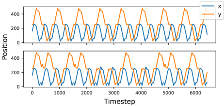
The image presents two time series charts, one above the other, displaying the relationship between "Position" and "Timestep". Each chart plots two data series, labeled 'x' and 'y', with 'x' represented by a blue line and 'y' by an orange line. Both 'x' and 'y' exhibit cyclical patterns, but with different amplitudes and phase relationships in the two charts.
### Components/Axes
* **X-axis (Timestep):** The horizontal axis represents the timestep, ranging from 0 to approximately 6000.
* **Y-axis (Position):** The vertical axis represents the position, ranging from 0 to 400.
* **Legend (Top-Right):**
* Blue line: 'x'
* Orange line: 'y'
* **Chart 1 (Top):** Displays the first set of 'x' and 'y' data.
* **Chart 2 (Bottom):** Displays the second set of 'x' and 'y' data.
### Detailed Analysis
**Chart 1 (Top):**
* **Blue Line (x):** The 'x' series oscillates between approximately 50 and 250. The peaks are relatively consistent.
* Timestep ~500: Position ~200
* Timestep ~1000: Position ~100
* Timestep ~1500: Position ~200
* Timestep ~2000: Position ~100
* Timestep ~2500: Position ~200
* Timestep ~3000: Position ~100
* Timestep ~3500: Position ~200
* Timestep ~4000: Position ~100
* Timestep ~4500: Position ~200
* Timestep ~5000: Position ~100
* Timestep ~5500: Position ~200
* Timestep ~6000: Position ~100
* **Orange Line (y):** The 'y' series oscillates between approximately 250 and 450. The peaks are relatively consistent.
* Timestep ~250: Position ~450
* Timestep ~750: Position ~250
* Timestep ~1250: Position ~450
* Timestep ~1750: Position ~250
* Timestep ~2250: Position ~450
* Timestep ~2750: Position ~250
* Timestep ~3250: Position ~450
* Timestep ~3750: Position ~250
* Timestep ~4250: Position ~450
* Timestep ~4750: Position ~250
* Timestep ~5250: Position ~450
* Timestep ~5750: Position ~250
**Chart 2 (Bottom):**
* **Blue Line (x):** The 'x' series oscillates between approximately 0 and 250. The peaks are relatively consistent.
* Timestep ~500: Position ~200
* Timestep ~1000: Position ~50
* Timestep ~1500: Position ~200
* Timestep ~2000: Position ~50
* Timestep ~2500: Position ~200
* Timestep ~3000: Position ~50
* Timestep ~3500: Position ~200
* Timestep ~4000: Position ~50
* Timestep ~4500: Position ~200
* Timestep ~5000: Position ~50
* Timestep ~5500: Position ~200
* Timestep ~6000: Position ~50
* **Orange Line (y):** The 'y' series oscillates between approximately 100 and 500. The peaks are less consistent than in the first chart.
* Timestep ~250: Position ~450
* Timestep ~750: Position ~100
* Timestep ~1250: Position ~450
* Timestep ~1750: Position ~100
* Timestep ~2250: Position ~450
* Timestep ~2750: Position ~100
* Timestep ~3250: Position ~450
* Timestep ~3750: Position ~100
* Timestep ~4250: Position ~450
* Timestep ~4750: Position ~100
* Timestep ~5250: Position ~450
* Timestep ~5750: Position ~100
### Key Observations
* Both charts show cyclical patterns for 'x' and 'y', but the amplitude and phase relationship differ.
* In the top chart, 'x' and 'y' appear to be roughly out of phase.
* In the bottom chart, the 'y' series has more variability in its peak values compared to the top chart.
* The 'x' series in the bottom chart has a lower minimum value (close to 0) compared to the top chart (around 50).
### Interpretation
The charts likely represent the position of two variables, 'x' and 'y', over time. The cyclical nature suggests some form of periodic motion or oscillation. The differences between the two charts could indicate different initial conditions, external influences, or system parameters affecting the 'x' and 'y' variables. The variability in the 'y' series in the bottom chart might indicate a less stable or more perturbed system compared to the top chart. Without further context, it's difficult to determine the exact nature of the system being represented.