\n
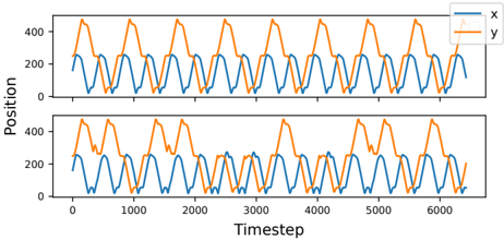
## Line Chart: Position vs. Timestep
### Overview
The image presents two identical line charts displaying the relationship between "Position" and "Timestep" for two variables, "x" and "y". Both charts exhibit periodic, wave-like patterns. The charts are stacked vertically, with the second chart mirroring the first.
### Components/Axes
* **X-axis:** Labeled "Timestep", ranging from approximately 0 to 6000, with tick marks at intervals of 1000.
* **Y-axis:** Labeled "Position", ranging from approximately 0 to 450, with tick marks at intervals of 100.
* **Legend:** Located in the top-right corner, identifying the lines as "x" (blue) and "y" (orange).
* **Data Series:** Two lines are plotted on each chart:
* "x" - Blue line
* "y" - Orange line
### Detailed Analysis
Each chart displays a similar pattern.
**Chart 1 (Top):**
* **Line "x" (Blue):** The line oscillates between approximately 100 and 300. The period of the oscillation is roughly 500 timesteps. The line starts at approximately 150, reaches a peak around 250 at timestep 250, returns to approximately 150 at timestep 500, and continues this pattern.
* **Line "y" (Orange):** The line oscillates between approximately 150 and 450. The period of the oscillation is also roughly 500 timesteps. The line starts at approximately 300, reaches a peak around 420 at timestep 250, returns to approximately 300 at timestep 500, and continues this pattern.
**Chart 2 (Bottom):**
* **Line "x" (Blue):** Identical pattern to the "x" line in the top chart. Oscillates between approximately 100 and 300 with a period of roughly 500 timesteps.
* **Line "y" (Orange):** Identical pattern to the "y" line in the top chart. Oscillates between approximately 150 and 450 with a period of roughly 500 timesteps.
The two charts are visually indistinguishable.
### Key Observations
* Both variables ("x" and "y") exhibit periodic behavior.
* The period of oscillation is approximately 500 timesteps for both variables.
* The amplitude of oscillation is different for "x" (approximately 150) and "y" (approximately 270).
* The two charts are identical, suggesting the same data is being displayed twice.
* There appears to be a phase shift between the two lines, with "y" reaching its peak approximately halfway through the period of "x".
### Interpretation
The data suggests two oscillating systems, represented by "x" and "y", that are coupled or related in some way. The consistent period and phase shift indicate a potential relationship, possibly a harmonic one. The fact that the two charts are identical suggests that the data represents a single experiment or simulation repeated or displayed in a redundant manner. The different amplitudes suggest that the two systems respond differently to the same driving force or have different inherent properties. Without further context, it's difficult to determine the exact nature of the relationship between "x" and "y", but the data strongly suggests a dynamic interaction. The "Timestep" variable likely represents discrete time intervals in a simulation or measurement process. The "Position" variable could represent physical location, state, or any other quantifiable property.