## Line Chart: Accuracy vs. Thinking Compute
### Overview
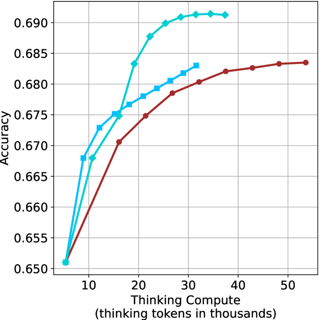
The image is a line chart comparing "Accuracy" against "Thinking Compute" (measured in thousands of thinking tokens). Three distinct data series are plotted, each represented by a different colored line (cyan, blue, and brown). The chart illustrates how accuracy changes with increasing thinking compute for each series.
### Components/Axes
* **Y-axis (Vertical):** "Accuracy". The scale ranges from 0.650 to 0.690, with increments of 0.005.
* **X-axis (Horizontal):** "Thinking Compute (thinking tokens in thousands)". The scale ranges from 0 to 50 (thousands), with increments of 10 (thousands).
* **Data Series:** Three data series are plotted.
* Cyan line with diamond markers.
* Blue line with square markers.
* Brown line with circle markers.
* **Gridlines:** Light gray gridlines are present, aiding in value estimation.
### Detailed Analysis
* **Cyan Line (Diamond Markers):** This line shows the highest accuracy overall. It increases rapidly from approximately 0.651 at 5k tokens to approximately 0.691 at 30k tokens, then plateaus.
* (5, 0.651)
* (10, 0.668)
* (15, 0.683)
* (20, 0.689)
* (25, 0.690)
* (30, 0.691)
* (40, 0.691)
* (50, 0.691)
* **Blue Line (Square Markers):** This line shows a moderate increase in accuracy. It starts at approximately 0.651 at 5k tokens, increases to approximately 0.683 at 30k tokens, then plateaus.
* (5, 0.651)
* (10, 0.673)
* (15, 0.676)
* (20, 0.679)
* (25, 0.681)
* (30, 0.683)
* **Brown Line (Circle Markers):** This line shows the lowest accuracy among the three. It starts at approximately 0.651 at 5k tokens, increases to approximately 0.684 at 50k tokens.
* (5, 0.651)
* (10, 0.668)
* (15, 0.671)
* (20, 0.675)
* (25, 0.679)
* (30, 0.681)
* (40, 0.683)
* (50, 0.684)
### Key Observations
* All three lines start at approximately the same accuracy level (0.651) with low thinking compute (5k tokens).
* The cyan line achieves the highest accuracy and plateaus earlier than the other two lines.
* The brown line shows the slowest increase in accuracy and does not plateau within the displayed range.
* The blue line's performance is in between the cyan and brown lines.
### Interpretation
The chart suggests that increasing "Thinking Compute" generally improves "Accuracy," but the extent of improvement and the point at which diminishing returns are observed varies depending on the specific data series (likely representing different models or configurations). The cyan line demonstrates the most efficient use of "Thinking Compute," achieving high accuracy with a relatively lower amount of compute compared to the brown line. The blue line represents a middle ground in terms of efficiency. The data implies that there are different strategies for improving accuracy, and some are more effective than others in terms of computational cost.