## Line Chart: Accuracy vs. Thinking Compute
### Overview
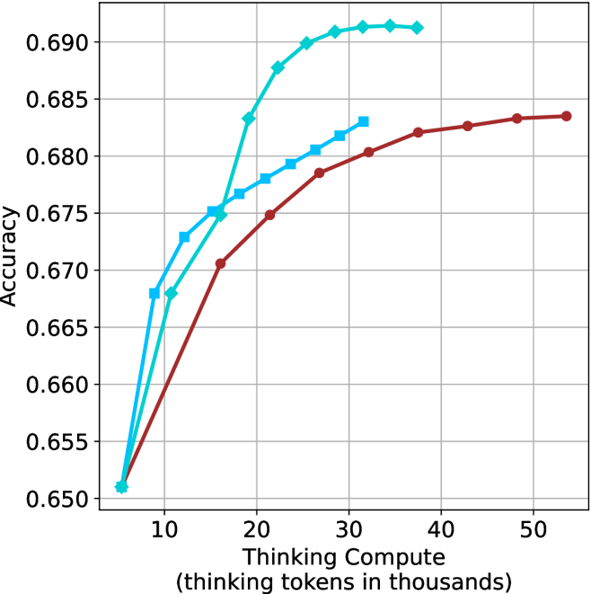
This image is a line chart illustrating the relationship between "Thinking Compute" (measured in thousands of thinking tokens) and model "Accuracy." The chart displays three distinct data series, each represented by a different color and marker shape. All three series originate from a common starting point and diverge as the thinking compute increases, demonstrating different scaling behaviors for the models represented.
### Components/Axes
* **Y-Axis:** Labeled "Accuracy." The scale ranges from 0.650 to 0.690, with grid lines at intervals of 0.005.
* **X-Axis:** Labeled "Thinking Compute (thinking tokens in thousands)." The scale ranges from 10 to 50, with major tick marks every 10 units. The data series begin at approximately 6,000 tokens.
* **Data Series (Legend is absent):**
* **Cyan Line with Diamond Markers:** Represents the model with the steepest initial performance gain.
* **Blue Line with Square Markers:** Represents the model with intermediate performance gain.
* **Dark Red/Maroon Line with Circle Markers:** Represents the model with the most gradual performance gain.
### Detailed Analysis
The chart displays three distinct trends originating from a shared coordinate of approximately (6, 0.651).
#### 1. Cyan Line (Diamond Markers)
* **Trend:** This line exhibits the steepest upward slope, indicating the highest efficiency in gaining accuracy per unit of thinking compute. It rises sharply until approximately 26,000 tokens, after which the slope flattens significantly, suggesting diminishing returns.
* **Data Points (Approximate):**
* Start: (6, 0.651)
* (11, 0.668)
* (16, 0.675)
* (19, 0.683)
* (22, 0.688)
* (26, 0.690)
* (29, 0.691)
* (32, 0.6915)
* (37, 0.6915)
#### 2. Blue Line (Square Markers)
* **Trend:** This line shows a moderate upward slope. It rises steadily but is consistently outperformed by the Cyan line after the 16,000-token mark. It shows signs of plateauing as it approaches 32,000 tokens.
* **Data Points (Approximate):**
* Start: (6, 0.651)
* (9, 0.668)
* (12, 0.673)
* (16, 0.675)
* (19, 0.677)
* (22, 0.678)
* (25, 0.679)
* (28, 0.6805)
* (30, 0.6815)
* (32, 0.683)
#### 3. Dark Red/Maroon Line (Circle Markers)
* **Trend:** This line has the most gradual slope. While it starts at the same point as the others, it gains accuracy much more slowly. However, unlike the other two, it does not show a sharp plateau within the visible range, continuing to climb steadily up to 54,000 tokens.
* **Data Points (Approximate):**
* Start: (6, 0.651)
* (16, 0.6705)
* (22, 0.675)
* (27, 0.6785)
* (32, 0.6805)
* (37, 0.682)
* (42, 0.6825)
* (48, 0.6835)
* (54, 0.6835)
### Key Observations
* **Efficiency vs. Capacity:** The Cyan model is highly efficient, reaching a high accuracy (0.690+) with relatively low compute (under 30k tokens). The Red model is less efficient at low compute levels but demonstrates a more sustained, albeit slower, growth trajectory.
* **Convergence:** All three models perform identically at the lowest compute level (approx. 6k tokens), suggesting a shared baseline capability before "thinking" compute is applied.
* **Missing Legend:** The absence of a legend makes it impossible to identify which specific models (e.g., different versions of an LLM like o1-mini vs. o1-preview) correspond to these colors.
### Interpretation
This chart is a classic representation of inference-time scaling laws. It demonstrates that increasing "thinking compute" (the number of tokens a model generates before providing an answer) generally improves accuracy, but the rate of improvement varies significantly by model architecture.
* **The Cyan Model** appears to be a highly optimized or "distilled" model that hits its performance ceiling quickly. It is the best choice if compute resources are constrained.
* **The Red Model** appears to be a larger or more complex model that requires more "thinking" to unlock its full potential. It does not plateau as early as the others, suggesting it may have a higher theoretical ceiling if given even more compute.
* **The Blue Model** occupies a middle ground, showing moderate scaling behavior.
The data suggests that for tasks requiring high accuracy, one must choose between a model that scales quickly (Cyan) and one that scales broadly (Red), depending on the available compute budget and the desired accuracy threshold.