## Histograms: Token Frequency Distribution for Questions and Answers
### Overview
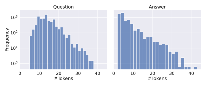
The image displays two side-by-side histograms comparing the frequency distribution of token counts for "Question" and "Answer" text segments. Both charts share identical axes and scales, facilitating direct comparison. The data is presented on a logarithmic frequency scale.
### Components/Axes
* **Chart Type:** Two histograms (subplots).
* **Titles:**
* Left Chart: "Question" (centered at the top).
* Right Chart: "Answer" (centered at the top).
* **X-Axis (Both Charts):**
* Label: "#Tokens" (centered below the axis).
* Scale: Linear, ranging from 0 to 40.
* Major Ticks: 0, 10, 20, 30, 40.
* **Y-Axis (Left Chart Only):**
* Label: "Frequency" (rotated vertically).
* Scale: Logarithmic (base 10).
* Major Ticks: 10⁰ (1), 10¹ (10), 10² (100), 10³ (1000).
* **Data Series:** Each chart contains a single data series represented by vertical blue bars. The bars are contiguous, indicating binned data.
* **Legend:** No separate legend is present; the chart titles serve as the primary identifiers for the data series.
### Detailed Analysis
**Left Chart: "Question"**
* **Trend:** The distribution is right-skewed. Frequency rises sharply from 0 tokens, peaks in the 10-20 token range, and then gradually declines with a long tail extending to 40 tokens.
* **Key Data Points (Approximate):**
* Peak Frequency: Occurs in the bin just after 10 tokens, with a frequency of approximately 1,500 (1.5 x 10³).
* High-Frequency Range (100+): Spans from roughly 5 tokens to 25 tokens.
* Low-Frequency Tail: Frequencies drop below 10 (10¹) after approximately 28 tokens and approach 1 (10⁰) near 38 tokens.
* Minimum Observed: The last visible bar is near 38 tokens with a frequency of ~1.
**Right Chart: "Answer"**
* **Trend:** Also right-skewed, but with a more pronounced peak at very low token counts and a steeper initial decline compared to the "Question" chart.
* **Key Data Points (Approximate):**
* Peak Frequency: Occurs in the bin just after 0 tokens, with a frequency of approximately 2,000 (2 x 10³). This is the highest frequency in either chart.
* High-Frequency Range (100+): Spans from roughly 0 tokens to 12 tokens.
* Steep Decline: Frequency drops from ~2000 to ~100 within the first 10 tokens.
* Low-Frequency Tail: Becomes sparse after 30 tokens, with a few isolated bars near 35 and 40 tokens having frequencies of ~1-3.
### Key Observations
1. **Peak Location Difference:** The most frequent token count for "Questions" is around 10-15 tokens, while for "Answers" it is significantly lower, around 1-5 tokens.
2. **Distribution Shape:** Both distributions are right-skewed, but the "Answer" distribution is more heavily concentrated at the low end (higher kurtosis).
3. **Range:** Both datasets span a similar range of token counts (0 to ~40), but the density within that range differs markedly.
4. **Logarithmic Scale:** The use of a log scale on the y-axis allows visualization of the wide dynamic range in frequencies, from single instances to thousands.
### Interpretation
This data suggests a fundamental structural difference between the questions and answers in the analyzed dataset. Questions tend to be longer, with a typical length around 10-20 tokens. Answers, however, are most frequently very short (1-5 tokens), indicating a prevalence of concise, direct responses. The long tail in both charts shows that while most text segments are relatively short, there is a subset of both questions and answers that are significantly longer (up to 40 tokens). The steep drop-off in answer frequency after the initial peak implies that lengthy, detailed answers are comparatively rare in this corpus. This pattern is common in QA systems or datasets where answers are often factual, single-phrase, or confirmatory.