## Dual-Axis Line and Bar Chart: Power Consumption vs. Clock Frequency Over Time
### Overview
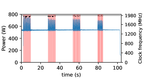
The chart displays two synchronized datasets over a 100-second interval:
1. **Power consumption** (red bars with blue tops)
2. **Clock frequency** (blue area and black line)
The x-axis represents time (0–100 seconds), while the left y-axis shows power in watts (W) and the right y-axis shows clock frequency in megahertz (MHz). A notable feature is the stepwise increase in power and frequency at discrete time intervals, followed by a sharp drop in frequency at the end.
---
### Components/Axes
- **X-axis**: Time (s), labeled at 0, 20, 40, 60, 80, 100.
- **Left Y-axis (Power)**: 0–800 W, with gridlines every 200 W.
- **Right Y-axis (Clock Frequency)**: 0–1980 MHz, with gridlines every 400 MHz.
- **Legend**:
- **Red**: Power (W)
- **Blue**: Clock frequency (MHz)
- **Key Elements**:
- Vertical red bars with blue tops (power spikes).
- Black stepwise line (clock frequency trend).
- Blue shaded area (constant frequency during intervals).
---
### Detailed Analysis
1. **Power (Red Bars)**:
- Five vertical red bars appear at **0, 20, 40, 60, and 80 seconds**.
- Each bar’s base is ~500 W, with blue tops reaching **~600–800 W** (uncertainty: ±50 W).
- The black line atop the bars shows a stepwise increase, peaking at **~800 W** at 80 seconds.
2. **Clock Frequency (Blue Area/Line)**:
- A flat blue line at **~1600 MHz** spans the entire x-axis, except for a sharp drop at **80 seconds**.
- Post-80 seconds, frequency plunges to **~400 MHz** (uncertainty: ±50 MHz).
3. **Blue Shaded Area**:
- Covers the region between red bars, indicating sustained clock frequency during active intervals.
---
### Key Observations
- **Stepwise Power/Frequency Increases**:
Power and frequency rise abruptly at each 20-second interval, suggesting periodic operational bursts.
- **Sudden Frequency Drop**:
At 80 seconds, clock frequency drops by **~1200 MHz** (from 1600 MHz to 400 MHz), possibly indicating a shutdown or low-power mode.
- **Power Consistency**:
Power remains stable (~600 W) during active intervals but aligns with the black line’s stepwise trend.
---
### Interpretation
- **Operational Cycles**:
The chart likely represents a system (e.g., CPU, GPU) executing periodic high-power tasks. The stepwise increases in power and frequency suggest scheduled workloads or clock speed adjustments.
- **Power Management**:
The abrupt frequency drop at 80 seconds implies a transition to a low-power state, possibly after task completion or user inactivity.
- **Data Gaps**:
No data is recorded between 80 and 100 seconds for power, but the frequency remains at 400 MHz. This could indicate idle mode or measurement cessation.
The chart highlights a correlation between power consumption and clock frequency during active periods, with a clear emphasis on energy efficiency post-80 seconds.