## Bar Charts: Vehicle Availability, Charging, and Other Status Over Time
### Overview
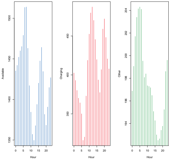
The image presents three vertically-oriented bar charts arranged side-by-side. Each chart displays a distribution of values over a 24-hour period, represented on the x-axis as "Hour" ranging from 0 to 20. The y-axes represent different vehicle statuses: "Available" (left chart), "Charging" (center chart), and "Other" (right chart). The charts appear to show the number of vehicles in each status at each hour.
### Components/Axes
* **X-axis (all charts):** "Hour" ranging from 0 to 20, with tick marks at integer values.
* **Y-axis (left chart):** "Available", ranging from approximately 1350 to 1500, with tick marks at 1350, 1400, 1450, and 1500.
* **Y-axis (center chart):** "Charging", ranging from approximately 350 to 450, with tick marks at 350, 400, and 450.
* **Y-axis (right chart):** "Other", ranging from approximately 194 to 204, with tick marks at 194, 196, 198, 200, 202, and 204.
* **Colors:** Blue for "Available", Red for "Charging", and Green for "Other".
### Detailed Analysis or Content Details
**Chart 1: Available Vehicles**
The "Available" chart shows a generally decreasing trend from hour 0 to hour 20, with several peaks and valleys.
* Hour 0: Approximately 1470 vehicles.
* Hour 2: Approximately 1440 vehicles.
* Hour 4: Approximately 1420 vehicles.
* Hour 6: Approximately 1400 vehicles.
* Hour 8: Approximately 1410 vehicles.
* Hour 10: Approximately 1430 vehicles.
* Hour 12: Approximately 1450 vehicles.
* Hour 14: Approximately 1440 vehicles.
* Hour 16: Approximately 1410 vehicles.
* Hour 18: Approximately 1390 vehicles.
* Hour 20: Approximately 1380 vehicles.
**Chart 2: Charging Vehicles**
The "Charging" chart shows an increasing trend from hour 0 to approximately hour 12, followed by a decreasing trend.
* Hour 0: Approximately 360 vehicles.
* Hour 2: Approximately 370 vehicles.
* Hour 4: Approximately 380 vehicles.
* Hour 6: Approximately 390 vehicles.
* Hour 8: Approximately 400 vehicles.
* Hour 10: Approximately 420 vehicles.
* Hour 12: Approximately 440 vehicles.
* Hour 14: Approximately 430 vehicles.
* Hour 16: Approximately 410 vehicles.
* Hour 18: Approximately 390 vehicles.
* Hour 20: Approximately 370 vehicles.
**Chart 3: Other Vehicles**
The "Other" chart exhibits a similar pattern to the "Charging" chart, with an increase followed by a decrease.
* Hour 0: Approximately 196 vehicles.
* Hour 2: Approximately 197 vehicles.
* Hour 4: Approximately 198 vehicles.
* Hour 6: Approximately 200 vehicles.
* Hour 8: Approximately 201 vehicles.
* Hour 10: Approximately 202 vehicles.
* Hour 12: Approximately 203 vehicles.
* Hour 14: Approximately 202 vehicles.
* Hour 16: Approximately 200 vehicles.
* Hour 18: Approximately 198 vehicles.
* Hour 20: Approximately 196 vehicles.
### Key Observations
* The number of available vehicles generally decreases throughout the day, while the number of vehicles charging and in "Other" status increases during the first half of the day and then decreases.
* The peak charging and "Other" status occur around hour 12.
* The "Available" vehicle count remains significantly higher than the "Charging" and "Other" counts.
### Interpretation
The data suggests a pattern of vehicle usage throughout the day. Vehicles are likely being utilized and taken off the "Available" pool during the day, with a corresponding increase in vehicles being charged or in some other state (e.g., maintenance, in use). The peak in charging and "Other" status around hour 12 could indicate a lunchtime or mid-day period where vehicles are being serviced or recharged. The consistent decline in available vehicles suggests a steady demand for the service throughout the observed period. The relatively small number of vehicles in the "Other" category suggests that most vehicles are either available or being charged. The charts provide a snapshot of vehicle fleet dynamics and could be used to optimize resource allocation and charging schedules.