\n
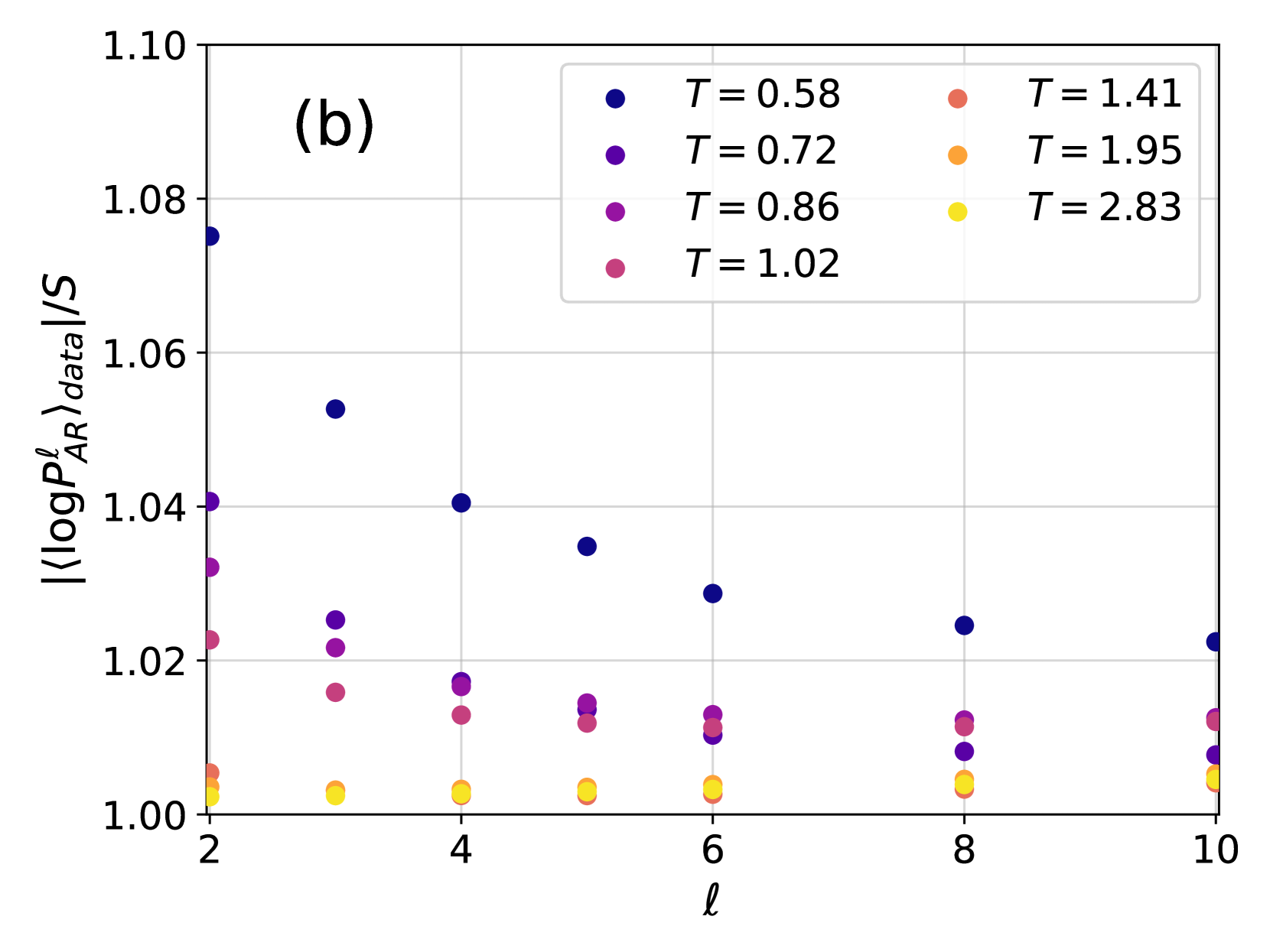
## Scatter Plot: Data Scaling with Temperature
### Overview
The image presents a scatter plot illustrating the relationship between a scaled quantity, `<log P<sup>l</sup><sub>AR</sub>><sub>data</sub>/S`, and a parameter 'l' (likely representing length or a similar scale). The data is presented for several different temperature values (T). The plot appears to show how this scaled quantity changes with 'l' for each temperature.
### Components/Axes
* **X-axis:** Labeled 'l', ranging from approximately 2 to 10, with tick marks at integer values.
* **Y-axis:** Labeled '<log P<sup>l</sup><sub>AR</sub>><sub>data</sub>/S', ranging from approximately 1.00 to 1.10, with tick marks at 0.02 intervals.
* **Legend:** Located in the top-right corner, containing the following temperature values and corresponding colors:
* T = 0.58 (Dark Blue)
* T = 0.72 (Medium Blue)
* T = 0.86 (Purple)
* T = 1.02 (Magenta)
* T = 1.41 (Red)
* T = 1.95 (Orange)
* T = 2.83 (Yellow)
* **Title:** "(b)" in the top-left corner. This suggests this is part of a larger figure.
### Detailed Analysis
The plot consists of several data series, each representing a different temperature. Let's analyze each series:
* **T = 0.58 (Dark Blue):** The data points are scattered, with a slight upward trend. Approximate data points: (2.2, 1.03), (3.2, 1.04), (4.2, 1.04), (5.2, 1.03), (7.2, 1.02), (9.2, 1.03).
* **T = 0.72 (Medium Blue):** The data points are scattered, with a slight upward trend. Approximate data points: (2.4, 1.01), (3.4, 1.03), (4.4, 1.04), (5.4, 1.03), (7.4, 1.02), (9.4, 1.03).
* **T = 0.86 (Purple):** The data points are scattered, with a slight upward trend. Approximate data points: (2.6, 1.02), (3.6, 1.03), (4.6, 1.03), (5.6, 1.02), (7.6, 1.01), (9.6, 1.02).
* **T = 1.02 (Magenta):** The data points are scattered, with a slight upward trend. Approximate data points: (2.8, 1.01), (3.8, 1.02), (4.8, 1.02), (5.8, 1.01), (7.8, 1.00), (9.8, 1.01).
* **T = 1.41 (Red):** The data points are scattered, with a slight upward trend. Approximate data points: (2.1, 1.01), (3.1, 1.02), (4.1, 1.02), (5.1, 1.01), (7.1, 1.00), (9.1, 1.00).
* **T = 1.95 (Orange):** The data points are scattered, with a slight upward trend. Approximate data points: (2.3, 1.00), (3.3, 1.00), (4.3, 1.01), (5.3, 1.00), (7.3, 1.00), (9.3, 1.00).
* **T = 2.83 (Yellow):** The data points are scattered, with a slight upward trend. Approximate data points: (2.5, 1.00), (3.5, 1.00), (4.5, 1.00), (5.5, 1.00), (7.5, 1.00), (9.5, 1.00).
All data series exhibit a relatively flat trend, with slight fluctuations around a value of approximately 1.02. There is no strong correlation between temperature and the scaled quantity.
### Key Observations
* The data points are relatively close together, indicating a small variance in the scaled quantity for each temperature.
* The values for T = 1.95 and T = 2.83 are consistently lower than the other temperatures.
* There is no clear monotonic relationship between temperature and the scaled quantity.
* The data appears to be somewhat noisy, with significant scatter within each temperature series.
### Interpretation
The plot suggests that the scaled quantity, `<log P<sup>l</sup><sub>AR</sub>><sub>data</sub>/S`, is relatively insensitive to changes in temperature (T) over the range examined. The slight variations observed could be due to statistical fluctuations or other factors not represented in the plot. The lower values observed at higher temperatures (T = 1.95 and T = 2.83) might indicate a change in the underlying physical process at those temperatures, potentially a transition or a different scaling behavior. The fact that all data series hover around a value of 1.02 suggests that the scaling factor is approximately constant across the temperatures studied, with minor deviations. The title "(b)" implies that this plot is part of a larger investigation, and the relationship between this data and other plots (e.g., "(a)") would be necessary for a more complete interpretation. The use of the logarithm in the y-axis label suggests that the original quantity, P<sup>l</sup><sub>AR</sub>, may have a wide range of values, and the logarithm is used to compress the scale and reveal underlying trends.