## Scatter Plot: Normalized Log Probability Magnitude vs. Length Scale ℓ
### Overview
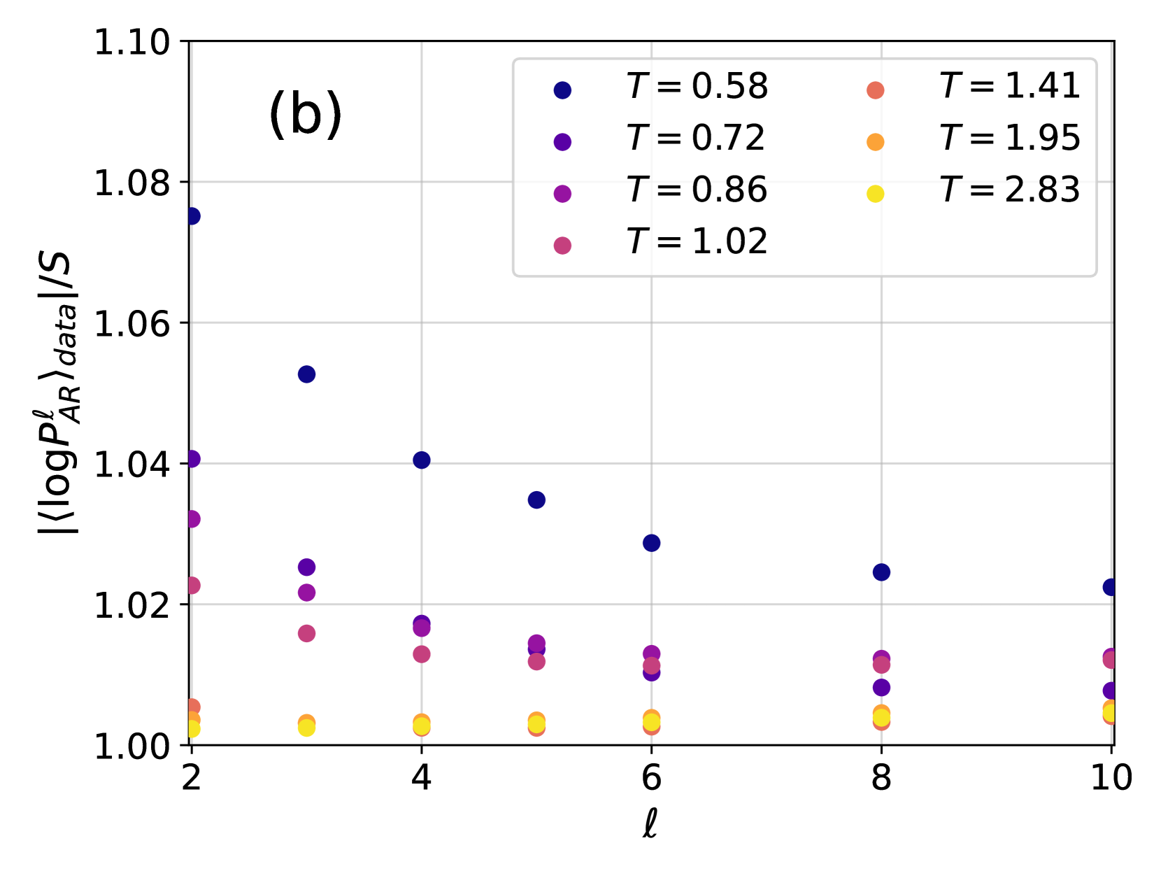
This image is a scientific scatter plot, labeled as panel "(b)", showing the relationship between a normalized log probability magnitude (y-axis) and a length scale parameter ℓ (x-axis) for eight different temperature values (T). The plot displays discrete data points for each combination of ℓ and T.
### Components/Axes
* **Plot Label:** "(b)" is located in the top-left corner of the plot area.
* **X-Axis:**
* **Label:** `ℓ` (the script letter "ell").
* **Scale:** Linear, with major tick marks and labels at `2`, `4`, `6`, `8`, and `10`.
* **Y-Axis:**
* **Label:** `|⟨log P_AR^ℓ⟩_data|/S`. This represents the absolute value of the average (over data) of the log of a quantity `P_AR^ℓ`, normalized by a factor `S`.
* **Scale:** Linear, with major tick marks and labels at `1.00`, `1.02`, `1.04`, `1.06`, `1.08`, and `1.10`.
* **Legend:** Positioned in the top-right quadrant of the plot area. It maps eight distinct colors to eight specific temperature values (T).
* **Dark Blue:** `T = 0.58`
* **Purple:** `T = 0.72`
* **Magenta:** `T = 0.86`
* **Pink:** `T = 1.02`
* **Salmon/Light Red:** `T = 1.41`
* **Orange:** `T = 1.95`
* **Yellow:** `T = 2.83`
* **Grid:** A light gray grid is present in the background.
### Detailed Analysis
The plot shows the value of `|⟨log P_AR^ℓ⟩_data|/S` for integer values of ℓ from 2 to 10, for each of the eight temperature series.
**Trend Verification & Data Points (Approximate):**
* **T = 0.58 (Dark Blue):** This series shows a clear downward trend. The value starts highest at ℓ=2 (~1.075) and decreases monotonically as ℓ increases, reaching ~1.022 at ℓ=10.
* **T = 0.72 (Purple):** Also shows a downward trend, but starting from a lower initial value. Points: ℓ=2 (~1.040), ℓ=3 (~1.025), ℓ=4 (~1.018), ℓ=5 (~1.015), ℓ=6 (~1.010), ℓ=8 (~1.008), ℓ=10 (~1.008).
* **T = 0.86 (Magenta):** Follows a similar downward trend, slightly below the T=0.72 series. Points: ℓ=2 (~1.032), ℓ=3 (~1.022), ℓ=4 (~1.017), ℓ=5 (~1.015), ℓ=6 (~1.012), ℓ=8 (~1.012), ℓ=10 (~1.012).
* **T = 1.02 (Pink):** Shows a very slight downward trend, nearly flat. Points: ℓ=2 (~1.022), ℓ=3 (~1.016), ℓ=4 (~1.013), ℓ=5 (~1.012), ℓ=6 (~1.011), ℓ=8 (~1.011), ℓ=10 (~1.012).
* **T = 1.41 (Salmon):** Appears nearly flat, clustered near the bottom. Points: ℓ=2 (~1.005), ℓ=3 (~1.003), ℓ=4 (~1.003), ℓ=5 (~1.003), ℓ=6 (~1.003), ℓ=8 (~1.004), ℓ=10 (~1.005).
* **T = 1.95 (Orange):** Appears nearly flat, clustered near the bottom. Points: ℓ=2 (~1.004), ℓ=3 (~1.002), ℓ=4 (~1.002), ℓ=5 (~1.002), ℓ=6 (~1.002), ℓ=8 (~1.003), ℓ=10 (~1.004).
* **T = 2.83 (Yellow):** Appears nearly flat, clustered at the very bottom. Points: ℓ=2 (~1.002), ℓ=3 (~1.001), ℓ=4 (~1.001), ℓ=5 (~1.001), ℓ=6 (~1.001), ℓ=8 (~1.002), ℓ=10 (~1.003).
**Spatial Grounding:** The legend is in the top-right. The data points for lower T (cooler colors: blue, purple) are positioned higher on the y-axis, especially at low ℓ. The data points for higher T (warmer colors: orange, yellow) are clustered tightly near y=1.00 across all ℓ.
### Key Observations
1. **Strong Temperature Dependence:** The magnitude of the y-axis quantity is highly sensitive to temperature T. Lower temperatures (T ≤ 1.02) result in significantly higher values, particularly at small ℓ.
2. **ℓ-Dependence Fades with Increasing T:** For T ≤ 1.02, the value decreases as ℓ increases. For T ≥ 1.41, the value is essentially independent of ℓ, remaining close to 1.00.
3. **Convergence at High ℓ:** All data series appear to converge toward a value near 1.00 as ℓ increases, though the low-T series remain slightly elevated even at ℓ=10.
4. **Critical Temperature Region:** The behavior changes markedly around T=1.02 to T=1.41. The series for T=1.02 still shows a slight ℓ-dependence, while T=1.41 and above are flat. This suggests a possible transition in the system's behavior in this temperature range.
### Interpretation
This plot likely comes from statistical physics or machine learning research, analyzing the behavior of a probability distribution (`P_AR^ℓ`) over different length scales (`ℓ`) and temperatures (`T`). The quantity on the y-axis, `|⟨log P_AR^ℓ⟩_data|/S`, measures the normalized magnitude of the average log-probability assigned by the model or observed in the data.
The data suggests a **phase transition or critical phenomenon**. At low temperatures (T < ~1.2), the system exhibits strong scale-dependent behavior: the log-probability magnitude is large at short scales (low ℓ) and decays toward a baseline (S) at larger scales. This could indicate ordered, structured, or predictable behavior at short ranges.
At high temperatures (T > ~1.2), the system becomes scale-invariant and disordered. The log-probability magnitude is uniformly low (~1.00, meaning |⟨log P⟩| ≈ S) across all length scales, suggesting randomness or a lack of meaningful structure at any scale.
The transition point (around T=1.02-1.41) is of particular interest, as it marks where the system's characteristic scale-dependence breaks down. This is a classic signature of a system moving from an ordered phase to a disordered phase as temperature increases.