## Line Chart: Accuracy vs. Sample Size (k)
### Overview
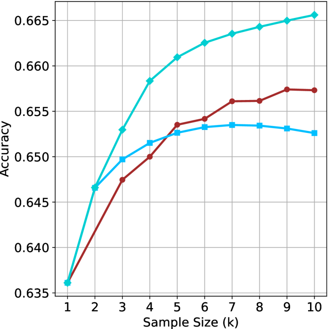
The image is a line chart illustrating the relationship between "Sample Size (k)" and "Accuracy." The chart features three distinct data series, each represented by a unique color and marker shape. There is no legend provided in the image to identify the specific models or methods associated with each line. All three series originate from a common starting point at a sample size of 1.
### Components/Axes
* **X-Axis:** Labeled "Sample Size (k)". The scale ranges from 1 to 10, with integer increments.
* **Y-Axis:** Labeled "Accuracy". The scale ranges from 0.635 to 0.665, with increments of 0.005.
* **Grid:** A standard grid is overlaid on the chart area to assist in reading values.
* **Data Series (Legend absent):**
* **Cyan Line:** Marked with diamond symbols.
* **Maroon Line:** Marked with circle symbols.
* **Light Blue Line:** Marked with square symbols.
### Detailed Analysis
The following data points are approximate based on visual inspection of the grid intersections.
| Sample Size (k) | Cyan (Diamonds) | Maroon (Circles) | Light Blue (Squares) |
| :--- | :--- | :--- | :--- |
| 1 | ~0.636 | ~0.636 | ~0.636 |
| 2 | ~0.647 | ~0.642 | ~0.647 |
| 3 | ~0.653 | ~0.648 | ~0.650 |
| 4 | ~0.658 | ~0.650 | ~0.652 |
| 5 | ~0.661 | ~0.654 | ~0.653 |
| 6 | ~0.663 | ~0.654 | ~0.653 |
| 7 | ~0.664 | ~0.656 | ~0.654 |
| 8 | ~0.664 | ~0.656 | ~0.653 |
| 9 | ~0.665 | ~0.657 | ~0.653 |
| 10 | ~0.666 | ~0.657 | ~0.653 |
**Trend Verification:**
* **Cyan Line:** Exhibits a strong, consistent upward trend across the entire range (1–10). It is the highest-performing series from x=2 onwards.
* **Maroon Line:** Shows a steady upward trend. It starts as the lowest performer but overtakes the Light Blue line between x=4 and x=5.
* **Light Blue Line:** Shows an initial upward trend, but the growth rate slows significantly after x=4. It reaches a peak at x=7 and exhibits a slight decline/plateau thereafter.
### Key Observations
* **Convergence:** All three series begin at the exact same coordinate (1, ~0.636).
* **Crossover:** The Maroon line crosses the Light Blue line between x=4 and x=5.
* **Performance Divergence:** By x=10, there is a clear hierarchy in performance: Cyan (highest) > Maroon > Light Blue (lowest).
* **Saturation:** The Light Blue series appears to reach a point of saturation or diminishing returns around x=7, after which accuracy slightly decreases.
### Interpretation
This chart likely represents the performance of three different machine learning models or algorithms as the training sample size increases.
* **Cyan Model:** This model appears to be the most robust, as it continues to gain accuracy as more data is provided, suggesting it has not yet reached its capacity limit or overfitting threshold within this range.
* **Light Blue Model:** This model shows signs of "early saturation." The slight decline after x=7 could indicate that adding more data is introducing noise or that the model architecture is not complex enough to leverage the additional data effectively, potentially leading to slight overfitting or degradation.
* **Maroon Model:** This model is slower to learn initially (lower accuracy at small sample sizes) but demonstrates more stable, consistent growth compared to the Light Blue model, eventually surpassing it.
Without a legend, it is impossible to identify the specific algorithms, but the data suggests that the "Cyan" approach is superior for larger sample sizes, while the "Light Blue" approach is only competitive at very small sample sizes (k=2).