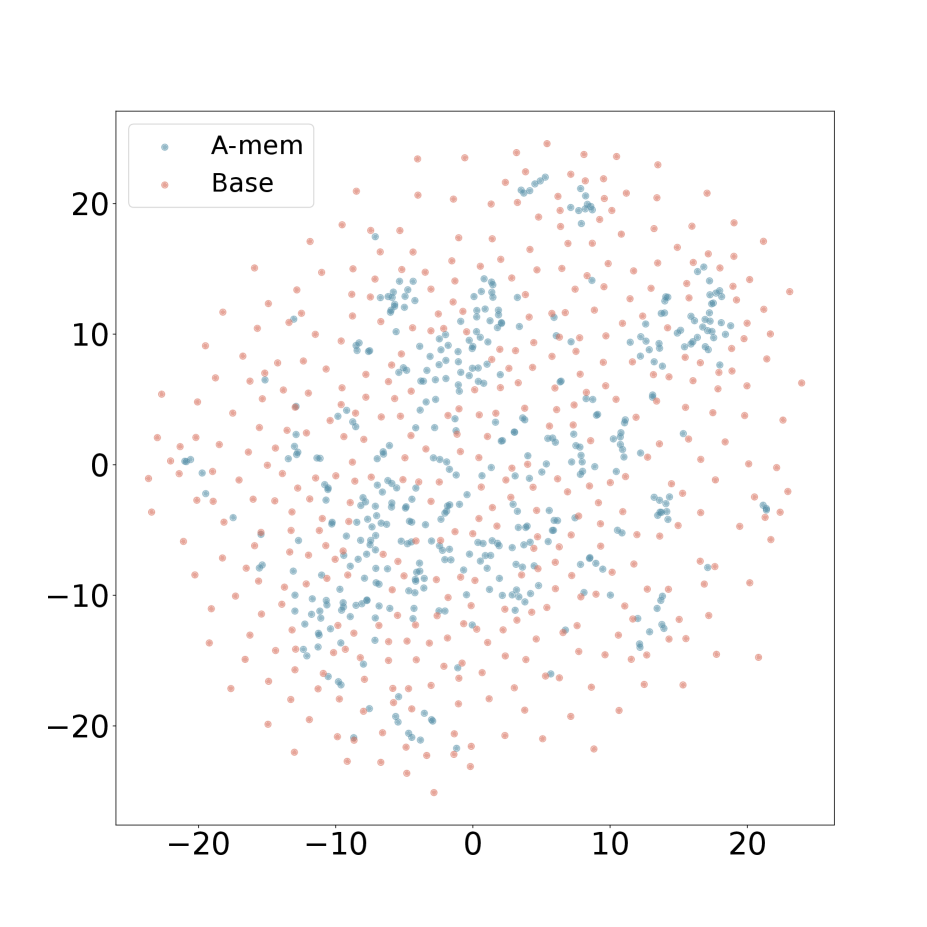
## Scatter Plot: A-mem vs. Base
### Overview
The image is a scatter plot comparing two datasets, "A-mem" and "Base". The plot displays the distribution of data points for each dataset across a two-dimensional space, with no explicit x or y axis labels. The "A-mem" data points are represented in light blue, while the "Base" data points are in light red.
### Components/Axes
* **X-axis:** No explicit label, but ranges approximately from -25 to 25.
* **Y-axis:** No explicit label, but ranges approximately from -25 to 25.
* **Legend:** Located in the top-left corner.
* "A-mem": Light blue data points.
* "Base": Light red data points.
### Detailed Analysis
The scatter plot shows the distribution of "A-mem" and "Base" data points.
* **A-mem (Light Blue):** The light blue points are more concentrated in the central region of the plot, with a higher density around the origin (0,0). They are also present, but less dense, in the outer regions.
* **Base (Light Red):** The light red points are more evenly distributed across the entire plot area, including the outer regions. They appear to have a more uniform spread compared to the "A-mem" data.
Approximate data point ranges:
* **A-mem:**
* X-axis: Mostly between -15 and 15.
* Y-axis: Mostly between -15 and 15.
* **Base:**
* X-axis: Ranging from -25 to 25.
* Y-axis: Ranging from -25 to 25.
### Key Observations
* The "A-mem" data points are more clustered towards the center of the plot, indicating a higher concentration in that region.
* The "Base" data points are more dispersed, suggesting a broader distribution across the plot area.
* There is some overlap between the two datasets, particularly in the central region.
### Interpretation
The scatter plot suggests that the "A-mem" dataset exhibits a stronger central tendency compared to the "Base" dataset. This could indicate that "A-mem" data points are more similar to each other or that they are influenced by a common factor that pulls them towards the center. The "Base" dataset, on the other hand, appears to be more diverse or influenced by a wider range of factors, resulting in a more dispersed distribution. The lack of axis labels makes it difficult to interpret the specific meaning of the x and y dimensions, but the relative distributions of the two datasets provide valuable insights into their underlying characteristics.