\n
## Charts: Early Stopping Step & Loss vs. Step
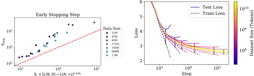
### Overview
The image contains two charts. The left chart shows the relationship between the early stopping step (S_stop) and a calculated value related to loss function (L) and dataset size (N, D). The right chart displays the training and test loss as a function of the training step, with a heatmap indicating dataset size.
### Components/Axes
**Left Chart:**
* **Title:** "Early Stopping Step"
* **X-axis:** S_c x (L(N, D) - L(N, ∞))^-1/α. Scale is logarithmic from approximately 10^2 to 10^5.
* **Y-axis:** S_stop. Scale is logarithmic from approximately 10^1 to 10^5.
* **Legend:** "Data Size" with the following categories and corresponding colors:
* 21M (Dark Blue)
* 43M (Blue)
* 86M (Medium Blue)
* 172M (Light Blue)
* 344M (Yellow)
* 688M (Orange)
* 1.4B (Green)
* **Trendline:** A dashed red line is fitted through the data points.
**Right Chart:**
* **Title:** None explicitly stated, but implied to be "Loss vs. Step"
* **X-axis:** Step. Scale is logarithmic from approximately 10^2 to 10^5.
* **Y-axis:** Loss. Scale is linear from approximately 2 to 6.
* **Legend:**
* Test Loss (Solid Purple)
* Train Loss (Dashed Purple)
* **Colorbar:** "Dataset Size (Tokens)" ranging from approximately 10^8 to 10^10, with a gradient from blue to red. The colorbar is positioned vertically on the right side of the chart.
### Detailed Analysis or Content Details
**Left Chart:**
The data points generally follow an upward trend, aligning with the dashed red trendline. As the value on the x-axis increases, the S_stop value also increases.
* 21M: Points cluster around (10^2, 10^2) to (10^3, 10^3).
* 43M: Points cluster around (10^3, 10^3) to (10^4, 10^4).
* 86M: Points cluster around (10^3, 10^3) to (10^4, 10^4).
* 172M: Points cluster around (10^4, 10^4) to (10^5, 10^5).
* 344M: Points cluster around (10^4, 10^4) to (10^5, 10^5).
* 688M: Points cluster around (10^4, 10^4) to (10^5, 10^5).
* 1.4B: Points cluster around (10^4, 10^4) to (10^5, 10^5).
**Right Chart:**
Both the train and test loss curves decrease as the step increases. The test loss is generally higher than the train loss. The color of each line corresponds to the dataset size, with blue representing smaller datasets and red representing larger datasets.
* **Smallest Dataset (Blue):** Loss starts around 5.5 and decreases to approximately 2.8.
* **Medium Dataset (Yellow/Orange):** Loss starts around 4.5 and decreases to approximately 2.5.
* **Largest Dataset (Red):** Loss starts around 4.0 and decreases to approximately 2.3.
The lines representing larger datasets (redder colors) tend to have lower loss values at each step.
### Key Observations
* The early stopping step (S_stop) increases with the calculated value on the x-axis of the left chart, and appears to be correlated with dataset size.
* Larger datasets generally lead to lower loss values during training (right chart).
* The gap between train and test loss decreases as the training progresses.
* The rate of loss decrease slows down as the step increases, indicating diminishing returns from further training.
### Interpretation
The charts likely illustrate the impact of dataset size on the training process of a machine learning model. The left chart suggests that as the complexity of the loss function (related to dataset size) increases, the early stopping step also increases, meaning more training steps are required to reach an optimal stopping point. The right chart confirms that larger datasets generally result in better model performance (lower loss), but also shows that the benefits of increasing dataset size may diminish beyond a certain point. The color mapping on the right chart provides a visual representation of how dataset size influences the loss curves. The convergence of the train and test loss curves suggests that the model is generalizing well to unseen data, but the persistent gap indicates some degree of overfitting. The diminishing rate of loss decrease suggests that further training may not yield significant improvements in performance.