\n
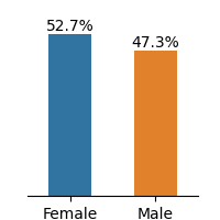
## Bar Chart: Gender Distribution
### Overview
This image presents a bar chart illustrating the distribution of gender within a population or sample. The chart compares the percentage of females to the percentage of males.
### Components/Axes
* **X-axis:** Represents gender categories: "Female" and "Male".
* **Y-axis:** Represents percentage, with values ranging from approximately 0% to 60%. The scale is not explicitly labeled, but can be inferred.
* **Bars:** Two vertical bars, one blue representing "Female" and one orange representing "Male".
* **Data Labels:** Percentage values are displayed above each bar.
### Detailed Analysis
* **Female:** The blue bar representing females has a height corresponding to 52.7%.
* **Male:** The orange bar representing males has a height corresponding to 47.3%.
* The bars are positioned side-by-side, allowing for direct comparison of the percentages.
### Key Observations
* The percentage of females (52.7%) is slightly higher than the percentage of males (47.3%).
* The difference between the two percentages is approximately 5.4% (52.7 - 47.3 = 5.4).
### Interpretation
The data suggests a slight female bias in the represented population or sample. The difference of 5.4% indicates that females are marginally more represented than males. This could be due to various factors depending on the context of the data collection. Without further information, it is difficult to determine the significance of this difference. The chart provides a clear and concise visual representation of the gender distribution, making it easy to compare the proportions of each gender.