## Line Charts: Training Metrics Comparison Across Runs and Recurrence Depths
### Overview
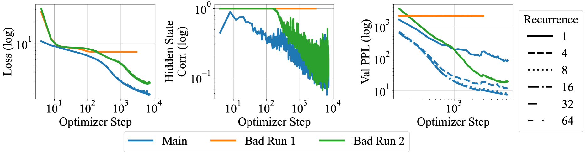
The image displays three horizontally aligned line charts comparing the training progress of three different runs ("Main", "Bad Run 1", "Bad Run 2") across three different metrics. All charts use logarithmic scales for both axes. A secondary legend on the right indicates that line styles correspond to different "Recurrence" depths (1, 4, 8, 16, 32, 64), which are applied within the runs shown in the third chart.
### Components/Axes
**Common Elements:**
* **X-Axis (All Charts):** "Optimizer Step" on a logarithmic scale. Major ticks are at 10¹, 10², 10³, and 10⁴.
* **Bottom Legend:** Centered below the charts. Defines three color-coded series:
* Blue solid line: "Main"
* Orange solid line: "Bad Run 1"
* Green solid line: "Bad Run 2"
* **Right Legend:** Positioned to the right of the third chart. Defines line styles for "Recurrence":
* Solid line: 1
* Dashed line: 4
* Dotted line: 8
* Dash-dot line: 16
* Long dash line: 32
* Dash-dot-dot line: 64
**Chart 1 (Left):**
* **Y-Axis:** "Loss (log)" on a logarithmic scale. Major ticks at 10¹ and 10⁰ (implied, not labeled).
**Chart 2 (Middle):**
* **Y-Axis:** "Hidden State Corr. (log)" on a logarithmic scale. Major ticks at 10⁰ and 10⁻¹.
**Chart 3 (Right):**
* **Y-Axis:** "Val PPL (log)" on a logarithmic scale. Major ticks at 10³, 10², and 10¹.
### Detailed Analysis
**Chart 1: Loss vs. Optimizer Step**
* **Main (Blue):** Starts at ~10¹. Shows a steady, near-linear decrease on the log-log plot, ending at approximately 2-3 by step 10⁴.
* **Bad Run 1 (Orange):** Starts higher than Main (~20-30). Drops sharply until ~10² steps, then plateaus at a value slightly below 10¹ (estimated ~7-8).
* **Bad Run 2 (Green):** Starts the highest (~50-60). Drops very sharply until ~10¹ steps, then continues a steady decline, remaining above the Main run. Ends at approximately 4-5 by step 10⁴.
**Chart 2: Hidden State Correlation vs. Optimizer Step**
* **Main (Blue):** Starts high (~0.8-0.9). Shows a general downward trend with significant high-frequency noise/fluctuation. Ends in the range of 0.05-0.1.
* **Bad Run 1 (Orange):** Appears as a flat line at the top of the chart (10⁰ = 1.0), indicating constant, perfect correlation throughout training.
* **Bad Run 2 (Green):** Starts at 1.0. Begins a steep decline around step 10², then exhibits extreme volatility/noise, oscillating roughly between 0.05 and 0.3 after step 10³.
**Chart 3: Validation Perplexity (Val PPL) vs. Optimizer Step**
* This chart overlays multiple line styles (Recurrence depths) for each of the three color-coded runs.
* **General Trend:** For all runs (Main, Bad 1, Bad 2), higher recurrence depth (e.g., 64, dash-dot-dot) generally leads to lower final validation perplexity compared to lower depth (e.g., 1, solid line).
* **Main (Blue) Series:** Shows the best performance. The solid line (Recurrence=1) ends near 10². The dashed (4) and dotted (8) lines end between 10¹ and 10². The dash-dot (16), long dash (32), and dash-dot-dot (64) lines cluster tightly at the bottom, ending very close to 10¹.
* **Bad Run 1 (Orange) Series:** All lines are flat at the top of the chart (~2000-3000), indicating no improvement in validation perplexity regardless of recurrence depth.
* **Bad Run 2 (Green) Series:** Shows intermediate performance. The solid line (Recurrence=1) ends near 200. Lines for higher recurrence depths show improvement, with the dash-dot-dot (64) line ending the lowest, around 20-30.
### Key Observations
1. **Performance Hierarchy:** The "Main" run consistently outperforms both "Bad Runs" across loss and validation perplexity. "Bad Run 2" shows some learning but is unstable, while "Bad Run 1" appears completely stalled after an initial drop.
2. **Correlation Anomaly:** "Bad Run 1" maintains a hidden state correlation of 1.0 throughout, which is highly unusual and likely indicates a failure mode (e.g., collapsed representations). "Bad Run 2" shows extreme volatility in this metric.
3. **Recurrence Benefit:** Increasing recurrence depth provides a clear and significant benefit to final validation perplexity, especially in the "Main" run where depths 16, 32, and 64 converge to a similar, low value.
4. **Stability:** The "Main" run exhibits the smoothest and most stable training curves. "Bad Run 2" is characterized by high noise and volatility, particularly in the hidden state correlation.
### Interpretation
This data suggests a comparative analysis of neural network training runs, likely for a recurrent or sequence model. The "Main" run represents a successful training trajectory, where both loss and validation perplexity decrease steadily, and hidden state correlation decays in a controlled manner—indicating the model is learning useful, non-redundant representations.
The "Bad Runs" illustrate two distinct failure modes:
* **Bad Run 1 (Orange):** Exhibits "feature collapse" or "representation death." The perfect, unchanging hidden state correlation (1.0) implies the model's internal states are not differentiating or learning meaningful temporal dependencies. Consequently, validation perplexity does not improve.
* **Bad Run 2 (Green):** Shows unstable training. While loss decreases, the extreme volatility in hidden state correlation suggests the model is struggling to find a stable solution, possibly due to issues like exploding/vanishing gradients or poor hyperparameter choices. Its validation performance is mediocre.
The third chart demonstrates a key architectural insight: **increasing recurrence depth (the number of recurrent steps or layers) is a powerful lever for improving model performance (lower validation perplexity)**, but its effectiveness depends on a stable training run (as seen in "Main"). In a failed run ("Bad Run 1"), changing recurrence depth has no effect. This highlights that architectural improvements must be coupled with stable training dynamics to be beneficial.