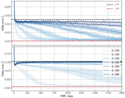
## Chart: Gibbs Error vs. HMC Steps for Varying Dimensions
### Overview
The image presents two line charts, one above the other, displaying the Gibbs error/2 as a function of HMC (Hamiltonian Monte Carlo) steps. The charts illustrate how the error changes with increasing HMC steps for different dimensions (d). The top chart shows the error for lower dimensions, while the bottom chart shows the error for higher dimensions. Both charts include horizontal dashed lines representing epsilon_bnn and epsilon_opt.
### Components/Axes
* **Y-axis (Left):** Gibbs error/2. The top chart ranges from approximately 0.015 to 0.027. The bottom chart ranges from approximately 0.025 to 0.125.
* **X-axis (Bottom):** HMC steps, ranging from 0 to 2000.
* **Horizontal Dashed Lines:**
* Black dashed line: epsilon_bnn (approximately 0.023 in the top chart and 0.10 in the bottom chart).
* Red dashed line: epsilon_opt (approximately 0.015 in the top chart and 0.028 in the bottom chart).
* **Legend (Right, between the two charts):**
* d=100 (lightest blue)
* d=150 (lighter blue)
* d=200 (mid-light blue)
* d=250 (mid-dark blue)
* d=300 (dark blue)
* d=350 (darker blue)
* d=400 (darkest blue)
### Detailed Analysis
**Top Chart (Lower Dimensions):**
* **d=100 (lightest blue):** Starts at approximately 0.024 and decreases rapidly, then slowly converges towards 0.018.
* **d=150 (lighter blue):** Starts at approximately 0.024 and decreases, converging towards 0.020.
* **d=200 (mid-light blue):** Starts at approximately 0.024 and decreases slightly, converging towards 0.021.
* **d=250 (mid-dark blue):** Starts at approximately 0.024 and remains relatively stable, fluctuating around 0.022.
* **d=300 (dark blue):** Starts at approximately 0.024 and remains relatively stable, fluctuating around 0.022.
* **d=350 (darker blue):** Starts at approximately 0.024 and remains relatively stable, fluctuating around 0.022.
* **d=400 (darkest blue):** Starts at approximately 0.024 and remains relatively stable, fluctuating around 0.022.
**Bottom Chart (Higher Dimensions):**
* **d=100 (lightest blue):** Starts at approximately 0.125 and decreases rapidly, then slowly converges towards 0.05.
* **d=150 (lighter blue):** Starts at approximately 0.125 and decreases rapidly, then slowly converges towards 0.075.
* **d=200 (mid-light blue):** Starts at approximately 0.125 and decreases rapidly, then slowly converges towards 0.0875.
* **d=250 (mid-dark blue):** Starts at approximately 0.125 and decreases rapidly, then slowly converges towards 0.09375.
* **d=300 (dark blue):** Starts at approximately 0.125 and decreases rapidly, then slowly converges towards 0.096875.
* **d=350 (darker blue):** Starts at approximately 0.125 and decreases rapidly, then slowly converges towards 0.0984375.
* **d=400 (darkest blue):** Starts at approximately 0.125 and decreases rapidly, then slowly converges towards 0.10.
### Key Observations
* For lower dimensions (top chart), the Gibbs error/2 converges to lower values compared to higher dimensions (bottom chart).
* As the dimension (d) increases, the initial Gibbs error/2 in the bottom chart is higher, and the convergence is slower.
* The black dashed line (epsilon_bnn) represents a threshold, and the error for higher dimensions in the bottom chart tends to stay close to or above this threshold.
* The red dashed line (epsilon_opt) represents an optimal error level, which the error curves approach but do not consistently reach, especially for higher dimensions.
### Interpretation
The charts illustrate the relationship between the Gibbs error, HMC steps, and dimensionality. The data suggests that as the dimensionality increases, the Gibbs error tends to be higher and the convergence to a lower error value requires more HMC steps. The epsilon_bnn and epsilon_opt lines provide benchmarks for evaluating the performance of the HMC algorithm under different dimensionalities. The fact that the error for higher dimensions remains close to or above epsilon_bnn suggests that achieving optimal performance becomes more challenging as the dimensionality increases. The shaded regions around the lines likely represent the variance or uncertainty in the Gibbs error estimates.