TECHNICAL ASSET FINGERPRINT
16b75f2de83ac58d86595045
Click to view fullscreen
Press ESC or click to close
FOUND IN PAPERS
EXPERT: healer-alpha-free VERSION 1
RUNTIME: free/openrouter/healer-alpha
INTEL_VERIFIED
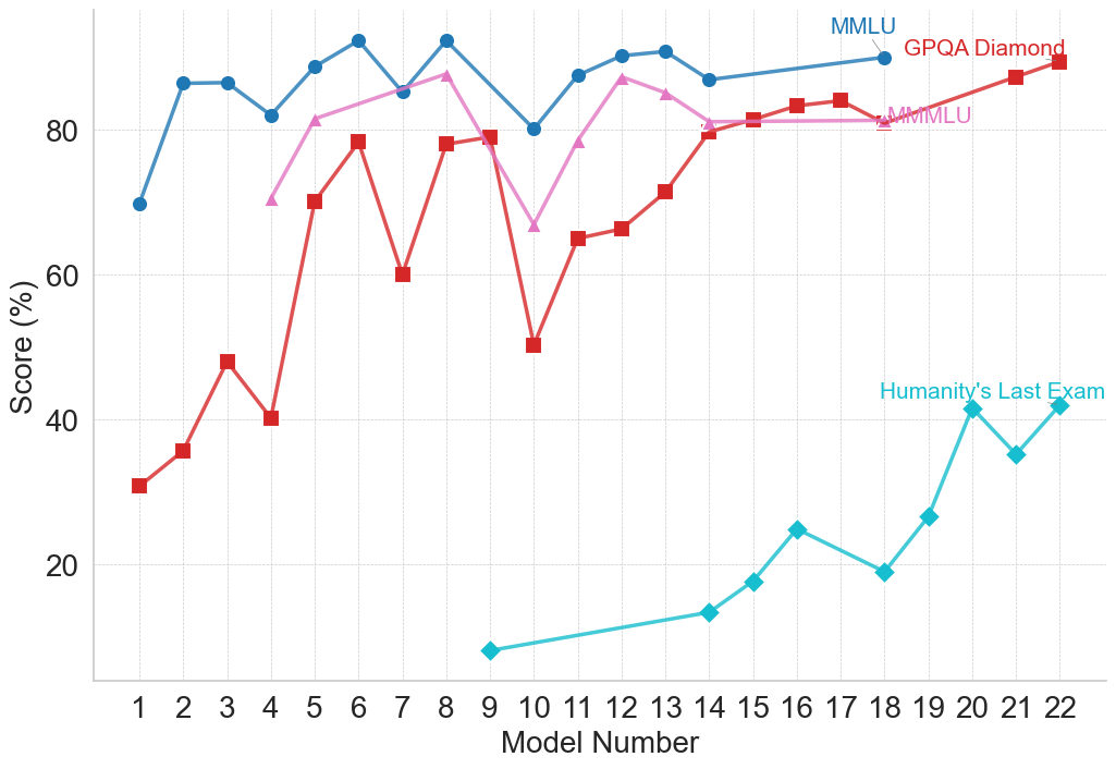
## Line Chart: Model Performance Across Multiple Benchmarks
### Overview
The image is a line chart comparing the performance scores (in percentage) of 22 different AI models across four distinct evaluation benchmarks. The chart tracks how scores change as the model number increases from 1 to 22, suggesting a progression, likely from older to newer or less to more capable models.
### Components/Axes
* **X-Axis:** Labeled "Model Number". It is a categorical axis with discrete integer markers from 1 to 22.
* **Y-Axis:** Labeled "Score (%)". It is a linear scale ranging from 0 to approximately 95, with major gridlines at intervals of 20 (0, 20, 40, 60, 80).
* **Legend:** Located in the top-right corner of the chart area. It identifies four data series:
1. **MMLU** (Blue line, circle markers)
2. **GPQA Diamond** (Red line, square markers)
3. **MMLU** (Pink line, triangle markers) - *Note: A second series with the same name as the first, but a different color and marker.*
4. **Humanity's Last Exam** (Cyan/Teal line, diamond markers)
### Detailed Analysis
**Data Series and Trends:**
1. **MMLU (Blue, Circles):**
* **Trend:** Starts high, exhibits moderate fluctuation, and maintains a generally high score throughout.
* **Data Points (Approximate):**
* Model 1: ~70%
* Model 2: ~86%
* Model 3: ~86%
* Model 4: ~82%
* Model 5: ~89%
* Model 6: ~92% (Peak)
* Model 7: ~85%
* Model 8: ~92%
* Model 9: ~80%
* Model 10: ~87%
* Model 11: ~90%
* Model 12: ~91%
* Model 13: ~87%
* Model 14: ~89%
* Model 15: ~90%
* Model 16: ~90%
* Model 17: ~90%
* Model 18: ~90%
* Model 19: ~90%
* Model 20: ~90%
* Model 21: ~90%
* Model 22: ~90%
2. **GPQA Diamond (Red, Squares):**
* **Trend:** Shows significant volatility with sharp peaks and troughs in the first half, followed by a more stable, upward trend in the second half.
* **Data Points (Approximate):**
* Model 1: ~31%
* Model 2: ~36%
* Model 3: ~48%
* Model 4: ~40%
* Model 5: ~70%
* Model 6: ~78%
* Model 7: ~60%
* Model 8: ~78%
* Model 9: ~79%
* Model 10: ~50% (Major trough)
* Model 11: ~65%
* Model 12: ~66%
* Model 13: ~71%
* Model 14: ~80%
* Model 15: ~81%
* Model 16: ~83%
* Model 17: ~84%
* Model 18: ~81%
* Model 19: ~84%
* Model 20: ~87%
* Model 21: ~89%
* Model 22: ~90% (Peak)
3. **MMLU (Pink, Triangles):**
* **Trend:** Begins at a moderate level, rises to a peak, dips sharply, then recovers and stabilizes at a high level.
* **Data Points (Approximate):**
* Model 4: ~70% (First point)
* Model 5: ~81%
* Model 6: ~84%
* Model 7: ~87%
* Model 8: ~87%
* Model 9: ~67% (Sharp dip)
* Model 10: ~78%
* Model 11: ~87%
* Model 12: ~85%
* Model 13: ~81%
* Model 14: ~81%
* Model 15: ~81%
* Model 16: ~81%
* Model 17: ~81%
* Model 18: ~81%
* Model 19: ~81%
* Model 20: ~81%
* Model 21: ~81%
* Model 22: ~81%
4. **Humanity's Last Exam (Cyan, Diamonds):**
* **Trend:** Starts very low and shows a consistent, strong upward trend from its first appearance.
* **Data Points (Approximate):**
* Model 9: ~7% (First point)
* Model 14: ~13%
* Model 15: ~17%
* Model 16: ~25%
* Model 17: ~19%
* Model 18: ~27%
* Model 19: ~41%
* Model 20: ~35%
* Model 21: ~42%
* Model 22: ~42%
### Key Observations
* **Benchmark Difficulty:** "Humanity's Last Exam" appears to be the most challenging benchmark, with scores starting near zero and only reaching the 40s by Model 22. In contrast, the two "MMLU" benchmarks and "GPQA Diamond" have scores clustering in the 80-90% range for later models.
* **Performance Convergence:** For Models 14-22, the scores for MMLU (Blue), GPQA Diamond (Red), and MMLU (Pink) converge into a narrow band between ~80% and ~90%, suggesting these models perform similarly on these specific tasks.
* **Volatility vs. Stability:** The earlier models (1-13) show much greater variance in scores across benchmarks, particularly for GPQA Diamond and the pink MMLU line. Later models (14+) show more stable and consistently high performance on three of the four benchmarks.
* **Anomaly:** The sharp dip in the pink MMLU line at Model 9 (~67%) and the deep trough in the red GPQA Diamond line at Model 10 (~50%) are notable outliers in their respective series.
### Interpretation
This chart likely illustrates the progression of AI model capabilities over time or across different development iterations (represented by "Model Number"). The data suggests several key insights:
1. **Specialized vs. General Improvement:** The dramatic, steady rise of "Humanity's Last Exam" scores indicates targeted improvement on what is presumably a very difficult, possibly novel, evaluation. Meanwhile, performance on more established benchmarks (MMLU, GPQA) plateaus at a high level, suggesting these tasks may be approaching a performance ceiling for the current model architecture or training paradigm.
2. **The "Last Exam" Challenge:** The name and low scores for "Humanity's Last Exam" imply it is designed to be a frontier test, measuring capabilities that remain challenging even for advanced models. Its upward trend is the most significant indicator of ongoing progress in AI capabilities.
3. **Model Development Phases:** The high volatility in early models could represent a phase of experimentation and architectural exploration. The convergence and stability in later models might indicate a maturing technology where incremental refinements lead to consistent, high performance across a suite of standard tests, while progress is now measured on more difficult, specialized benchmarks.
4. **Duplicate Benchmark Label:** The presence of two "MMLU" series (blue and pink) is ambiguous. It could represent two different versions of the test, evaluations on different subsets of data, or a simple labeling error. Their divergent paths (blue starts earlier and is more stable; pink starts later, dips, then plateaus) suggest they are not measuring identical things.
In essence, the chart tells a story of AI development moving from a phase of inconsistent performance to one of reliable, high competence on standard tasks, with the frontier of progress now being pushed on exceptionally difficult new evaluations.
DECODING INTELLIGENCE...