\n
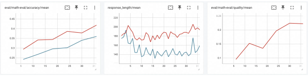
## Line Charts: Model Evaluation Metrics Over Training Steps
### Overview
The image displays three horizontally aligned line charts, each tracking a different metric over what appears to be training steps or epochs (x-axis, labeled 5 to 35). The charts share a common visual style with a white background, light gray grid lines, and two data series (red and blue lines) in the first two charts, and a single red line in the third. The charts are likely from a machine learning experiment dashboard, showing the progression of model performance.
### Components/Axes
**Common Elements:**
* **X-Axis:** All three charts have an x-axis with numerical markers at intervals of 5, ranging from 5 to 35. The axis is not explicitly labeled with a title (e.g., "Epoch" or "Step").
* **Chart Titles:** Each chart has a title at the top center.
* **Grid:** A light gray grid is present in the plot area of each chart.
* **Toolbar Icons:** Each chart has a small toolbar in the top-right corner with icons for view options (e.g., fullscreen, download).
**Chart 1 (Left):**
* **Title:** `eval/math-eval/accuracy/mean`
* **Y-Axis:** Labeled from 0.25 to 0.45 in increments of 0.05. Represents mean accuracy.
* **Data Series:** Two lines.
* **Red Line:** Positioned above the blue line throughout.
* **Blue Line:** Positioned below the red line throughout.
**Chart 2 (Center):**
* **Title:** `response_length/mean`
* **Y-Axis:** Labeled from 140 to 220 in increments of 20. Represents mean response length (likely in tokens).
* **Data Series:** Two lines.
* **Red Line:** Positioned above the blue line throughout.
* **Blue Line:** Positioned below the red line throughout.
**Chart 3 (Right):**
* **Title:** `eval/math-eval/quality/mean`
* **Y-Axis:** Labeled from 0.1 to 0.25 in increments of 0.05. Represents mean quality score.
* **Data Series:** One line.
* **Red Line:** The only data series in this chart.
### Detailed Analysis
**Chart 1: eval/math-eval/accuracy/mean**
* **Trend Verification:** Both lines show a clear, consistent upward trend from left to right, indicating improving accuracy over the measured steps.
* **Data Points (Approximate):**
* **Red Line:** Starts at ~0.30 (x=5). Rises steadily to ~0.35 (x=15), then to ~0.38 (x=25), and ends at its peak of ~0.42 (x=35).
* **Blue Line:** Starts at ~0.25 (x=5). Rises to ~0.28 (x=15), ~0.31 (x=25), and ends at ~0.35 (x=35).
* **Relationship:** The red line maintains a consistent lead of approximately 0.05-0.07 accuracy points over the blue line across the entire range.
**Chart 2: response_length/mean**
* **Trend Verification:** Both lines are highly volatile with no clear long-term upward or downward trend. They fluctuate within a defined band. The red line is consistently higher than the blue line.
* **Data Points (Approximate):**
* **Red Line:** Fluctuates primarily between 180 and 220. Notable peaks near 220 at x≈5 and x≈33. Notable troughs near 180 at x≈10 and x≈20.
* **Blue Line:** Fluctuates primarily between 140 and 180. Shows similar volatile patterns to the red line but at a lower magnitude. Has a sharp dip to ~140 at x≈32.
* **Relationship:** The two lines appear to be correlated in their short-term fluctuations (rising and falling together), but the red line maintains a significant offset, averaging about 40-50 units higher in response length.
**Chart 3: eval/math-eval/quality/mean**
* **Trend Verification:** The single red line shows a strong upward trend, with a notable temporary decline in the middle.
* **Data Points (Approximate):**
* Starts at ~0.10 (x=5).
* Rises to a local peak of ~0.15 (x=15).
* Dips to a local trough of ~0.13 (x=20).
* Rises sharply thereafter, reaching ~0.23 by x=30 and plateauing near ~0.23 at x=35.
### Key Observations
1. **Performance Improvement:** Both evaluation metrics (accuracy and quality) show clear improvement over the training steps, suggesting the model is learning effectively on the math evaluation task.
2. **Consistent Model Comparison:** In the first two charts, the red series consistently outperforms (higher accuracy) and differs in behavior (longer responses) from the blue series. This likely represents two different models, model variants, or training configurations (e.g., "Model A" vs. "Model B", or "With Feature X" vs. "Without").
3. **Response Length Volatility:** The mean response length is highly variable for both series and does not correlate directly with the steady improvement in accuracy/quality. The dip in the blue line's length at x≈32 is an outlier.
4. **Quality Metric Dip:** The temporary decline in the quality score around step 20 is an anomaly amidst an otherwise strong upward trend. This could indicate a period of instability or a temporary setback in training.
### Interpretation
The data suggests a successful training run where the primary model (red line) is improving its mathematical reasoning capabilities, as evidenced by rising accuracy and quality scores. The comparison model (blue line) also improves but lags behind.
The lack of correlation between the volatile response length and the steadily improving quality/accuracy is insightful. It indicates that **longer responses are not inherently better** for this task; the model is learning to produce more accurate and higher-quality answers, not just longer ones. The quality metric's dip around step 20, while accuracy continued to rise, might suggest the model temporarily sacrificed answer quality (e.g., coherence, correctness of steps) for raw correctness, or encountered a difficult batch of evaluation data.
The charts collectively tell a story of model progression, comparative performance, and the nuanced relationship between different evaluation metrics. To fully interpret the results, one would need the legend labels (e.g., what "red" and "blue" represent) and the definition of the x-axis (e.g., "Training Steps" or "Epochs").