\n
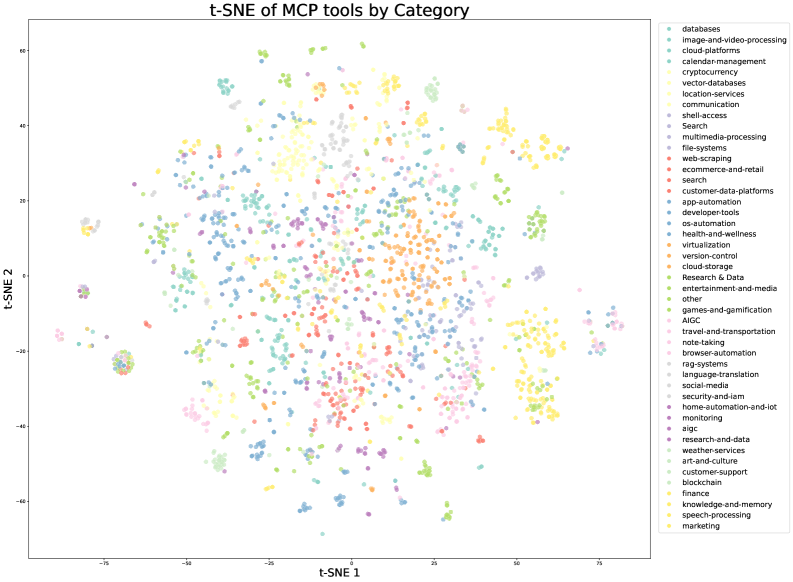
## Scatter Plot: t-SNE of MCP tools by Category
### Overview
This image presents a two-dimensional t-distributed Stochastic Neighbor Embedding (t-SNE) scatter plot visualizing the distribution of Machine Centric Productivity (MCP) tools across various categories. Each point on the plot represents a tool, and its position is determined by the t-SNE algorithm, aiming to preserve the relative similarity between tools based on their category. The plot is labeled with axes "t-SNE 1" and "t-SNE 2", and a legend on the right side identifies the color-coded categories.
### Components/Axes
* **X-axis:** t-SNE 1, ranging approximately from -15 to 75.
* **Y-axis:** t-SNE 2, ranging approximately from -60 to 65.
* **Legend:** Located in the top-right corner, listing the following categories with corresponding colors:
* databases (light blue)
* image-and-video-processing (light green)
* cloud-platforms (yellow)
* calendar-management (pale orange)
* cryptocurrency (dark orange)
* vector-databases (dark yellow)
* location-services (light purple)
* communication (pink)
* shell-access (red)
* Search (dark red)
* multimedia-processing (brown)
* file-utilities (dark brown)
* web-scraping (grey)
* ecommerce-and-retail (light grey)
* search (dark grey)
* customer-data-platforms (teal)
* app-automation (dark teal)
* developer-tools (blue)
* os-automation (dark blue)
* health-and-wellness (purple)
* virtualization (dark purple)
* version-control (olive)
* cloud-storage (dark olive)
* Research & Data (light brown)
* entertainment-and-media (beige)
* other (light beige)
* games-and-gamification (peach)
* AIGC (light peach)
* travel-and-transportation (lavender)
* note-taking (dark lavender)
* browser-automation (cyan)
* rag-systems (dark cyan)
* language-translation (sea green)
* social-media (dark sea green)
* security-and-iam (magenta)
* home-automation-and-iot (dark magenta)
* monitoring (lime)
* aiqc (dark lime)
* research-and-data (coral)
* weather-services (dark coral)
* art-and-culture (gold)
* customer-support (dark gold)
* blockchain (silver)
* finance (dark silver)
* knowledge-and-memory (bronze)
* speech-processing (dark bronze)
* marketing (rose gold)
### Detailed Analysis
The plot shows a complex distribution of points, with several clusters and overlapping regions. It's difficult to provide precise numerical values for each point without access to the underlying data. However, we can describe the general trends and approximate positions of the clusters:
* **Databases (light blue):** Concentrated in the lower-left quadrant, around t-SNE 1 = -10 and t-SNE 2 = -40.
* **Image-and-video-processing (light green):** Forms a cluster in the upper-left quadrant, around t-SNE 1 = -20 and t-SNE 2 = 50.
* **Cloud-platforms (yellow):** Located in the upper-right quadrant, around t-SNE 1 = 30 and t-SNE 2 = 40.
* **Cryptocurrency (dark orange):** A small cluster in the lower-right quadrant, around t-SNE 1 = 60 and t-SNE 2 = -50.
* **Communication (pink):** A dense cluster in the center-left, around t-SNE 1 = -10 and t-SNE 2 = 20.
* **Shell-access (red):** Overlaps with Communication, but slightly more dispersed.
* **Search (dark red):** Located in the center, around t-SNE 1 = 0 and t-SNE 2 = 0.
* **Developer-tools (blue):** Forms a cluster in the lower-center, around t-SNE 1 = -20 and t-SNE 2 = -20.
* **Health-and-wellness (purple):** Located in the lower-right quadrant, around t-SNE 1 = 40 and t-SNE 2 = -40.
* **AIGC (light peach):** Located in the lower-center, around t-SNE 1 = 0 and t-SNE 2 = -30.
* **Marketing (rose gold):** Located in the bottom-right quadrant, around t-SNE 1 = 70 and t-SNE 2 = -60.
Many other categories are scattered throughout the plot, with varying degrees of clustering. There is significant overlap between several categories, indicating that some tools may fall into multiple categories or have features that are common across categories.
### Key Observations
* The plot demonstrates a clear separation between some categories (e.g., Databases and Cloud-platforms), while others are more closely intertwined (e.g., Communication and Shell-access).
* The density of points varies across the plot, with some regions being more crowded than others. This suggests that some categories have a larger number of tools than others.
* The t-SNE algorithm has effectively captured the relationships between tools, grouping similar tools together and separating dissimilar ones.
* The "Research & Data" category appears to be spread out, suggesting a diverse range of tools within that category.
### Interpretation
The t-SNE plot provides a visual representation of the landscape of MCP tools. The clustering of categories suggests that there are distinct areas of functionality and specialization within the MCP ecosystem. The overlap between categories highlights the interconnectedness of these tools and the potential for cross-functional capabilities.
The plot can be used to identify potential gaps in the market, areas where there is a high concentration of tools, and opportunities for innovation. For example, the relatively sparse region in the upper-right quadrant might indicate a need for more tools in the Cloud-platforms and related categories.
The t-SNE algorithm is a dimensionality reduction technique, and the resulting plot should be interpreted with caution. The positions of the points are not absolute, but rather reflect the relative similarity between tools based on their category. However, the plot provides a valuable overview of the MCP tool landscape and can be used to guide further research and analysis.