## Cumulative Distribution Chart: First Thoughts vs. Second Thoughts
### Overview
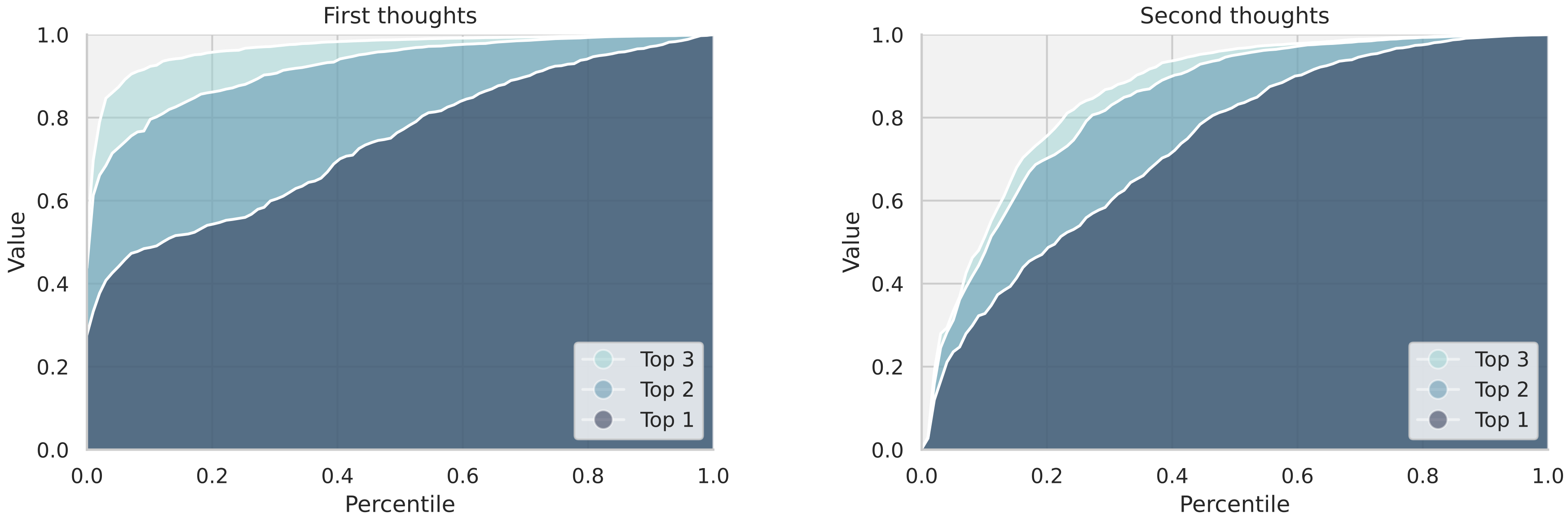
The image presents two cumulative distribution charts, titled "First thoughts" and "Second thoughts," comparing the distribution of values for "Top 1," "Top 2," and "Top 3" categories. The charts display the percentile on the x-axis and the value on the y-axis, showing how the cumulative distribution changes between the first and second thoughts.
### Components/Axes
**Chart Titles:**
* Left Chart: "First thoughts"
* Right Chart: "Second thoughts"
**Axes:**
* X-axis (both charts): "Percentile," ranging from 0.0 to 1.0 in increments of 0.2.
* Y-axis (both charts): "Value," ranging from 0.0 to 1.0 in increments of 0.2.
**Legend (both charts, located in the bottom-right):**
* Top 3: Light cyan color
* Top 2: Medium cyan color
* Top 1: Dark cyan color
### Detailed Analysis
**Left Chart: First Thoughts**
* **Top 1 (Dark cyan):** The curve starts at approximately (0, 0.35) and rises steadily, reaching a value of 0.6 at a percentile of 0.2, and approaches 1.0 at a percentile of 1.0.
* **Top 2 (Medium cyan):** The curve starts at approximately (0, 0.45) and rises steadily, reaching a value of 0.8 at a percentile of 0.2, and approaches 1.0 at a percentile of 1.0.
* **Top 3 (Light cyan):** The curve starts at approximately (0, 0.5) and rises steadily, reaching a value of 0.9 at a percentile of 0.2, and approaches 1.0 at a percentile of 1.0.
**Right Chart: Second Thoughts**
* **Top 1 (Dark cyan):** The curve starts at approximately (0, 0.25) and rises steadily, reaching a value of 0.6 at a percentile of 0.2, and approaches 1.0 at a percentile of 1.0.
* **Top 2 (Medium cyan):** The curve starts at approximately (0, 0.35) and rises steadily, reaching a value of 0.75 at a percentile of 0.2, and approaches 1.0 at a percentile of 1.0.
* **Top 3 (Light cyan):** The curve starts at approximately (0, 0.4) and rises steadily, reaching a value of 0.85 at a percentile of 0.2, and approaches 1.0 at a percentile of 1.0.
### Key Observations
* In both charts, the "Top 3" category consistently has the highest values for any given percentile, followed by "Top 2" and then "Top 1."
* The "Second thoughts" chart shows a lower starting value for all three categories compared to the "First thoughts" chart.
* All curves approach a value of 1.0 as the percentile approaches 1.0.
### Interpretation
The charts illustrate the cumulative distribution of values for the top categories, showing how the distribution shifts from "First thoughts" to "Second thoughts." The lower starting values in the "Second thoughts" chart suggest that, overall, the values in each category are lower after reconsideration. The consistent ordering of "Top 3," "Top 2," and "Top 1" indicates a hierarchical structure where higher-ranked categories generally have higher values. The fact that all curves approach 1.0 suggests that, eventually, all values in each category are accounted for as the percentile increases.