## Bar Chart: R1-Qwen | GK23EN
### Overview
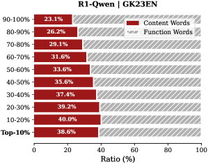
The image is a horizontal bar chart comparing the ratio of "Content Words" to "Function Words" across different percentile ranges (Top-10% to 90-100%). The chart shows how the proportion of content words changes as we move from the top percentiles to the lower percentiles.
### Components/Axes
* **Title:** R1-Qwen | GK23EN
* **Y-axis (Percentile Ranges):** Top-10%, 10-20%, 20-30%, 30-40%, 40-50%, 50-60%, 60-70%, 70-80%, 80-90%, 90-100%
* **X-axis (Ratio %):** 0 to 100%
* **Legend (Top-Right):**
* Content Words (Dark Red)
* Function Words (Light Gray with diagonal lines)
### Detailed Analysis
The chart displays the ratio of content words and function words for different percentile ranges. The content words are represented by dark red bars, and the function words are represented by light gray bars with diagonal lines.
* **Top-10%:** Content Words: 38.6%, Function Words: approximately 61.4%
* **10-20%:** Content Words: 40.0%, Function Words: approximately 60.0%
* **20-30%:** Content Words: 39.2%, Function Words: approximately 60.8%
* **30-40%:** Content Words: 37.4%, Function Words: approximately 62.6%
* **40-50%:** Content Words: 35.6%, Function Words: approximately 64.4%
* **50-60%:** Content Words: 33.6%, Function Words: approximately 66.4%
* **60-70%:** Content Words: 31.6%, Function Words: approximately 68.4%
* **70-80%:** Content Words: 29.1%, Function Words: approximately 70.9%
* **80-90%:** Content Words: 26.2%, Function Words: approximately 73.8%
* **90-100%:** Content Words: 23.1%, Function Words: approximately 76.9%
**Trend:** The proportion of content words generally decreases as the percentile range increases (from Top-10% to 90-100%). Conversely, the proportion of function words increases as the percentile range increases.
### Key Observations
* The highest proportion of content words is observed in the 10-20% range (40.0%).
* The lowest proportion of content words is observed in the 90-100% range (23.1%).
* There is a gradual decrease in the proportion of content words as we move from the top percentiles to the lower percentiles.
### Interpretation
The data suggests that in the top-performing segments (Top-10% to 10-20%), the ratio of content words is higher compared to function words. As we move towards lower-performing segments (90-100%), the ratio of function words increases, indicating a potential shift in the nature of the text or language used. This could imply that higher-performing segments use more substantive vocabulary, while lower-performing segments rely more on grammatical or structural words. The chart highlights a clear inverse relationship between the percentile range and the proportion of content words.