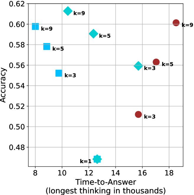
## Scatter Plot: Accuracy vs. Time-to-Answer
### Overview
The image is a scatter plot comparing "Accuracy" on the y-axis with "Time-to-Answer (longest thinking in thousands)" on the x-axis. The plot displays data points for different values of 'k' (1, 3, 5, and 9), with two distinct series represented by different colors and shapes: cyan (squares, diamonds, and octagons) and red (circles).
### Components/Axes
* **X-axis:** "Time-to-Answer (longest thinking in thousands)". The scale ranges from 8 to 18, with gridlines at each integer value.
* **Y-axis:** "Accuracy". The scale ranges from 0.48 to 0.62, with gridlines at intervals of 0.02.
* **Data Series:**
* Cyan: Represented by squares (k=3, k=9), diamonds (k=3, k=5, k=9), and an octagon (k=1).
* Red: Represented by circles (k=3, k=5, k=9).
* **Legend:** There is no explicit legend, but the 'k' values are labeled directly next to each data point.
### Detailed Analysis
**Cyan Data Series:**
* **k=1:** Located at approximately (12.5, 0.47). Shape: Octagon.
* **k=3:** Located at approximately (9.5, 0.55). Shape: Square.
* **k=3:** Located at approximately (15.5, 0.56). Shape: Diamond.
* **k=5:** Located at approximately (8.5, 0.58). Shape: Square.
* **k=5:** Located at approximately (13.5, 0.59). Shape: Diamond.
* **k=9:** Located at approximately (8, 0.60). Shape: Square.
* **k=9:** Located at approximately (11.5, 0.61). Shape: Diamond.
**Red Data Series:**
* **k=3:** Located at approximately (16, 0.51). Shape: Circle.
* **k=5:** Located at approximately (17.5, 0.56). Shape: Circle.
* **k=9:** Located at approximately (18, 0.60). Shape: Circle.
### Key Observations
* For the cyan data series, as 'k' increases, the accuracy tends to increase, but the time-to-answer also increases.
* For the red data series, as 'k' increases, both accuracy and time-to-answer increase.
* The cyan data points generally have lower time-to-answer values compared to the red data points for the same 'k' value (except for k=9 where they are very close).
* The lowest accuracy is observed for k=1 (cyan series).
### Interpretation
The scatter plot visualizes the relationship between accuracy and time-to-answer for different values of 'k'. The two distinct data series (cyan and red) likely represent different algorithms or configurations. The data suggests that increasing 'k' generally improves accuracy, but at the cost of increased time-to-answer. The cyan series appears to achieve higher accuracy with lower time-to-answer for lower values of 'k', but the red series catches up at k=9. The choice of 'k' and the algorithm (cyan vs. red) would depend on the specific requirements of the application, balancing the need for high accuracy with acceptable response times. The single point at k=1 for the cyan series is an outlier, showing the lowest accuracy and a relatively low time-to-answer.