\n
## Scatter Plot: Relationship between C and MA
### Overview
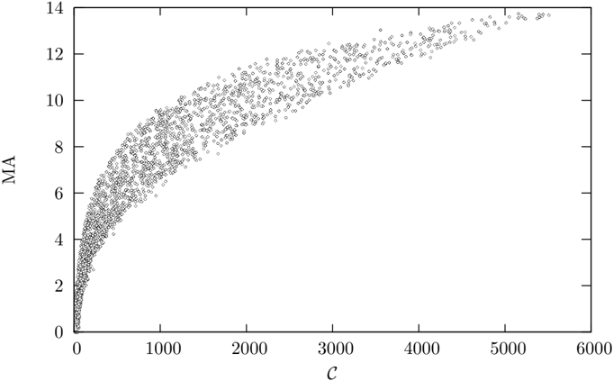
The image presents a scatter plot illustrating the relationship between two variables, labeled "C" on the x-axis and "MA" on the y-axis. The plot consists of a large number of data points distributed across the graph, showing a generally increasing trend with diminishing returns.
### Components/Axes
* **X-axis Label:** "C"
* Scale: 0 to 6000, with tick marks at intervals of approximately 1000.
* **Y-axis Label:** "MA"
* Scale: 0 to 14, with tick marks at intervals of approximately 2.
* **Data Points:** Numerous small, gray dots representing individual data observations.
* **No Legend:** There is no legend present in the image.
### Detailed Analysis
The scatter plot shows a positive correlation between "C" and "MA". As "C" increases, "MA" generally increases, but the rate of increase slows down as "C" gets larger.
* **Initial Trend (C = 0 to 1000):** The data points exhibit a steep upward slope. "MA" increases rapidly from approximately 0 to around 8 as "C" goes from 0 to 1000.
* **Mid-Range Trend (C = 1000 to 3000):** The slope begins to flatten. "MA" increases from approximately 8 to 11 as "C" goes from 1000 to 3000.
* **High-Range Trend (C = 3000 to 6000):** The slope becomes very shallow, approaching a horizontal asymptote. "MA" increases from approximately 11 to 13.5 as "C" goes from 3000 to 6000.
Approximate Data Points (sampled):
* C = 0, MA ≈ 0
* C = 500, MA ≈ 4
* C = 1000, MA ≈ 8
* C = 2000, MA ≈ 10
* C = 3000, MA ≈ 11.5
* C = 4000, MA ≈ 12.5
* C = 5000, MA ≈ 13
* C = 6000, MA ≈ 13.5
The data points are densely clustered, indicating a relatively large sample size. There is some scatter around the general trend, but no obvious outliers.
### Key Observations
* The relationship between "C" and "MA" is non-linear. It appears to follow a logarithmic or square root-like curve.
* The rate of increase in "MA" diminishes as "C" increases, suggesting a saturation effect.
* The data is relatively consistent, with no major gaps or anomalies.
### Interpretation
The scatter plot suggests that "MA" is a function of "C", but the relationship is not directly proportional. The diminishing returns observed as "C" increases could indicate that "C" has a decreasing marginal impact on "MA" beyond a certain point. This could represent a system where "C" is an input or resource, and "MA" is an output or performance metric. The saturation effect might be due to limitations in the system's capacity or other factors that constrain the relationship between "C" and "MA". Without knowing what "C" and "MA" represent, it's difficult to provide a more specific interpretation. However, the plot clearly demonstrates a positive, but diminishing, relationship between the two variables. The lack of a legend or further context limits the depth of analysis possible.