\n
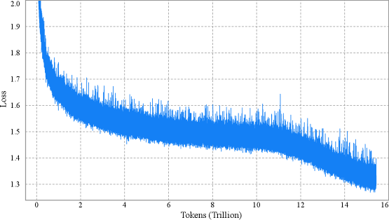
## Line Chart: Loss vs. Tokens (Trillion)
### Overview
The image presents a line chart illustrating the relationship between Loss and Tokens (measured in Trillions). The chart displays a single data series, showing how Loss changes as the number of Tokens processed increases. The chart appears to represent a training process, where Loss is expected to decrease as the model is exposed to more data.
### Components/Axes
* **X-axis:** Labeled "Tokens (Trillion)". The scale ranges from approximately 0 to 16 Trillion.
* **Y-axis:** Labeled "Loss". The scale ranges from approximately 1.3 to 2.0.
* **Data Series:** A single blue line representing the Loss value at each Token count.
* **Grid:** A light gray grid is present in the background to aid in reading values.
### Detailed Analysis
The blue line starts at approximately Loss = 1.95 when Tokens = 0. The line exhibits a steep downward slope initially, indicating a rapid decrease in Loss. This rapid decrease continues until approximately Tokens = 2 Trillion, where Loss reaches around 1.55.
From 2 to 8 Trillion Tokens, the line fluctuates around a relatively stable Loss value of approximately 1.5 to 1.6. There is significant noise in this region, with frequent small oscillations.
Between 8 and 12 Trillion Tokens, the line begins to exhibit a slight downward trend again, but the rate of decrease is much slower than the initial phase. The Loss value decreases from approximately 1.6 to 1.45.
From 12 to 16 Trillion Tokens, the line continues to decrease, reaching a final Loss value of approximately 1.35. The slope is gentle in this region.
Approximate data points:
* (0, 1.95)
* (2, 1.55)
* (4, 1.58)
* (6, 1.52)
* (8, 1.57)
* (10, 1.48)
* (12, 1.42)
* (14, 1.38)
* (16, 1.35)
### Key Observations
* **Initial Rapid Decrease:** The most significant change in Loss occurs in the first 2 Trillion Tokens.
* **Plateau:** A period of relative stability in Loss is observed between 2 and 8 Trillion Tokens.
* **Gradual Decline:** A slow and steady decrease in Loss is observed after 8 Trillion Tokens.
* **Noise:** The data is noisy, with frequent fluctuations in Loss, particularly between 2 and 8 Trillion Tokens.
### Interpretation
The chart likely represents the training process of a machine learning model. The initial rapid decrease in Loss indicates that the model is quickly learning from the data. The plateau suggests that the model has reached a point of diminishing returns, where further training provides only marginal improvements. The gradual decline after 8 Trillion Tokens suggests that the model is continuing to refine its parameters, but at a slower rate.
The noise in the data could be due to several factors, such as the stochastic nature of the training process, the variability of the data, or the presence of outliers. The overall trend suggests that the model is converging, but further training may be required to achieve optimal performance. The fact that the loss continues to decrease, even slowly, until 16 Trillion tokens suggests that the model is still benefiting from additional training data.