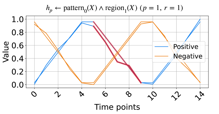
## Line Chart: Positive and Negative Values Over Time
### Overview
The image is a line chart comparing "Positive" and "Negative" values over 15 time points (0 to 14). The chart displays two primary data series, one in blue representing "Positive" values and the other in orange representing "Negative" values. There is also a thicker red line that seems to represent a modified version of the "Positive" values between time points 5 and 9. The chart includes a grid for easier value estimation. The title indicates this chart relates to a pattern and region, with parameters p=1 and r=1.
### Components/Axes
* **Title:** `h_p ← pattern_0(X) ∧ region_1(X) (p = 1, r = 1)`
* **X-axis:** "Time points", labeled from 0 to 14 in increments of 2.
* **Y-axis:** "Value", ranging from 0.0 to 1.0 in increments of 0.2.
* **Legend:** Located on the right side of the chart.
* Blue line: "Positive"
* Orange line: "Negative"
### Detailed Analysis
* **Positive (Blue) Line:**
* Starts at approximately 0.0 at time point 0.
* Increases to approximately 0.5 at time point 2.
* Increases to approximately 0.95 at time point 4.
* Remains at approximately 0.95 at time point 6.
* Decreases to approximately 0.0 at time point 10.
* Increases to approximately 0.95 at time point 14.
* **Negative (Orange) Line:**
* Starts at approximately 0.95 at time point 0.
* Decreases to approximately 0.5 at time point 2.
* Decreases to approximately 0.0 at time point 4.
* Remains at approximately 0.0 at time point 6.
* Increases to approximately 0.5 at time point 8.
* Increases to approximately 0.95 at time point 10.
* Decreases to approximately 0.0 at time point 14.
* **Modified Positive (Red) Line:**
* This line is only present between time points 5 and 9.
* It starts at approximately 0.95 at time point 5.
* Decreases to approximately 0.35 at time point 8.
* Decreases to approximately 0.0 at time point 9.
### Key Observations
* The "Positive" and "Negative" lines exhibit an inverse relationship, with one increasing as the other decreases.
* The "Positive" line has a modified version (red line) between time points 5 and 9, which deviates from the original "Positive" line.
* Both lines appear to oscillate between approximately 0.0 and 1.0.
### Interpretation
The chart likely represents a scenario where two opposing factors, "Positive" and "Negative", influence a system over time. The inverse relationship suggests that as one factor becomes more dominant, the other weakens. The modified "Positive" line could indicate an intervention or a change in the system that temporarily alters the "Positive" value. The formula in the title suggests that the data is related to pattern recognition and regional analysis, possibly within a machine learning or data analysis context. The parameters p=1 and r=1 might represent specific settings or conditions within the analysis.