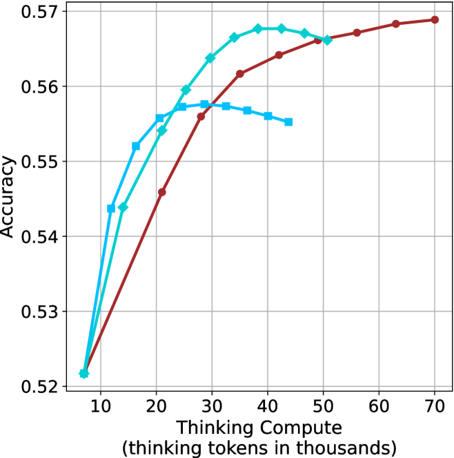
## Line Chart: Accuracy vs. Thinking Compute
### Overview
The image is a line chart comparing the accuracy of different models against the "Thinking Compute" (measured in thousands of thinking tokens). Three different models are represented by three lines: a light blue line with diamond markers, a dark red line with circle markers, and a medium blue line with square markers. The chart shows how accuracy changes as the thinking compute increases.
### Components/Axes
* **X-axis:** "Thinking Compute (thinking tokens in thousands)". The axis ranges from approximately 5 to 70, with tick marks at intervals of 10 (10, 20, 30, 40, 50, 60, 70).
* **Y-axis:** "Accuracy". The axis ranges from 0.52 to 0.57, with tick marks at intervals of 0.01 (0.52, 0.53, 0.54, 0.55, 0.56, 0.57).
* **Data Series:**
* Light Blue line with diamond markers.
* Dark Red line with circle markers.
* Medium Blue line with square markers.
* **Grid:** The chart has a grid for easier reading of values.
### Detailed Analysis
* **Light Blue (Diamond Markers):**
* Trend: Initially increases rapidly, peaks around x=40, then decreases slightly.
* Data Points:
* (8, 0.522)
* (15, 0.544)
* (20, 0.550)
* (30, 0.560)
* (40, 0.568)
* (50, 0.567)
* **Dark Red (Circle Markers):**
* Trend: Increases steadily, then plateaus.
* Data Points:
* (8, 0.522)
* (20, 0.547)
* (30, 0.557)
* (40, 0.564)
* (50, 0.566)
* (60, 0.568)
* (70, 0.569)
* **Medium Blue (Square Markers):**
* Trend: Increases, peaks around x=35, then decreases.
* Data Points:
* (8, 0.522)
* (15, 0.544)
* (20, 0.550)
* (30, 0.557)
* (40, 0.553)
* (50, 0.552)
### Key Observations
* All three models start with similar accuracy at low thinking compute values.
* The light blue model (diamond markers) achieves the highest accuracy initially, but its performance plateaus and then slightly decreases after a certain point.
* The dark red model (circle markers) shows a consistent increase in accuracy with increasing thinking compute, eventually surpassing the other models.
* The medium blue model (square markers) peaks and then declines.
### Interpretation
The chart suggests that increasing "Thinking Compute" generally improves model accuracy, but the optimal amount of compute varies depending on the model architecture. The light blue model benefits less from increased compute beyond a certain point, while the dark red model continues to improve even at higher compute levels. The medium blue model's performance degrades after a certain compute level, suggesting potential overfitting or other issues. The data indicates that there is a trade-off between compute cost and accuracy, and the best model choice depends on the specific application and resource constraints.