\n
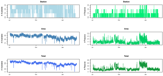
## Line Charts: Available vs. Passive Counts Over Time
### Overview
The image presents six line charts arranged in a 3x2 grid. Each chart displays a time series of counts, comparing "Available" and "Passive" values over a period from approximately July to January. The charts are grouped by category: "Station", "Area", and "Total". The left column shows "# Available" on the y-axis, while the right column shows "# Passive" on the y-axis.
### Components/Axes
* **X-axis:** Represents time, with labels indicating months from July to January. The scale is not explicitly marked, but appears to be roughly evenly spaced.
* **Y-axis (Left Column):** "# Available" - The scale ranges from approximately 0 to 30, with no explicit tick marks.
* **Y-axis (Right Column):** "# Passive" - The scale ranges from approximately 0 to 30, with no explicit tick marks.
* **Chart Titles:** Each chart has a title indicating the category ("Station", "Area", "Total").
* **Data Series:** Each chart contains two data series represented by line graphs: one for "Available" (blue) and one for "Passive" (green).
### Detailed Analysis or Content Details
**1. Station:**
* **# Available (Blue):** The line fluctuates rapidly and consistently between approximately 0 and 30. There is no clear upward or downward trend. The data appears highly volatile.
* **# Passive (Green):** The line fluctuates between approximately 0 and 25, with more frequent peaks and valleys than the "Available" series. The data also appears highly volatile.
**2. Area:**
* **# Available (Blue):** The line exhibits a generally decreasing trend from July to October, then stabilizes around a value of approximately 10-15, with some fluctuations. A sharp increase is observed around January.
* **# Passive (Green):** The line shows a generally increasing trend from July to January, with significant fluctuations. Peaks are observed around October and January, reaching values up to approximately 25.
**3. Total:**
* **# Available (Blue):** The line shows a similar pattern to the "Area" chart, with a decreasing trend from July to October, stabilizing around 10-15, and a sharp increase in January.
* **# Passive (Green):** The line exhibits a similar pattern to the "Area" chart's "Passive" series, with an increasing trend from July to January, significant fluctuations, and peaks around October and January, reaching values up to approximately 25.
### Key Observations
* The "Station" data shows the highest degree of volatility in both "Available" and "Passive" counts.
* The "Area" and "Total" data exhibit similar trends, suggesting a correlation between the two categories.
* Both "Area" and "Total" show a decrease in "Available" counts and an increase in "Passive" counts from July to January.
* There is a noticeable spike in both "Available" and "Passive" counts around January for "Area" and "Total".
### Interpretation
The data suggests a shift in resource allocation or usage patterns over time. The "Station" data indicates a consistently high level of activity with frequent changes in availability and passivity. The "Area" and "Total" data suggest a gradual decline in available resources and a corresponding increase in passive resources from July to October, potentially indicating a seasonal change or a shift in operational priorities. The spike in January could represent a surge in demand or a change in resource allocation. The correlation between "Area" and "Total" suggests that the "Area" data may be a component of the "Total" data. Without further context, it is difficult to determine the specific meaning of "Available" and "Passive" in this scenario, but the data provides valuable insights into their temporal dynamics.