\n
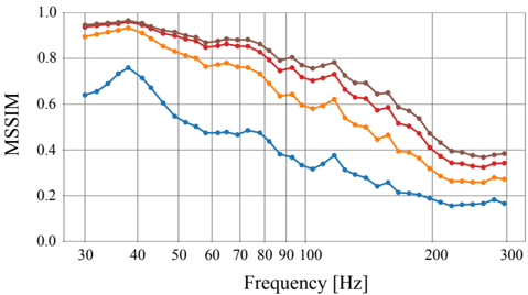
## Line Chart: MSIM vs. Frequency
### Overview
The image presents a line chart illustrating the relationship between Frequency (in Hertz) and MSIM (likely referring to a metric for image similarity or quality). Four distinct data series are plotted, each represented by a different colored line. The chart spans a frequency range from approximately 30 Hz to 300 Hz, with MSIM values ranging from 0.0 to 1.0.
### Components/Axes
* **X-axis:** Frequency [Hz]. Scale ranges from 30 to 300 Hz, with markings at 30, 40, 50, 60, 70, 80, 90, 100, 200, and 300.
* **Y-axis:** MSIM. Scale ranges from 0.0 to 1.0, with markings at 0.0, 0.2, 0.4, 0.6, 0.8, and 1.0.
* **Data Series:** Four lines, visually distinguishable by color:
* Dark Blue
* Orange
* Red
* Brown
### Detailed Analysis
* **Dark Blue Line:** This line exhibits a decreasing trend. Starting at approximately 0.65 at 30 Hz, it rises to a peak of around 0.72 at 40 Hz, then steadily declines to approximately 0.15 at 300 Hz.
* **Orange Line:** This line also shows a decreasing trend, but starts at a higher MSIM value than the dark blue line. It begins at approximately 0.85 at 30 Hz, decreases to around 0.45 at 200 Hz, and continues to approximately 0.3 at 300 Hz.
* **Red Line:** This line demonstrates a relatively stable, decreasing trend. It starts at approximately 0.9 at 30 Hz, gradually decreases to around 0.4 at 200 Hz, and continues to approximately 0.35 at 300 Hz.
* **Brown Line:** This line is similar to the red line, showing a decreasing trend. It begins at approximately 0.9 at 30 Hz, decreases to around 0.4 at 200 Hz, and continues to approximately 0.35 at 300 Hz.
Approximate Data Points (read from the chart):
| Frequency (Hz) | Dark Blue MSIM | Orange MSIM | Red MSIM | Brown MSIM |
|---|---|---|---|---|
| 30 | 0.65 | 0.85 | 0.90 | 0.90 |
| 40 | 0.72 | 0.82 | 0.87 | 0.87 |
| 50 | 0.68 | 0.80 | 0.85 | 0.85 |
| 60 | 0.62 | 0.76 | 0.80 | 0.80 |
| 70 | 0.58 | 0.72 | 0.76 | 0.76 |
| 80 | 0.55 | 0.69 | 0.73 | 0.73 |
| 90 | 0.52 | 0.66 | 0.70 | 0.70 |
| 100 | 0.50 | 0.64 | 0.68 | 0.68 |
| 200 | 0.25 | 0.45 | 0.40 | 0.40 |
| 300 | 0.15 | 0.30 | 0.35 | 0.35 |
### Key Observations
* All four data series exhibit a general decreasing trend as frequency increases.
* The dark blue line consistently has the lowest MSIM values across the entire frequency range.
* The red and brown lines are nearly identical, suggesting they represent the same or very similar data.
* The orange line starts with the highest MSIM values but decreases more rapidly than the red and brown lines.
### Interpretation
The chart likely demonstrates how the similarity or quality (as measured by MSIM) of an image or signal degrades as the frequency content increases. The different lines could represent different algorithms, processing methods, or image types. The consistent decline in MSIM suggests that higher frequencies introduce more distortion or loss of information. The fact that the red and brown lines are almost identical suggests that two different methods yield very similar results. The dark blue line's lower MSIM values could indicate a less robust or less accurate method. The initial high MSIM values for the orange line, followed by a rapid decline, might indicate a method that performs well at lower frequencies but struggles with higher frequency components. This data could be used to evaluate the performance of different image processing techniques or to understand the limitations of a particular system in handling high-frequency signals.