## Line Chart: OOD Generalization: 10x10 -> 15x15 Transfer
### Overview
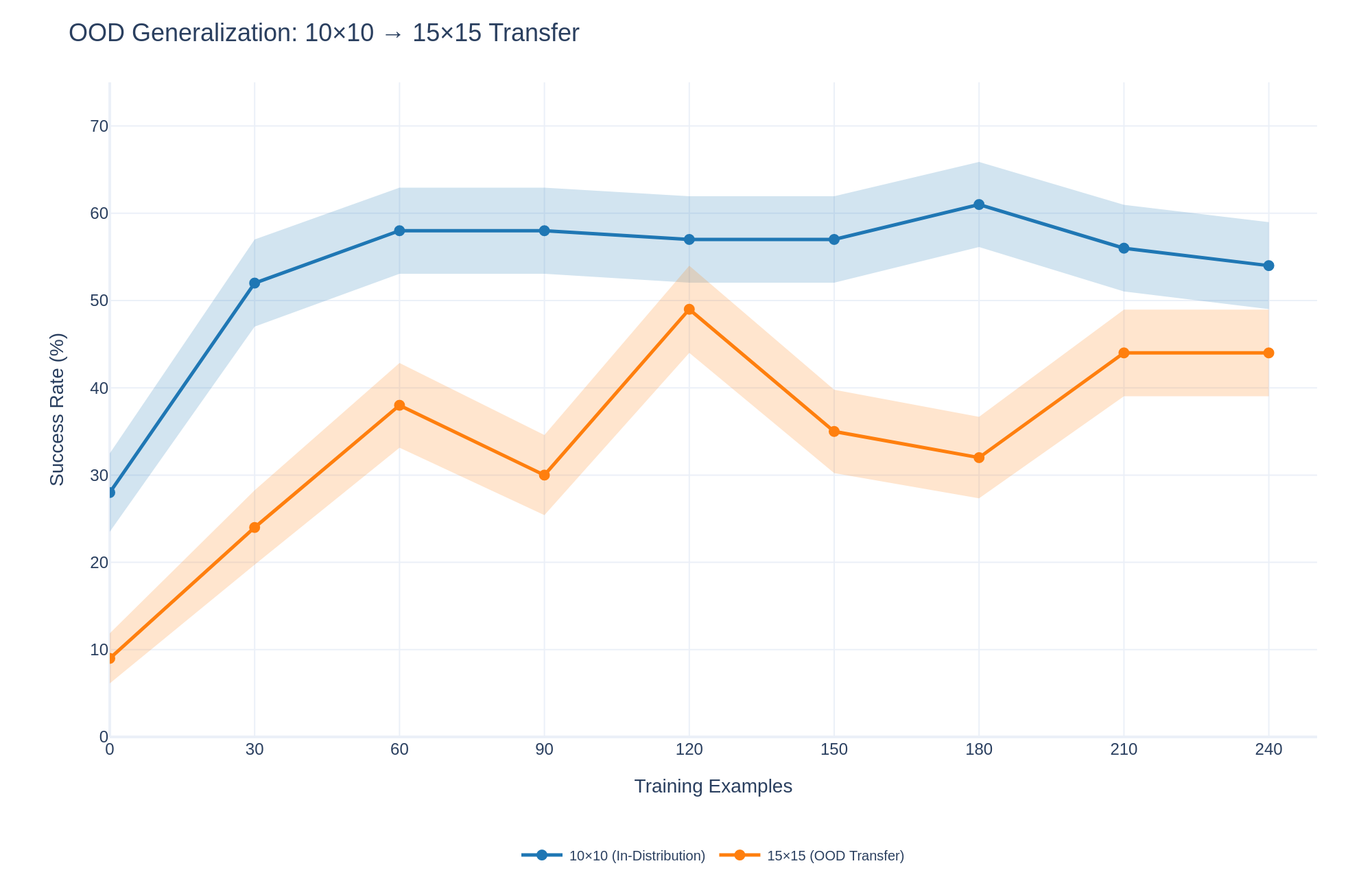
The image is a line chart comparing the success rate of two models: one trained and tested on 10x10 data (in-distribution) and another trained on 10x10 data but tested on 15x15 data (OOD transfer). The x-axis represents the number of training examples, and the y-axis represents the success rate in percentage. The chart shows how the success rate changes with increasing training examples for both models. Each line has a shaded region around it, representing the uncertainty or variance in the success rate.
### Components/Axes
* **Title:** OOD Generalization: 10x10 -> 15x15 Transfer
* **X-axis:**
* **Label:** Training Examples
* **Scale:** 0, 30, 60, 90, 120, 150, 180, 210, 240
* **Y-axis:**
* **Label:** Success Rate (%)
* **Scale:** 0, 10, 20, 30, 40, 50, 60, 70
* **Legend:** Located at the bottom of the chart.
* Blue line with circle marker: 10x10 (In-Distribution)
* Orange line with circle marker: 15x15 (OOD Transfer)
### Detailed Analysis
* **10x10 (In-Distribution) - Blue Line:**
* **Trend:** The line starts at approximately 25% and increases sharply to around 52% at 30 training examples. It then plateaus around 58% until 150 training examples. It peaks at approximately 61% at 180 training examples, then decreases to approximately 54% at 240 training examples.
* **Data Points:**
* 0 Training Examples: ~25%
* 30 Training Examples: ~52%
* 60 Training Examples: ~58%
* 90 Training Examples: ~58%
* 120 Training Examples: ~57%
* 150 Training Examples: ~57%
* 180 Training Examples: ~61%
* 210 Training Examples: ~56%
* 240 Training Examples: ~54%
* **15x15 (OOD Transfer) - Orange Line:**
* **Trend:** The line starts at approximately 10% and increases to approximately 38% at 60 training examples. It then decreases to approximately 30% at 90 training examples, before peaking at approximately 50% at 120 training examples. It then decreases to approximately 35% at 150 training examples, before decreasing again to approximately 32% at 180 training examples. Finally, it increases to approximately 44% at 210 and 240 training examples.
* **Data Points:**
* 0 Training Examples: ~10%
* 30 Training Examples: ~24%
* 60 Training Examples: ~38%
* 90 Training Examples: ~30%
* 120 Training Examples: ~50%
* 150 Training Examples: ~35%
* 180 Training Examples: ~32%
* 210 Training Examples: ~44%
* 240 Training Examples: ~44%
### Key Observations
* The in-distribution model (10x10) consistently outperforms the OOD transfer model (15x15) across all training example counts.
* The in-distribution model (10x10) reaches a higher success rate and plateaus earlier than the OOD transfer model (15x15).
* The OOD transfer model (15x15) shows more fluctuation in success rate as the number of training examples increases.
* The shaded regions around the lines indicate the variance or uncertainty in the success rates. The OOD transfer model (15x15) generally has a wider shaded region, indicating higher variance.
### Interpretation
The chart demonstrates the performance difference between a model trained and tested on the same distribution (10x10) and a model trained on one distribution (10x10) but tested on a different distribution (15x15). The in-distribution model achieves a higher success rate, indicating that it generalizes better to data similar to what it was trained on. The OOD transfer model, on the other hand, struggles to generalize to the 15x15 data, resulting in a lower success rate and higher variance. This highlights the challenge of out-of-distribution generalization and the importance of training data that is representative of the data the model will encounter in real-world scenarios. The fluctuations in the OOD transfer model's performance suggest that it may be more sensitive to the specific training examples used.