\n
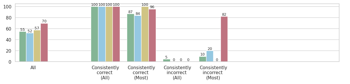
## Bar Chart: Performance Across Consistency Categories
### Overview
The image displays a grouped bar chart comparing four distinct data series (represented by different colors) across five categories related to consistency of correctness. The vertical axis represents a numerical score or percentage, ranging from 0 to 100. The chart is designed to show how different groups perform across varying levels of consistency in their correctness.
### Components/Axes
* **Vertical Axis (Y-axis):** Numerical scale from 0 to 100, with major gridlines at intervals of 20 (0, 20, 40, 60, 80, 100). The axis title is not explicitly shown but implies a performance metric (e.g., accuracy percentage).
* **Horizontal Axis (X-axis):** Five categorical groups:
1. `All`
2. `Consistently correct (All)`
3. `Consistently correct (Most)`
4. `Consistently incorrect (All)`
5. `Consistently incorrect (Most)`
* **Data Series (Legend Inferred from Bar Colors):** The legend is not visible in the image. The four data series are identified by their bar colors, listed here in the order they appear within each group from left to right:
1. **Green** (approximate hex: #8fbc8f)
2. **Light Blue** (approximate hex: #add8e6)
3. **Beige/Tan** (approximate hex: #d2b48c)
4. **Red/Mauve** (approximate hex: #bc8f8f)
* **Data Labels:** The exact numerical value for each bar is displayed directly above it.
### Detailed Analysis
**Group 1: `All`**
* Green: 55
* Light Blue: 52
* Beige: 57
* Red: 70
* *Trend:* All series show moderate performance, with the Red series scoring notably higher than the others.
**Group 2: `Consistently correct (All)`**
* Green: 100
* Light Blue: 100
* Beige: 100
* Red: 100
* *Trend:* Perfect scores across all four data series. This represents the peak performance for every group.
**Group 3: `Consistently correct (Most)`**
* Green: 87
* Light Blue: 84
* Beige: 100
* Red: 96
* *Trend:* High performance, but with variation. Beige maintains a perfect score, Red is very high, while Green and Light Blue show a slight decrease from the perfect score in the previous category.
**Group 4: `Consistently incorrect (All)`**
* Green: 5
* Light Blue: 0
* Beige: 0
* Red: 0
* *Trend:* Extremely low performance. Only the Green series registers a minimal score (5); the other three series have a score of 0.
**Group 5: `Consistently incorrect (Most)`**
* Green: 10
* Light Blue: 20
* Beige: 0
* Red: 82
* *Trend:* Mixed and highly anomalous. Green and Light Blue show low but non-zero scores. Beige remains at 0. The Red series is a dramatic outlier with a very high score of 82.
### Key Observations
1. **Perfect Performance Ceiling:** All series achieve a score of 100 in the `Consistently correct (All)` category.
2. **The "Red" Series Anomaly:** The Red series exhibits a unique and counterintuitive pattern. It scores high in the `All` category (70), very high in `Consistently correct (Most)` (96), and then an extremely high 82 in `Consistently incorrect (Most)`. This suggests it performs well even when the underlying subjects are mostly incorrect.
3. **The "Beige" Series Consistency:** The Beige series shows a binary pattern: it scores either 100 (in the first three categories) or 0 (in the last two "incorrect" categories).
4. **Low Performance in Incorrect Categories:** As expected, scores plummet in the `Consistently incorrect` categories for Green, Light Blue, and Beige. The Green series shows a slight residual score (5 and 10), while Light Blue only shows a score in the `Most` incorrect category (20).
### Interpretation
This chart likely visualizes the performance of four different models, algorithms, or methods (the color series) on a task, segmented by the consistency of the ground truth or the subjects' behavior.
* **What the data suggests:** The `Consistently correct (All)` category represents an ideal scenario where all methods perform perfectly. The `Consistently correct (Most)` category introduces some noise or difficulty, causing performance to dip slightly for most methods, except Beige which remains robust.
* **Relationship between elements:** The stark contrast between the `correct` and `incorrect` categories highlights the fundamental challenge. Most methods (Green, Light Blue, Beige) fail catastrophically when faced with consistently incorrect data, as their scores drop to near zero. This is an expected outcome for systems trained on correct patterns.
* **Notable anomaly and its implication:** The Red series is the critical outlier. Its high score in `Consistently incorrect (Most)` (82) is paradoxical. This could indicate several possibilities:
* **Overfitting to a Spurious Feature:** The Red method might be relying on a feature that correlates with the *label* in the training data but is actually irrelevant or misleading in this specific "incorrect" context.
* **Different Objective:** The Red method might not be optimizing for correctness in the same way as the others. It could be designed to predict a different, correlated attribute that remains present even when the primary judgment is "incorrect."
* **Data Leakage or Flaw:** There might be a flaw in the evaluation setup for this specific series and category, allowing it to achieve a high score inappropriately.
* **Why it matters:** This chart moves beyond simple average performance. By segmenting results based on consistency, it reveals critical failure modes (the collapse in incorrect categories) and exposes potentially problematic behavior (the Red series' anomaly) that would be hidden in an aggregated metric. It prompts investigation into *why* the Red series behaves so differently, which is key to understanding the reliability and true capabilities of each method.