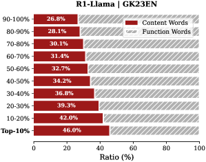
## Bar Chart: R1-Llama | GK23EN
### Overview
The image is a horizontal bar chart comparing the ratio of "Content Words" and "Function Words" across different percentile ranges of a dataset, labeled "R1-Llama | GK23EN". The y-axis represents percentile ranges (Top-10% to 90-100%), and the x-axis represents the ratio in percentage (0-100%). The chart uses color-coding to distinguish between "Content Words" (dark red) and "Function Words" (light gray with diagonal lines).
### Components/Axes
* **Title:** R1-Llama | GK23EN
* **X-Axis Title:** Ratio (%)
* **X-Axis Scale:** 0 to 100, incrementing by 20.
* **Y-Axis Labels (Percentile Ranges):** Top-10%, 10-20%, 20-30%, 30-40%, 40-50%, 50-60%, 60-70%, 70-80%, 80-90%, 90-100%
* **Legend (Top-Right):**
* Dark Red: Content Words
* Light Gray with Diagonal Lines: Function Words
### Detailed Analysis
The chart displays the ratio of content words and function words for different percentile ranges. The "Content Words" ratio generally decreases as the percentile range increases (from Top-10% to 90-100%). The "Function Words" ratio is implicitly represented by the remaining percentage to reach 100% for each percentile range.
Here's a breakdown of the "Content Words" ratio for each percentile range:
* **Top-10%:** 46.0%
* **10-20%:** 42.0%
* **20-30%:** 39.3%
* **30-40%:** 36.8%
* **40-50%:** 34.2%
* **50-60%:** 32.7%
* **60-70%:** 31.4%
* **70-80%:** 30.1%
* **80-90%:** 28.1%
* **90-100%:** 26.8%
### Key Observations
* The ratio of "Content Words" is highest in the Top-10% percentile range (46.0%) and lowest in the 90-100% percentile range (26.8%).
* There is a general downward trend in the "Content Words" ratio as the percentile range increases.
* The "Function Words" ratio is implicitly the inverse of the "Content Words" ratio for each percentile range.
### Interpretation
The chart suggests that the top-performing segments (Top-10%) of the dataset, "R1-Llama | GK23EN", contain a higher proportion of content-rich words compared to the lower-performing segments (90-100%). This could indicate that the quality or informativeness of the content decreases as you move towards the higher percentile ranges. The higher proportion of function words in the higher percentile ranges might suggest a greater emphasis on grammatical structure or filler content in those segments. The data demonstrates a clear inverse relationship between the percentile range and the proportion of content words.