## Horizontal Bar Chart: Content vs. Function Word Ratios by Percentile Range
### Overview
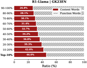
This image is a horizontal stacked bar chart titled "R1-Llama | G2K23EN". It displays the percentage ratio of "Content Words" versus "Function Words" across ten different percentile ranges, from "90-100%" down to "Top-10%". The chart illustrates how the proportion of content words changes relative to function words across these ranked segments.
### Components/Axes
* **Chart Title:** "R1-Llama | G2K23EN" (located at the top center).
* **Y-Axis (Vertical):** Lists ten categorical percentile ranges. From top to bottom, they are: "90-100%", "80-90%", "70-80%", "60-70%", "50-60%", "40-50%", "30-40%", "20-30%", "10-20%", and "Top-10%".
* **X-Axis (Horizontal):** Labeled "Ratio (%)". It is a linear scale marked from 0 to 100 in increments of 20 (0, 20, 40, 60, 80, 100).
* **Legend:** Positioned in the top-right corner of the chart area. It defines two categories:
* **Content Words:** Represented by a solid red color.
* **Function Words:** Represented by a gray and white diagonal striped pattern.
* **Data Bars:** Each horizontal bar corresponds to a percentile range on the y-axis. The bar is divided into two segments whose lengths represent the percentage ratio of each word type. The exact percentage value for the "Content Words" segment is printed in white text within the red portion of each bar.
### Detailed Analysis
The chart presents a clear, monotonic trend. As the percentile range moves from the lowest-performing segment ("90-100%") to the highest-performing segment ("Top-10%"), the ratio of Content Words consistently increases.
**Data Series - Content Words (Red Bars):**
* **Trend Verification:** The red segment of each bar grows progressively longer from the top of the chart to the bottom, indicating a steady upward trend in the Content Words ratio.
* **Extracted Values (from top to bottom):**
* 90-100%: 26.8%
* 80-90%: 28.1%
* 70-80%: 30.1%
* 60-70%: 31.4%
* 50-60%: 32.7%
* 40-50%: 34.2%
* 30-40%: 36.8%
* 20-30%: 39.3%
* 10-20%: 42.0%
* Top-10%: 46.0%
**Data Series - Function Words (Gray Striped Bars):**
* **Trend Verification:** The gray striped segment of each bar grows progressively shorter from top to bottom, indicating a steady downward trend in the Function Words ratio. This is the inverse of the Content Words trend.
* **Calculated Values (100% - Content Words %):**
* 90-100%: 73.2%
* 80-90%: 71.9%
* 70-80%: 69.9%
* 60-70%: 68.6%
* 50-60%: 67.3%
* 40-50%: 65.8%
* 30-40%: 63.2%
* 20-30%: 60.7%
* 10-20%: 58.0%
* Top-10%: 54.0%
### Key Observations
1. **Perfect Inverse Relationship:** The sum of Content Words and Function Words for each bar is exactly 100%, confirming they are complementary parts of a whole.
2. **Linear Progression:** The increase in Content Words ratio is remarkably consistent across the percentile ranges, with increments between consecutive ranges generally falling between 1.3% and 2.7%.
3. **Significant Range:** The Content Words ratio spans from a low of 26.8% to a high of 46.0%, a difference of 19.2 percentage points across the ranked segments.
4. **Peak at Top-10%:** The highest concentration of Content Words (46.0%) is found in the "Top-10%" segment, which likely represents the highest-performing or most relevant subset of the data (e.g., top-ranked responses or documents).
### Interpretation
This chart likely analyzes the linguistic composition of text outputs from a model named "R1-Llama" evaluated on a benchmark or dataset abbreviated "G2K23EN". The data suggests a strong, positive correlation between the proportion of "Content Words" (nouns, verbs, adjectives, adverbs carrying semantic meaning) and the ranking/performance tier of the text.
* **What it demonstrates:** Higher-performing outputs (those in the "Top-10%") are characterized by a significantly higher density of meaningful, content-bearing words. Conversely, lower-performing outputs rely more heavily on "Function Words" (prepositions, articles, conjunctions, pronouns that provide grammatical structure).
* **Relationship between elements:** The percentile ranking (y-axis) is the independent variable, and the word-type ratio (x-axis) is the dependent variable. The chart shows that as the independent variable improves (moving to a better percentile), the dependent variable shifts predictably toward more content words.
* **Implication:** This pattern could indicate that the evaluation metric or human preference for these texts favors substantive, information-dense language over structurally functional but semantically lighter language. It provides a quantitative linguistic feature that distinguishes high-quality from lower-quality outputs in this specific context. The "Top-10%" segment serves as a benchmark for the ideal content-to-function word ratio (~46:54) for this task.