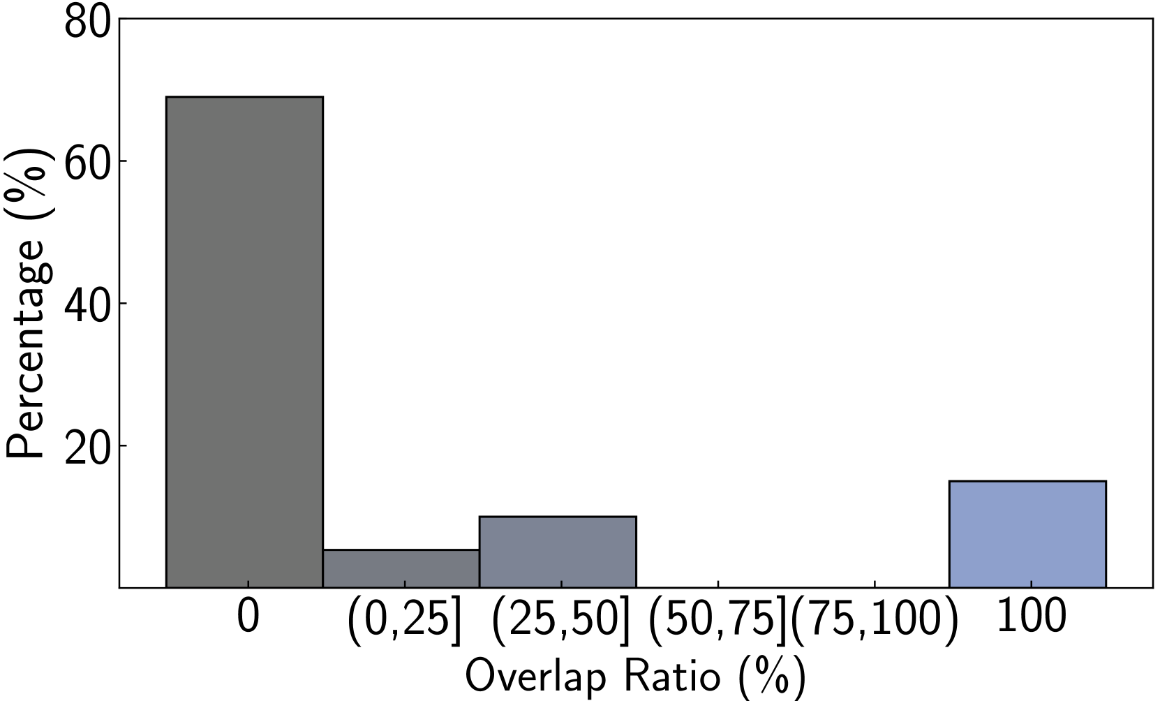
## Bar Chart: Percentage Distribution of Overlap Ratio
### Overview
This image displays a bar chart illustrating the percentage distribution of an "Overlap Ratio (%)". The x-axis represents different ranges of overlap ratios, and the y-axis represents the percentage. There are four distinct bars, each representing a specific range of overlap ratios and its corresponding percentage.
### Components/Axes
* **X-axis Title:** "Overlap Ratio (%)"
* **X-axis Labels:**
* "0"
* "(0, 25]"
* "(25, 50]"
* "(50, 75]"
* "(75, 100)"
* "100"
* **Y-axis Title:** "Percentage (%)"
* **Y-axis Labels:** 0, 20, 40, 60, 80
### Detailed Analysis
The chart displays the following bars:
1. **Bar 1 (Dark Grey):**
* **X-axis Category:** "0"
* **Visual Trend:** This bar is the tallest, indicating the highest percentage.
* **Data Point:** The top of the bar aligns with approximately 68% on the y-axis.
* **Approximate Value:** 68% (with an uncertainty of +/- 2%)
2. **Bar 2 (Medium Grey):**
* **X-axis Category:** "(0, 25]"
* **Visual Trend:** This bar is significantly shorter than the first bar.
* **Data Point:** The top of the bar aligns with approximately 7% on the y-axis.
* **Approximate Value:** 7% (with an uncertainty of +/- 1%)
3. **Bar 3 (Light Blue-Grey):**
* **X-axis Category:** "(25, 50]"
* **Visual Trend:** This bar is taller than the second bar but much shorter than the first.
* **Data Point:** The top of the bar aligns with approximately 12% on the y-axis.
* **Approximate Value:** 12% (with an uncertainty of +/- 1%)
4. **Bar 4 (Light Blue):**
* **X-axis Category:** "100"
* **Visual Trend:** This bar is of moderate height, taller than the second bar but shorter than the third.
* **Data Point:** The top of the bar aligns with approximately 16% on the y-axis.
* **Approximate Value:** 16% (with an uncertainty of +/- 1%)
**Note:** The x-axis labels "(50, 75]" and "(75, 100)" are present but have no corresponding bars, indicating that the percentage for these overlap ratio ranges is 0% or negligible.
### Key Observations
* The most significant portion of the data falls within the "0" overlap ratio category, accounting for approximately 68% of the total.
* There is a sharp decrease in percentage from an overlap ratio of 0 to the range of (0, 25].
* The percentage increases slightly for the (25, 50] and then further for the "100" overlap ratio categories.
* The overlap ratio ranges between (50, 75] and (75, 100) have no observed data points represented by bars.
### Interpretation
This bar chart suggests a distribution where a very high percentage of observations have an overlap ratio of zero. This could imply that in the context being measured, a significant majority of items or events do not overlap at all. Following this, there are smaller, but notable, percentages for overlap ratios of (0, 25%], (25, 50%], and a peak at 100%. The presence of a bar at "100" suggests a distinct category of complete overlap. The absence of bars for the intermediate ranges (50, 75] and (75, 100) indicates that these specific overlap ratios are either not present in the dataset or occur with a frequency too low to be represented on this chart. The data demonstrates a strong tendency towards either no overlap or complete overlap, with a moderate presence of partial overlap in the lower to mid-range.