## Bar Chart: Distribution of Overlap Ratios
### Overview
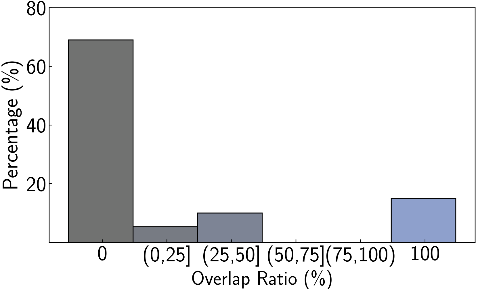
The image displays a bar chart illustrating the percentage distribution of items across different overlap ratio categories. The chart shows a highly skewed distribution, with the majority of items having zero overlap, a small portion having complete (100%) overlap, and very few items falling into intermediate overlap ranges.
### Components/Axes
* **Chart Type:** Vertical bar chart.
* **X-Axis (Horizontal):** Labeled "Overlap Ratio (%)". It contains six categorical bins:
* `0`
* `(0,25]` (greater than 0% and less than or equal to 25%)
* `(25,50]` (greater than 25% and less than or equal to 50%)
* `(50,75]` (greater than 50% and less than or equal to 75%)
* `(75,100)` (greater than 75% and less than 100%)
* `100`
* **Y-Axis (Vertical):** Labeled "Percentage (%)". The scale runs from 0 to 80, with major tick marks at intervals of 20 (0, 20, 40, 60, 80).
* **Legend:** No explicit legend is present. The bars are differentiated by color/shade.
* **Bar Colors (from left to right):**
* `0`: Dark gray.
* `(0,25]`: Medium gray.
* `(25,50]`: Lighter gray.
* `(50,75]`: No visible bar (value is 0%).
* `(75,100)`: No visible bar (value is 0%).
* `100`: Light blue.
### Detailed Analysis
The following table reconstructs the data presented in the chart. Values are approximate, estimated from the visual height of the bars relative to the y-axis scale.
| Overlap Ratio Category | Approximate Percentage (%) | Bar Color/Shade |
| :--- | :--- | :--- |
| 0 | ~70% | Dark Gray |
| (0,25] | ~5% | Medium Gray |
| (25,50] | ~10% | Lighter Gray |
| (50,75] | 0% | (No bar) |
| (75,100) | 0% | (No bar) |
| 100 | ~15% | Light Blue |
**Trend Verification:** The data series shows a sharp decline from the first category (`0`) to the second (`(0,25]`), a slight increase to the third (`(25,50]`), then drops to zero for the next two categories, before rising again for the final category (`100`). The dominant trend is concentration at the two extremes (0% and 100%).
### Key Observations
1. **Dominant Category:** The `0` overlap ratio category is overwhelmingly the most common, representing approximately 70% of the total.
2. **Bimodal Distribution:** The distribution is bimodal, with significant peaks at `0` and `100`, and very low values in between.
3. **Absence of Mid-Range Overlap:** There are no items (0%) in the `(50,75]` and `(75,100)` overlap ratio ranges.
4. **Minor Intermediate Presence:** Only about 15% of items have any overlap between 0% and 100%, split between the `(0,25]` and `(25,50]` bins.
5. **Complete Overlap:** A notable minority (~15%) of items exhibit complete (100%) overlap.
### Interpretation
This chart likely represents the degree of similarity or redundancy between pairs of items in a dataset (e.g., duplicate detection, document comparison, or feature matching). The data suggests a scenario where most pairs are completely distinct (0% overlap), while a smaller, separate group is perfectly identical (100% overlap). The near absence of pairs with partial overlap (especially above 50%) indicates a clear dichotomy in the data: items are either entirely different or exactly the same, with very little middle ground. This pattern is characteristic of datasets containing exact duplicates alongside a large set of unique records, and it implies that a simple threshold-based deduplication strategy (e.g., flagging pairs above 90% overlap) would be highly effective, as it would cleanly separate the two main clusters.