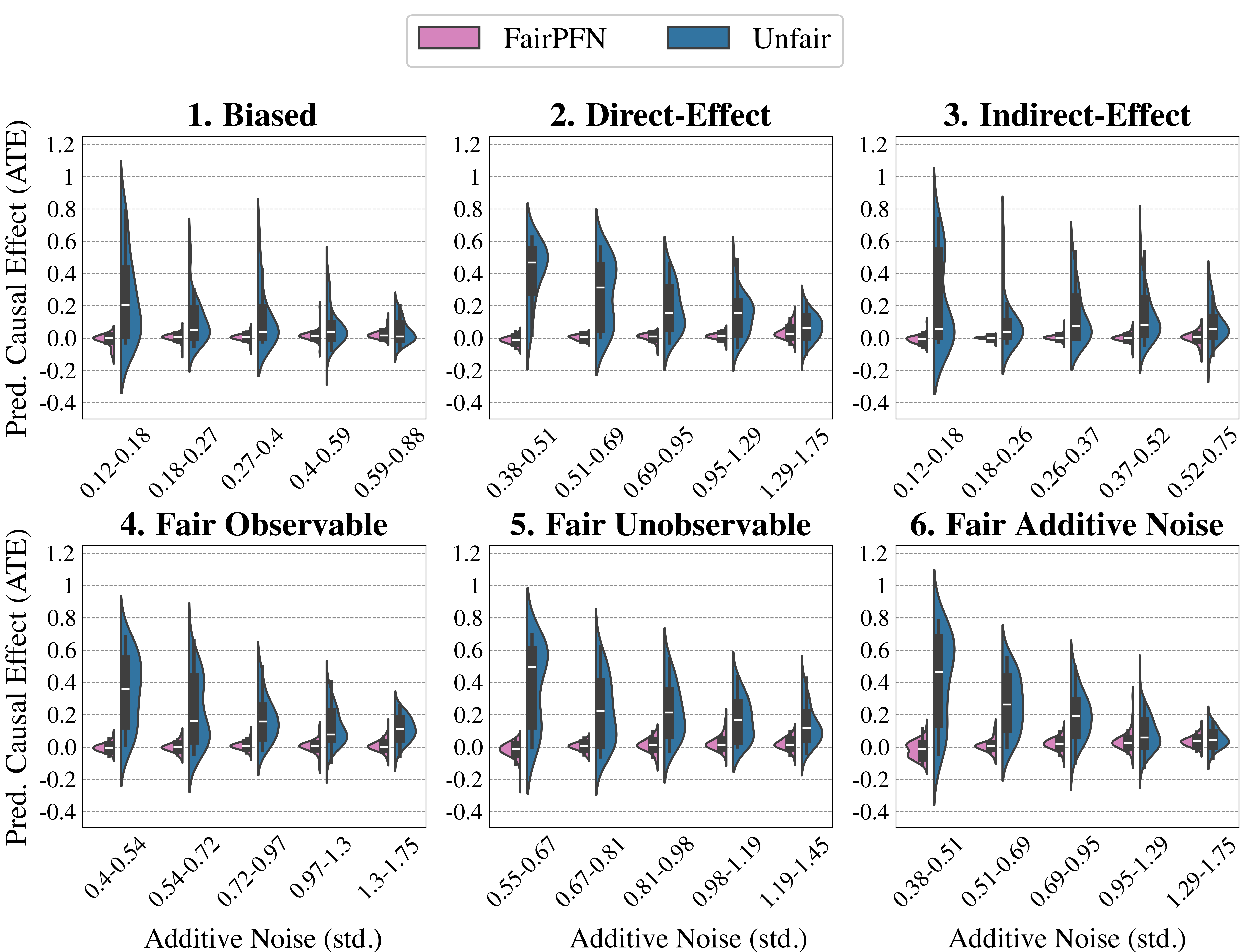
## Chart Type: Violin Plots of Predicted Causal Effect (ATE) vs. Additive Noise
### Overview
The image presents six violin plots arranged in a 2x3 grid. Each plot visualizes the distribution of the Predicted Causal Effect (ATE) for different levels of Additive Noise (std.). The plots compare two methods: "FairPFN" (represented in pink) and "Unfair" (represented in blue). The plots are titled: "1. Biased", "2. Direct-Effect", "3. Indirect-Effect", "4. Fair Observable", "5. Fair Unobservable", and "6. Fair Additive Noise".
### Components/Axes
* **Y-axis (Vertical):** "Pred. Causal Effect (ATE)" with a scale from -0.4 to 1.2, marked at intervals of 0.2.
* **X-axis (Horizontal):** "Additive Noise (std.)" with varying ranges for each plot. The x-axis represents different ranges of standard deviation of additive noise.
* **Legend (Top):** Located at the top of the image, it identifies "FairPFN" (pink) and "Unfair" (blue).
* **Plot Titles:** Each plot has a title indicating the specific scenario being evaluated (e.g., "1. Biased").
* **Violin Plots:** Each plot contains violin plots representing the distribution of the predicted causal effect for each noise level. The width of the violin indicates the density of data points at that value.
* **X-Axis Markers:** Each plot has 5-6 markers on the x-axis, indicating the range of additive noise (std.) for each violin plot.
### Detailed Analysis
**Plot 1: Biased**
* X-axis markers: 0.12-0.18, 0.18-0.27, 0.27-0.4, 0.4-0.59, 0.59-0.88
* Unfair (blue): The distribution is centered around higher ATE values for lower noise levels, decreasing as noise increases. At 0.12-0.18, the distribution is centered around 0.8, decreasing to around 0.2 at 0.59-0.88.
* FairPFN (pink): The distribution is centered around 0 for all noise levels.
**Plot 2: Direct-Effect**
* X-axis markers: 0.38-0.51, 0.51-0.69, 0.69-0.95, 0.95-1.29, 1.29-1.75
* Unfair (blue): The distribution is centered around higher ATE values for lower noise levels, decreasing as noise increases. At 0.38-0.51, the distribution is centered around 0.7, decreasing to around 0.2 at 1.29-1.75.
* FairPFN (pink): The distribution is centered around 0 for all noise levels.
**Plot 3: Indirect-Effect**
* X-axis markers: 0.12-0.18, 0.18-0.26, 0.26-0.37, 0.37-0.52, 0.52-0.75
* Unfair (blue): The distribution is centered around higher ATE values for lower noise levels, decreasing as noise increases. At 0.12-0.18, the distribution is centered around 0.9, decreasing to around 0.2 at 0.52-0.75.
* FairPFN (pink): The distribution is centered around 0 for all noise levels.
**Plot 4: Fair Observable**
* X-axis markers: 0.4-0.54, 0.54-0.72, 0.72-0.97, 0.97-1.3, 1.3-1.75
* Unfair (blue): The distribution is centered around higher ATE values for lower noise levels, decreasing as noise increases. At 0.4-0.54, the distribution is centered around 0.8, decreasing to around 0.2 at 1.3-1.75.
* FairPFN (pink): The distribution is centered around 0 for all noise levels.
**Plot 5: Fair Unobservable**
* X-axis markers: 0.55-0.67, 0.67-0.81, 0.81-0.98, 0.98-1.19, 1.19-1.45
* Unfair (blue): The distribution is centered around higher ATE values for lower noise levels, decreasing as noise increases. At 0.55-0.67, the distribution is centered around 0.7, decreasing to around 0.2 at 1.19-1.45.
* FairPFN (pink): The distribution is centered around 0 for all noise levels.
**Plot 6: Fair Additive Noise**
* X-axis markers: 0.38-0.51, 0.51-0.69, 0.69-0.95, 0.95-1.29, 1.29-1.75
* Unfair (blue): The distribution is centered around higher ATE values for lower noise levels, decreasing as noise increases. At 0.38-0.51, the distribution is centered around 0.8, decreasing to around 0.2 at 1.29-1.75.
* FairPFN (pink): The distribution is centered around 0 for all noise levels.
### Key Observations
* In all six plots, the "Unfair" method (blue) shows a decreasing trend in the predicted causal effect (ATE) as the additive noise increases.
* In all six plots, the "FairPFN" method (pink) consistently shows a distribution centered around 0, regardless of the additive noise level.
* The range of additive noise (std.) varies across the different plots.
### Interpretation
The plots demonstrate the impact of additive noise on the predicted causal effect (ATE) for two different methods: "FairPFN" and "Unfair". The "Unfair" method is significantly affected by the noise, with the predicted causal effect decreasing as the noise increases. This suggests that the "Unfair" method is sensitive to noise and may produce biased estimates in the presence of noise.
In contrast, the "FairPFN" method appears to be robust to additive noise, consistently predicting a causal effect close to 0, regardless of the noise level. This suggests that "FairPFN" is a more reliable method for causal inference in noisy environments.
The different plot titles ("Biased", "Direct-Effect", etc.) likely represent different scenarios or assumptions about the underlying causal model. The consistent behavior of "FairPFN" across these scenarios suggests that it is a generally applicable method for mitigating the effects of noise on causal inference.