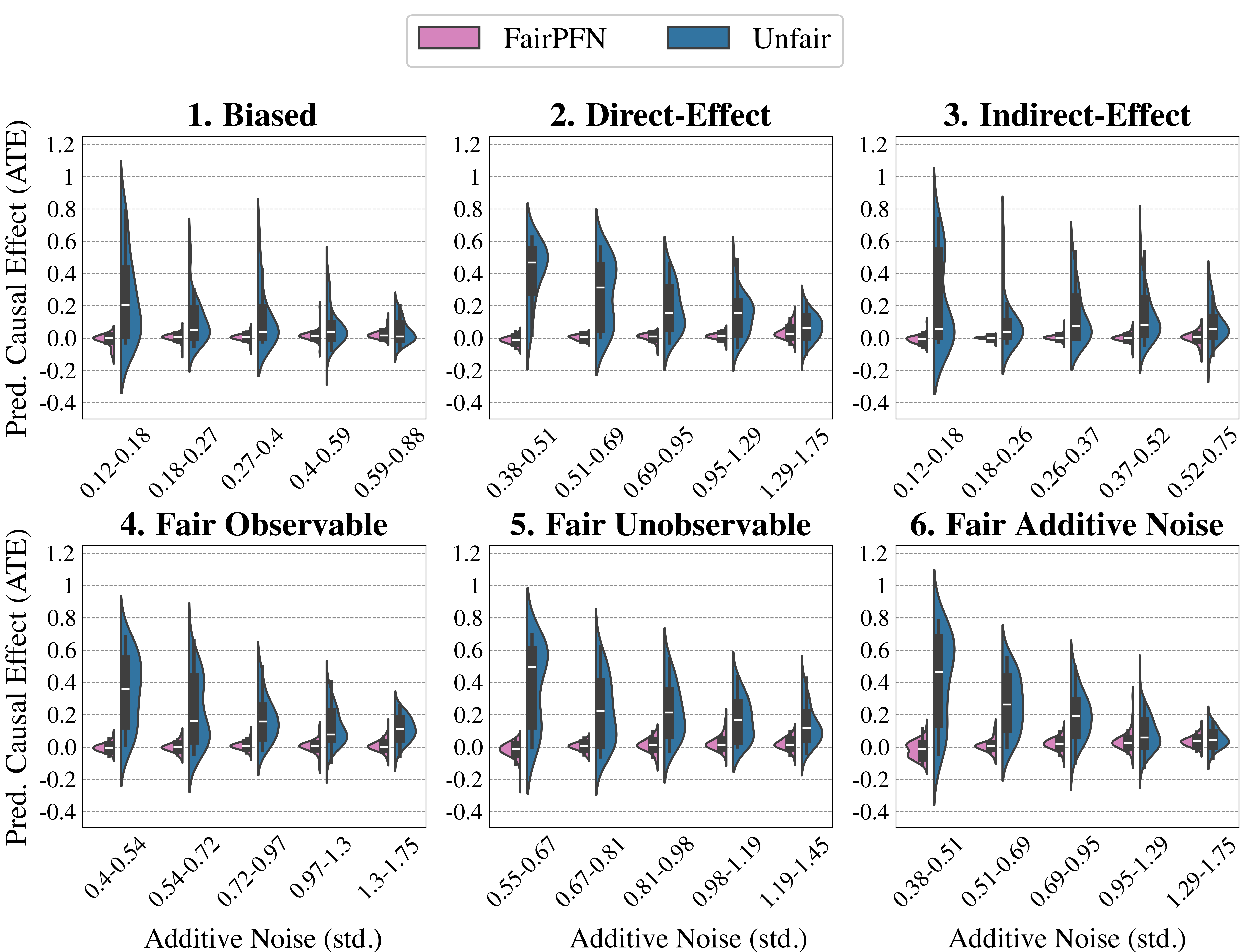
## Violin Plots: Predicted Causal Effect (ATE) vs. Additive Noise
### Overview
The image presents six violin plots, arranged in a 2x3 grid, illustrating the relationship between predicted causal effect (Average Treatment Effect - ATE) and additive noise (standard deviation). Each plot represents a different scenario: Biased, Direct-Effect, Indirect-Effect, Fair Observable, Fair Unobservable, and Fair Additive Noise. Within each plot, data is presented for two conditions: "FairPFN" (represented in purple) and "Unfair" (represented in teal). Each violin plot also includes a black triangle indicating the mean value.
### Components/Axes
* **X-axis:** Additive Noise (std.) - Ranges vary for each plot, representing different standard deviation values.
* **Y-axis:** Pred. Causal Effect (ATE) - Scale from -0.4 to 1.2.
* **Legend (Top-Left):**
* FairPFN: Purple color
* Unfair: Teal color
* **Plot Titles:** Each plot is numbered (1-6) and labeled with a scenario name (Biased, Direct-Effect, Indirect-Effect, Fair Observable, Fair Unobservable, Fair Additive Noise).
### Detailed Analysis
**1. Biased:**
* X-axis: 0.2-0.18, 0.27-0.4, 0.59-0.88
* FairPFN (Purple): The violin shape is wide, indicating a broad distribution. The mean (black triangle) is approximately 0.4. The distribution appears to be centered around 0.4, with values ranging from approximately 0.1 to 0.8.
* Unfair (Teal): The violin shape is also wide. The mean is approximately 0.0. The distribution ranges from approximately -0.2 to 0.6.
**2. Direct-Effect:**
* X-axis: 0.38-0.51, 0.51-0.69, 0.69-0.95, 0.95-1.29, 1.29-1.75
* FairPFN (Purple): The violin shape is relatively narrow. The mean is approximately 0.6. The distribution is centered around 0.6, ranging from approximately 0.3 to 0.9.
* Unfair (Teal): The violin shape is narrow. The mean is approximately 0.0. The distribution ranges from approximately -0.2 to 0.4.
**3. Indirect-Effect:**
* X-axis: 0.12-0.18, 0.18-0.26, 0.26-0.37, 0.37-0.52, 0.52-0.75
* FairPFN (Purple): The violin shape is wide. The mean is approximately 0.4. The distribution ranges from approximately 0.1 to 0.8.
* Unfair (Teal): The violin shape is wide. The mean is approximately -0.1. The distribution ranges from approximately -0.3 to 0.4.
**4. Fair Observable:**
* X-axis: 0.4-0.54, 0.54-0.72, 0.72-0.97, 0.97-1.3, 1.3-1.75
* FairPFN (Purple): The violin shape is narrow. The mean is approximately 0.2. The distribution ranges from approximately -0.1 to 0.5.
* Unfair (Teal): The violin shape is narrow. The mean is approximately 0.0. The distribution ranges from approximately -0.2 to 0.3.
**5. Fair Unobservable:**
* X-axis: 0.55-0.67, 0.67-0.81, 0.81-0.98, 0.98-1.19, 1.19-1.45
* FairPFN (Purple): The violin shape is narrow. The mean is approximately 0.1. The distribution ranges from approximately -0.1 to 0.4.
* Unfair (Teal): The violin shape is narrow. The mean is approximately 0.0. The distribution ranges from approximately -0.2 to 0.3.
**6. Fair Additive Noise:**
* X-axis: 0.38-0.51, 0.51-0.69, 0.69-0.95, 0.95-1.29, 1.29-1.75
* FairPFN (Purple): The violin shape is narrow. The mean is approximately 0.1. The distribution ranges from approximately -0.1 to 0.4.
* Unfair (Teal): The violin shape is narrow. The mean is approximately 0.0. The distribution ranges from approximately -0.2 to 0.3.
### Key Observations
* In all scenarios, the "FairPFN" condition generally exhibits a higher predicted causal effect (ATE) than the "Unfair" condition.
* The "Unfair" condition often has a distribution centered around or below 0, suggesting a potential for negative or negligible causal effects.
* The width of the violin plots varies across scenarios, indicating different levels of variability in the predicted causal effects.
* The "Biased" and "Indirect-Effect" scenarios show the widest distributions for both conditions.
* As additive noise increases, the distributions tend to become more concentrated around the mean in the "Fair" scenarios.
### Interpretation
The plots demonstrate the impact of different fairness interventions ("FairPFN" vs. "Unfair") on predicted causal effects under varying conditions. The consistent positive shift in ATE for "FairPFN" suggests that the intervention is effective in mitigating bias and promoting fairer causal estimates. The scenarios (Biased, Direct-Effect, Indirect-Effect, etc.) likely represent different types of causal structures or confounding factors. The additive noise represents the level of randomness or uncertainty in the data.
The wider distributions in the "Biased" and "Indirect-Effect" scenarios suggest that these conditions are more sensitive to confounding or bias, requiring more robust fairness interventions. The narrowing of distributions with increasing additive noise in the "Fair" scenarios indicates that the fairness intervention is more stable and reliable in the presence of noise.
The consistent centering of the "Unfair" distributions around zero or below suggests that without fairness interventions, causal estimates may be systematically biased towards zero or even negative, potentially leading to incorrect conclusions about the effectiveness of treatments or interventions. The data suggests that the FairPFN method is effective in reducing bias and improving the accuracy of causal effect estimates, particularly in scenarios where bias is more prevalent.