\n
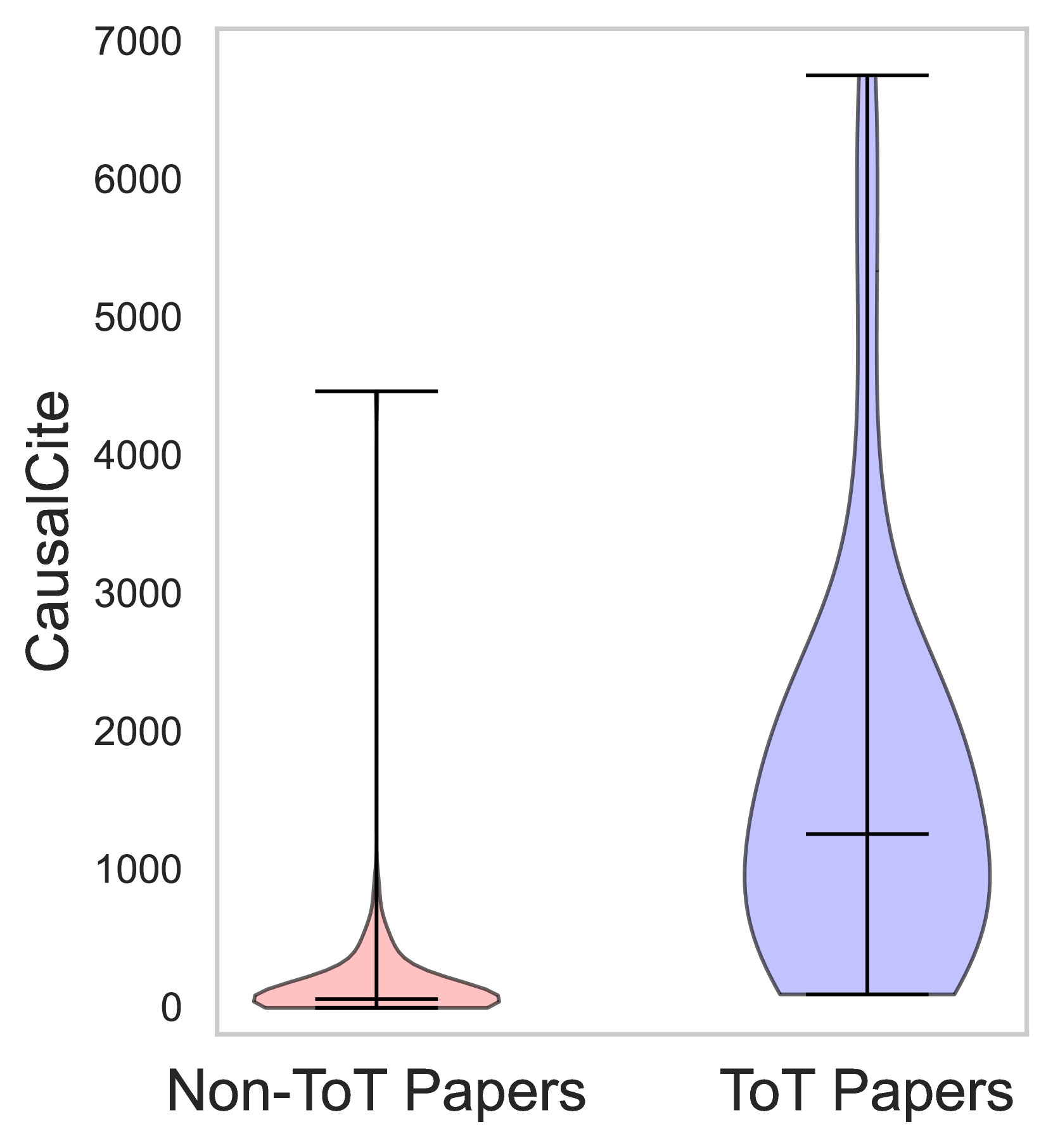
## Violin Plot: CausalCite Distribution for Non-ToT vs. ToT Papers
### Overview
The image is a violin plot comparing the distribution of a metric called "CausalCite" between two categories of academic papers: "Non-ToT Papers" and "ToT Papers". The plot visualizes the probability density of the data at different values, with the width of each "violin" representing the frequency of data points at that y-axis value.
### Components/Axes
* **Y-Axis:** Labeled "CausalCite". The scale is linear, ranging from 0 to 7000, with major tick marks at intervals of 1000 (0, 1000, 2000, 3000, 4000, 5000, 6000, 7000).
* **X-Axis:** Contains two categorical labels:
* **Left Category:** "Non-ToT Papers"
* **Right Category:** "ToT Papers"
* **Plot Elements:** Each category has a corresponding violin shape and internal box plot elements (median line, interquartile range bar, and whiskers).
* **Non-ToT Papers Violin:** Colored light pink/salmon. Positioned on the left side of the chart.
* **ToT Papers Violin:** Colored light blue/lavender. Positioned on the right side of the chart.
### Detailed Analysis
**1. Non-ToT Papers (Left, Pink Violin):**
* **Trend/Shape:** The distribution is extremely right-skewed. The vast majority of data points are concentrated very close to 0, creating a wide, flat base. The violin tapers extremely rapidly into a very thin, long tail extending upward.
* **Key Data Points (Approximate):**
* **Median (Central horizontal line within the violin):** Very close to 0, approximately at 50-100 on the CausalCite scale.
* **Interquartile Range (Thicker central bar):** Very narrow, spanning from near 0 to approximately 200-300.
* **Range (Whiskers/Full extent):** The lower whisker is at 0. The upper whisker extends to approximately 4500, indicating a maximum outlier value in this group.
* **Density:** The highest density (widest part of the violin) is at the very bottom, near 0. Density becomes negligible above ~500.
**2. ToT Papers (Right, Blue Violin):**
* **Trend/Shape:** The distribution is also right-skewed but is much more spread out and has a significantly higher central tendency compared to the Non-ToT group. It has a broad base, a pronounced bulge in the lower-middle range, and a long, thin tail extending to the top of the chart.
* **Key Data Points (Approximate):**
* **Median (Central horizontal line):** Located at approximately 1200-1300 on the CausalCite scale.
* **Interquartile Range (Thicker central bar):** Spans from approximately 500 to 2500.
* **Range (Whiskers/Full extent):** The lower whisker is at 0. The upper whisker extends to the top of the chart, at approximately 6800-6900, indicating a maximum value near the upper limit of the axis.
* **Density:** The distribution shows significant density from 0 up to about 3000, with the widest point (highest density) occurring around 800-1500. The tail remains visible but very thin all the way to the maximum value.
### Key Observations
1. **Stark Contrast in Central Tendency:** The median CausalCite for ToT Papers (~1250) is over an order of magnitude higher than the median for Non-ToT Papers (~75).
2. **Difference in Spread:** The ToT Papers group exhibits vastly greater variability. Its interquartile range (~2000 units wide) is many times larger than that of the Non-ToT group (~250 units wide).
3. **Presence of Extreme Values:** Both groups contain high-value outliers, but the maximum value for ToT Papers (~6850) is substantially higher than the maximum for Non-ToT Papers (~4500).
4. **Distribution Shape:** While both are right-skewed, the ToT Papers distribution has a much more substantial "body" in the 500-2500 range, whereas the Non-ToT Papers distribution is almost entirely collapsed near zero.
### Interpretation
This chart strongly suggests that papers categorized as "ToT Papers" are associated with a significantly higher "CausalCite" metric compared to "Non-ToT Papers". The data indicates this is not merely a shift in the average but a fundamental difference in distribution:
* **Impact:** The ToT methodology or topic (whatever "ToT" signifies) appears to be linked to papers that achieve much higher causal citation counts. The typical (median) ToT paper has a CausalCite score comparable to a high-performing outlier in the Non-ToT group.
* **Consistency vs. Potential:** The Non-ToT group is highly consistent, with nearly all papers clustering near zero impact, punctuated by rare exceptions. The ToT group shows a broader range of outcomes, but even its lower quartile performs better than the vast majority of Non-ToT papers. This suggests the ToT category either enables higher impact or attracts research with inherently higher causal citation potential.
* **Underlying Question:** The plot visualizes a dramatic disparity but does not explain its cause. It prompts investigation into what "ToT" represents (e.g., a specific research paradigm, topic, or methodology) and why it correlates so strongly with this measure of causal influence in the literature. The long tails in both distributions also highlight the presence of exceptional papers in both categories that achieve very high CausalCite scores.