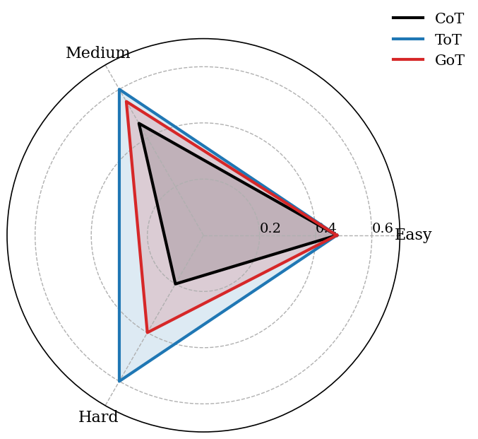
## Radar Chart: Performance Metrics Across Difficulty Levels
### Overview
The image is a radar chart comparing three data series (CoT, ToT, GoT) across three difficulty levels (Easy, Medium, Hard). The chart uses a circular layout with radial axes representing performance scores (0.0–1.0) and angular axes representing difficulty levels. Shaded regions indicate data distributions or confidence intervals.
### Components/Axes
- **Axes**:
- **Angular (Categories)**:
- **Easy** (right side, 0°)
- **Medium** (top, 90°)
- **Hard** (left, 180°)
- **Radial (Scale)**:
- Linear scale from 0.0 to 1.0, with tick marks at 0.2, 0.4, 0.6, 0.8.
- **Legend**:
- **CoT**: Black line (solid)
- **ToT**: Blue line (dashed)
- **GoT**: Red line (dotted)
- **Shading**:
- Gray (CoT), Light Blue (ToT), Light Red (GoT) for filled areas.
### Detailed Analysis
- **CoT (Black)**:
- **Easy**: ~0.3
- **Medium**: ~0.4
- **Hard**: ~0.5
- **Trend**: Gradual increase from Easy to Hard.
- **ToT (Blue)**:
- **Easy**: ~0.4
- **Medium**: ~0.5
- **Hard**: ~0.6
- **Trend**: Steeper increase than CoT.
- **GoT (Red)**:
- **Easy**: ~0.5
- **Medium**: ~0.6
- **Hard**: ~0.7
- **Trend**: Highest values across all levels, consistent upward slope.
### Key Observations
1. **GoT** consistently outperforms ToT and CoT across all difficulty levels.
2. **ToT** shows a steeper improvement from Easy to Hard compared to CoT.
3. **CoT** has the lowest values but follows a similar upward trend.
4. Shaded regions suggest variability or confidence intervals, though exact metrics are unspecified.
### Interpretation
The data suggests that **GoT** is the most effective metric across all difficulty levels, with performance increasing as difficulty rises. **ToT** demonstrates stronger growth in harder tasks compared to CoT, which shows more modest improvements. The shaded areas imply uncertainty or distribution, but without explicit labels, their interpretation remains speculative. The chart highlights a clear hierarchy in performance, with GoT as the dominant series.